 Brand: Jovial Foods
Manufacturer: Jovial Foods
Agency: Truly Creative
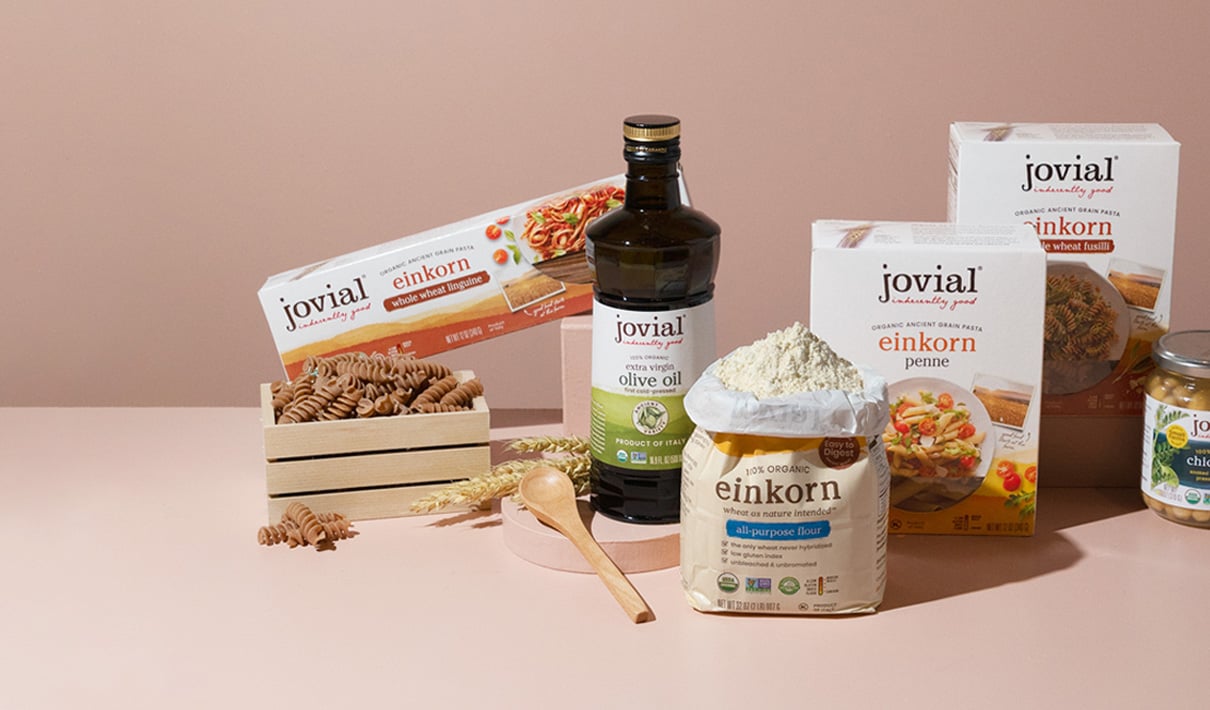
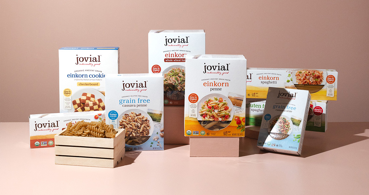
When their daughter developed a gluten sensitivity, Carla and Rodolfo Bartolucci—a food-forward, Italian-American couple—sought a culinary solution that would allow their family to continue enjoying 100% organic, traditional Italian foods. By 2010, they were ready to bring their delicious creations to even more people with food intolerances—and so Jovial Foods was born. Today, the brand makes a wide range of gluten-free and grain-free foods, including pasta, flour, cookies, crackers, jarred beans and tomatoes, olive oil, and more.
It was in correcting a communication issue with Jovial’s flour packaging that Carla Bartolucci and newly-appointed president, Frank Bergin, realized the opportunity to create a much more cohesive design system across all the brand’s products.
“We were about to go to press with the new design when Carla said, ‘You know what? This is good, but it would be great if this could fit into an entire redesigned Jovial portfolio,’” recalled Bergin. “She had launched one product, and then another and another, and collectively they didn't work together, even if they were doing really well on an individual basis,” he explained.
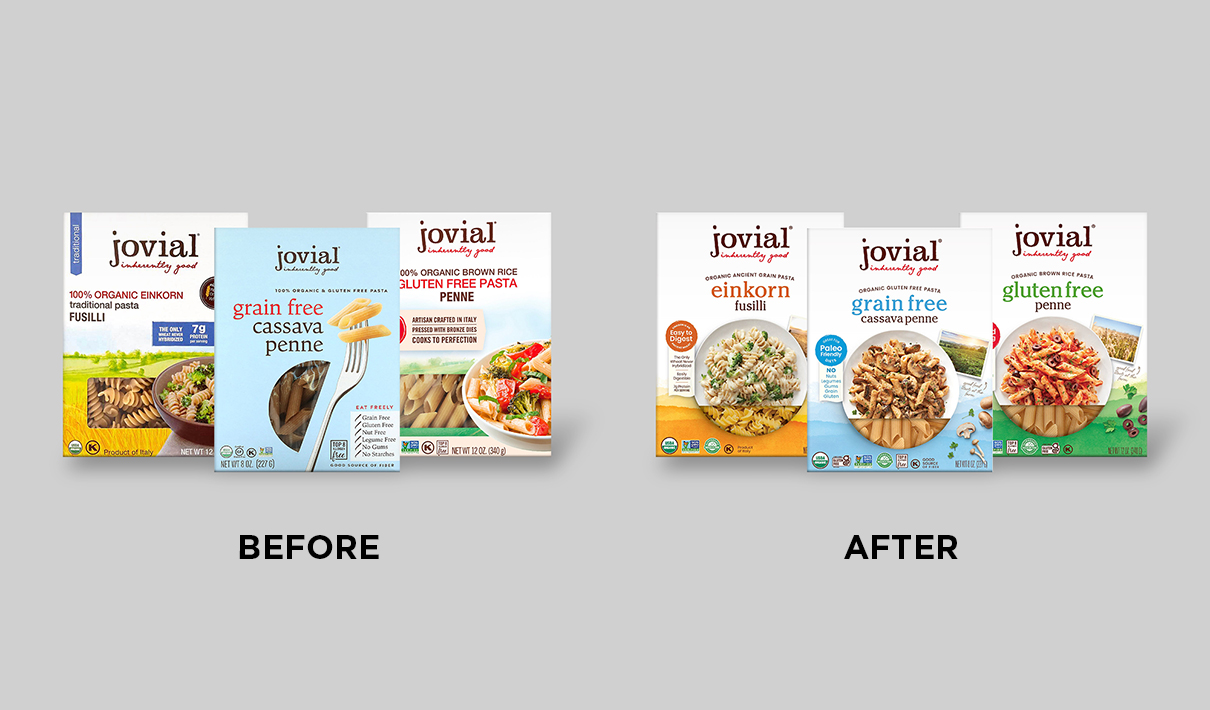
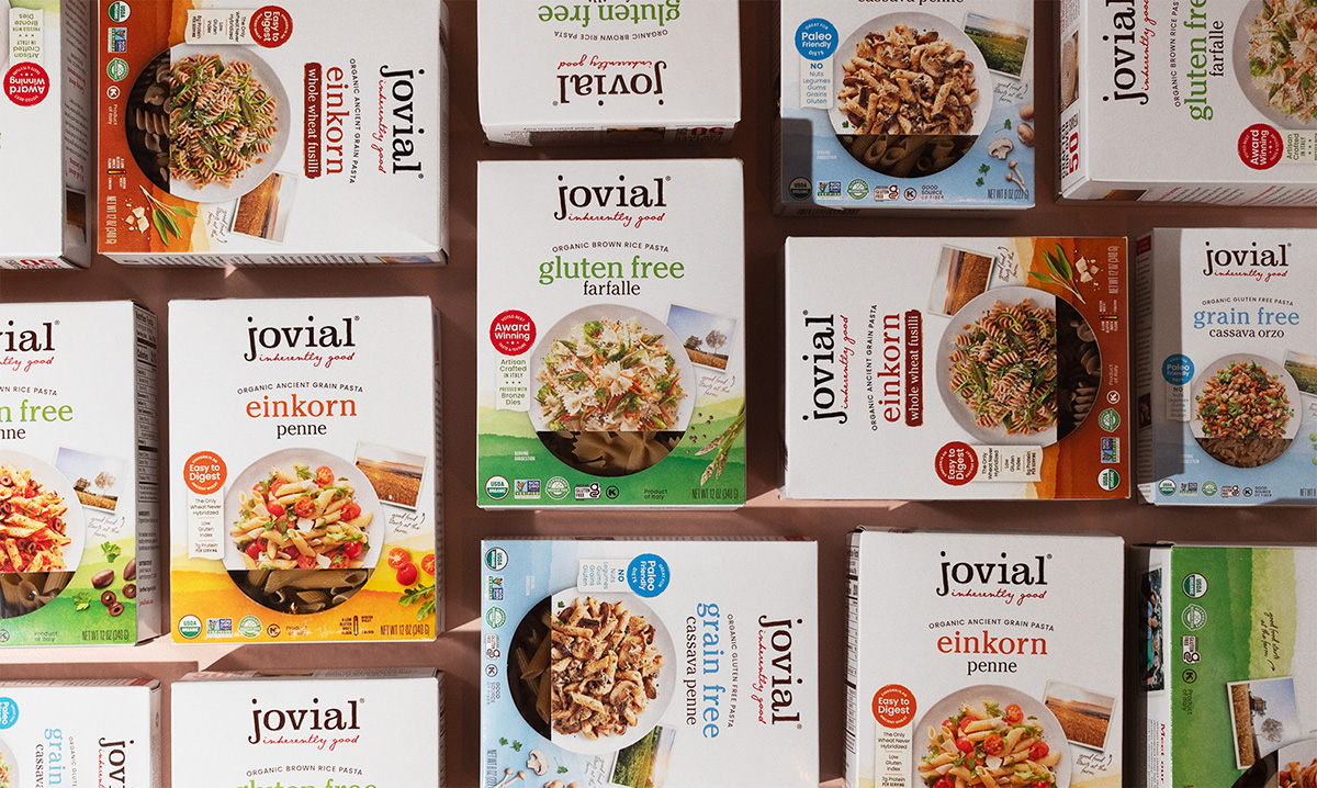
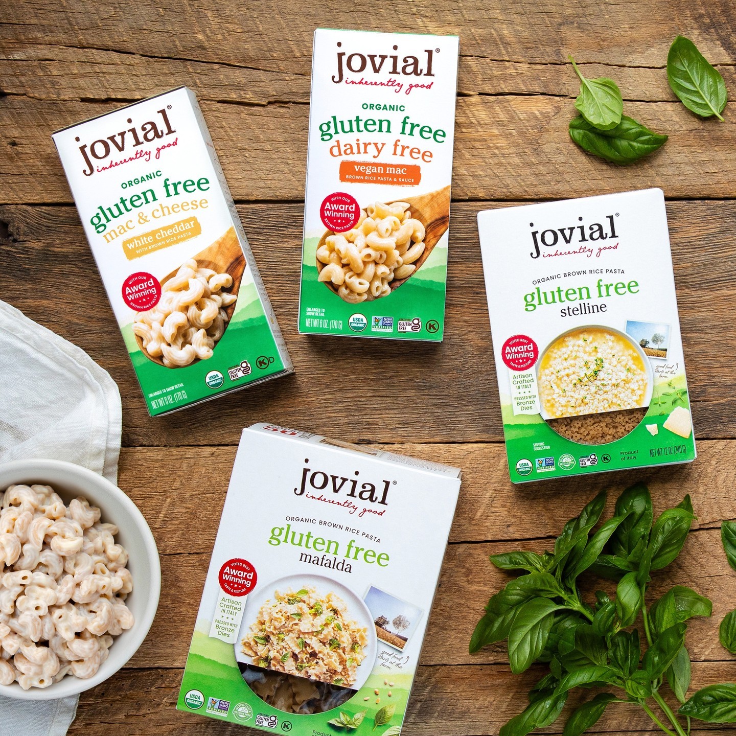
The Jovial team turned to Truly Creative, a California-based creative agency, to lead Jovial’s broader redesign efforts. “We needed to bring more consistency to the brand overall so that consumers could identify the products as Jovial Foods’ regardless of where they were shopping in the store, and even if they couldn’t see the logo,” said Carrie Dufour, founder at Truly Creative. “The hierarchy of information was also a key focus area—really making it as easy as possible for people to shop, being able to tell the product is grain-free, and having information in consistent places on the packages so that it's easy to compare one variety against another,” she added.
Dufour took this latter point seriously, sending out a survey to all key stakeholders at Jovial to understand which messages were most important to communicate to consumers. “As it turned out, nobody was on the same page—literally nobody,” recalled Bergin. “It led to some really robust discussions about what to prioritize for every product. For example, is it more important to say ‘made with brown rice’ or ‘gluten-free’? These claims were getting the same amount of real estate, and making it hard to focus on the one that was most important,’” said Bergin.
“I think what's interesting is that almost everything that was on the old package is on the new package. It's just rearranged or reprioritized so that it's less frustrating to read through. A lot of the fonts were in all caps and seemed to be yelling at you, so we wanted to calm them down,” explained Dufour.
“I think what's interesting is that almost everything that was on the old package is on the new package. It's just rearranged or reprioritized so that it's less frustrating to read through."
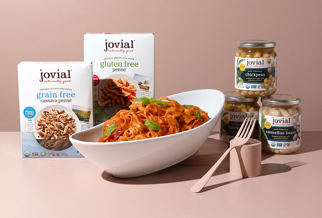
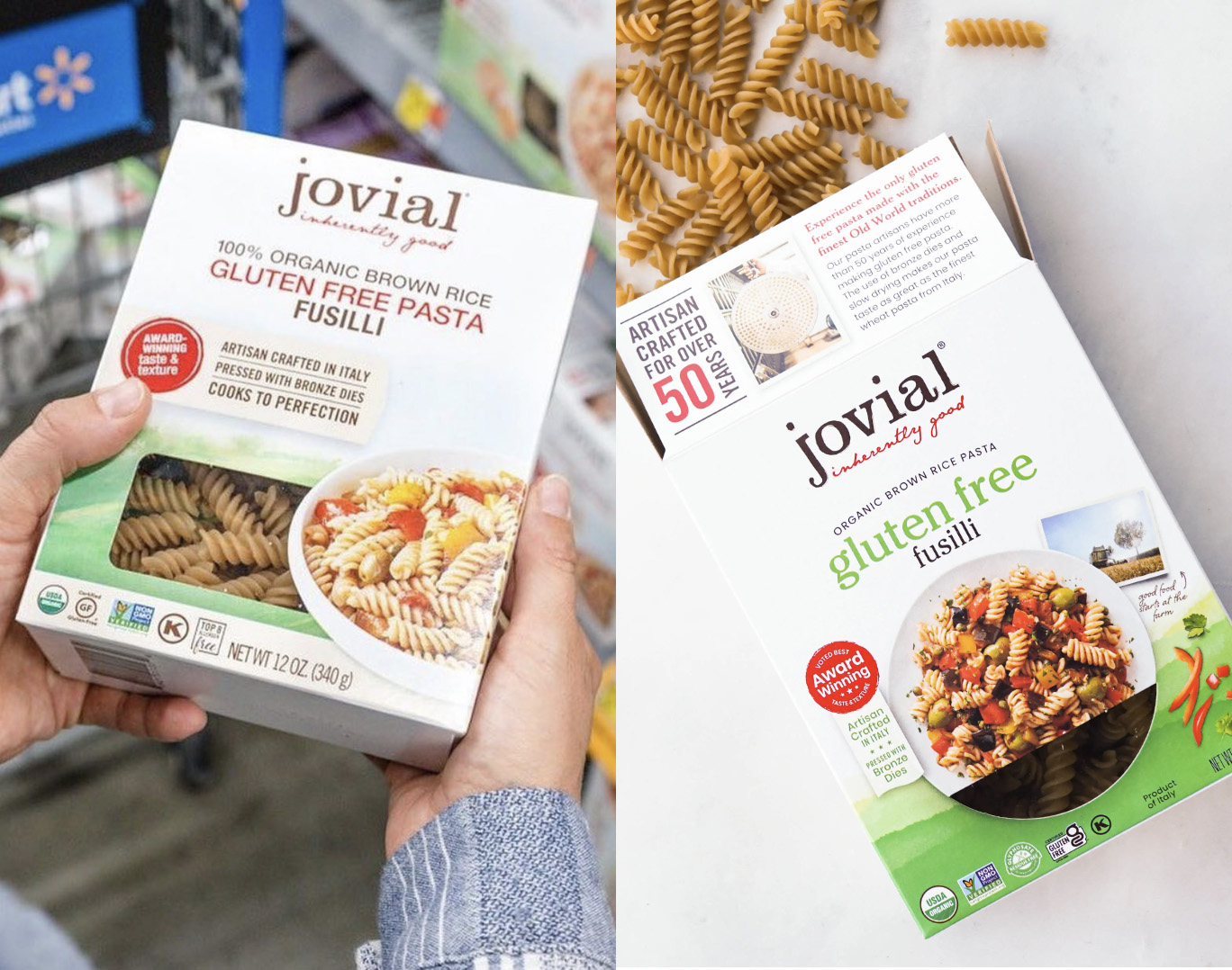
Of course, there was also the matter of appetite appeal; as any brand manager in the food industry knows, “tastes great” almost always ranks number-one for consumers. “It was surprising to me how little appetite appeal the pasta category contains. Most of the time, the focus is on the product window or on communicating a sense of heritage—but the actual appetite appeal is minimal. Using photography seemed like a great competitive advantage for us,” explained Dufour.
In this respect, Jovial was already ahead of the curve since the majority of their old packaging included food photography. Dufour’s team took this advantage even further by putting newer, even tastier food photography front and center—while still including the transparent window as a clever extension of the plate itself. As an added bonus for consumers, the recipe for the dish displayed on the front of each box can be found on the back.
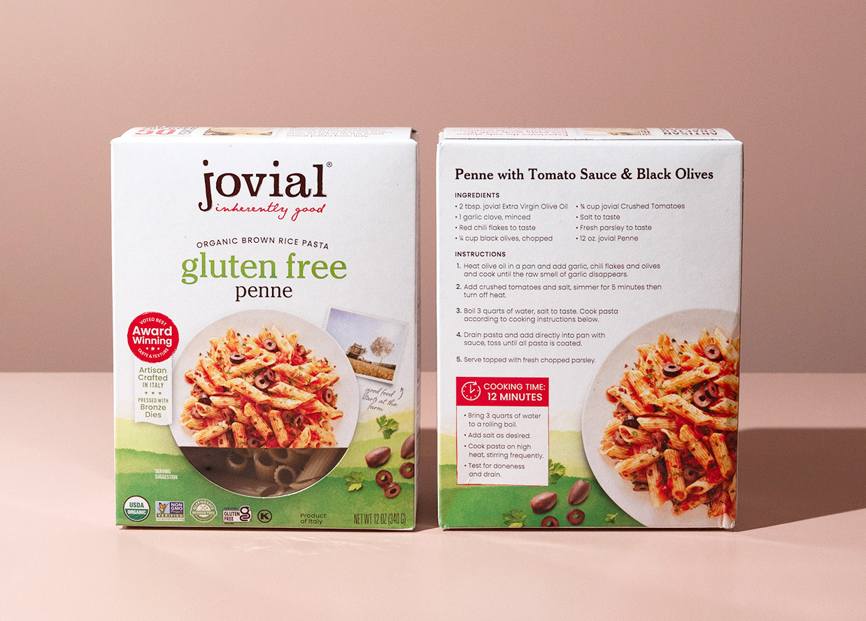
“I've worked for companies in the past where you would do one tomato sauce recipe for all of the pasta varieties, and rely on the different pasta cuts for differentiation. But for Carla and Rodolfo, everything needed to be authentic. They would say, ‘Well, you would never put a tomato sauce on that kind of pasta,’” said Bergin.
For the Bartoluccis, authenticity started at the food’s source—not just in the kitchen. Jovial works closely with farmers, having established a small network of trusted people that grow their ingredients throughout several regions in Italy. On the prior packaging, an illustrated landscape had been near-and-dear to Carla’s heart for the way it evoked this facet of the brand. “The trouble was that 95% of consumers had no idea it was meant to represent a brown rice field,” explained Bergin.
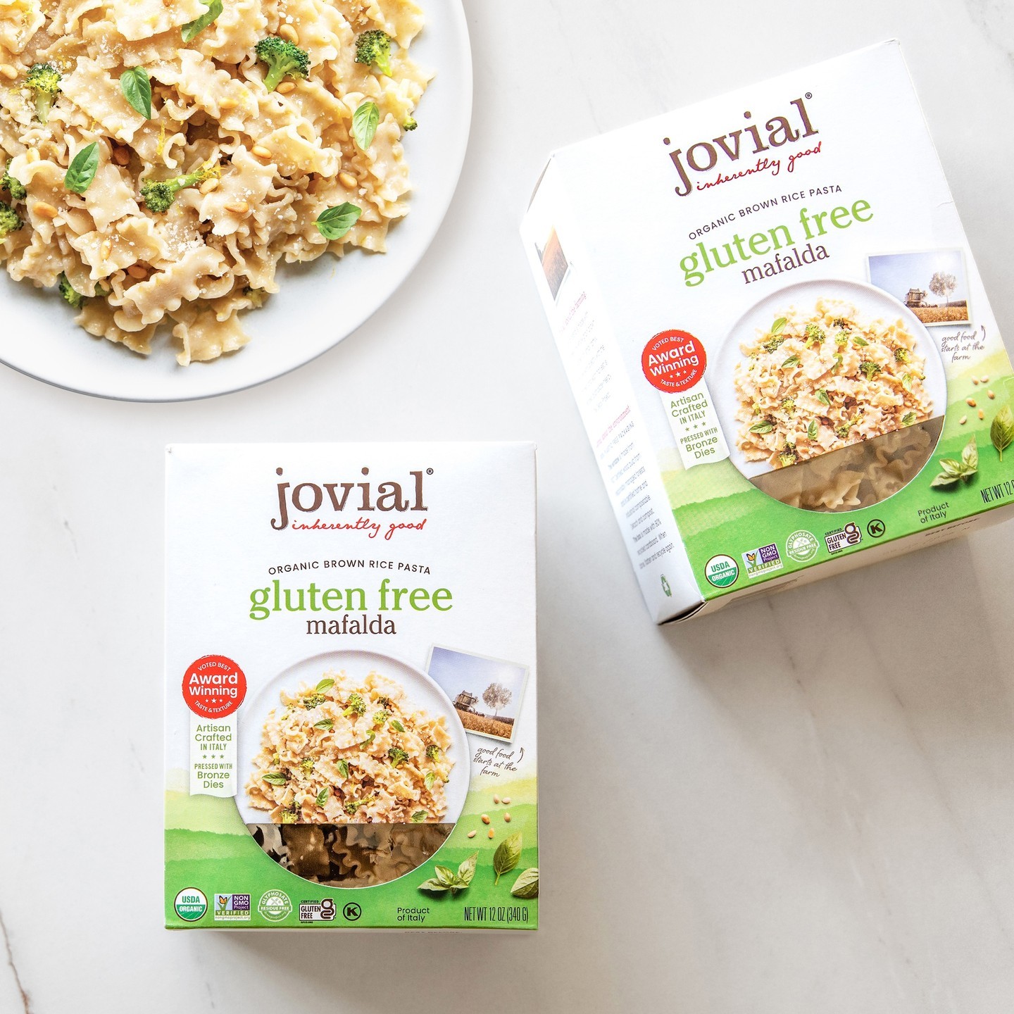
So how could the brand better communicate its use of simple ingredients from trusted, high-quality sources? The new packaging maintained a slightly-abstracted version of the watercolor landscape to serve as a background element—a visual whose color could be changed to work with different product varieties. To this, Dufour’s team added one real photographic snapshot to each package with a call-out that reads, “Good food starts at the farm.”
“When we talked about the brand’s personality, we kept referring to words like gentle and joyful—when consumers find a food that fits their dietary needs and actually tastes good, and that feels inclusive,” said Dufour. “The watercolor landscape evoked those soothing emotions, and the photographs tied the product to a sense of place.”
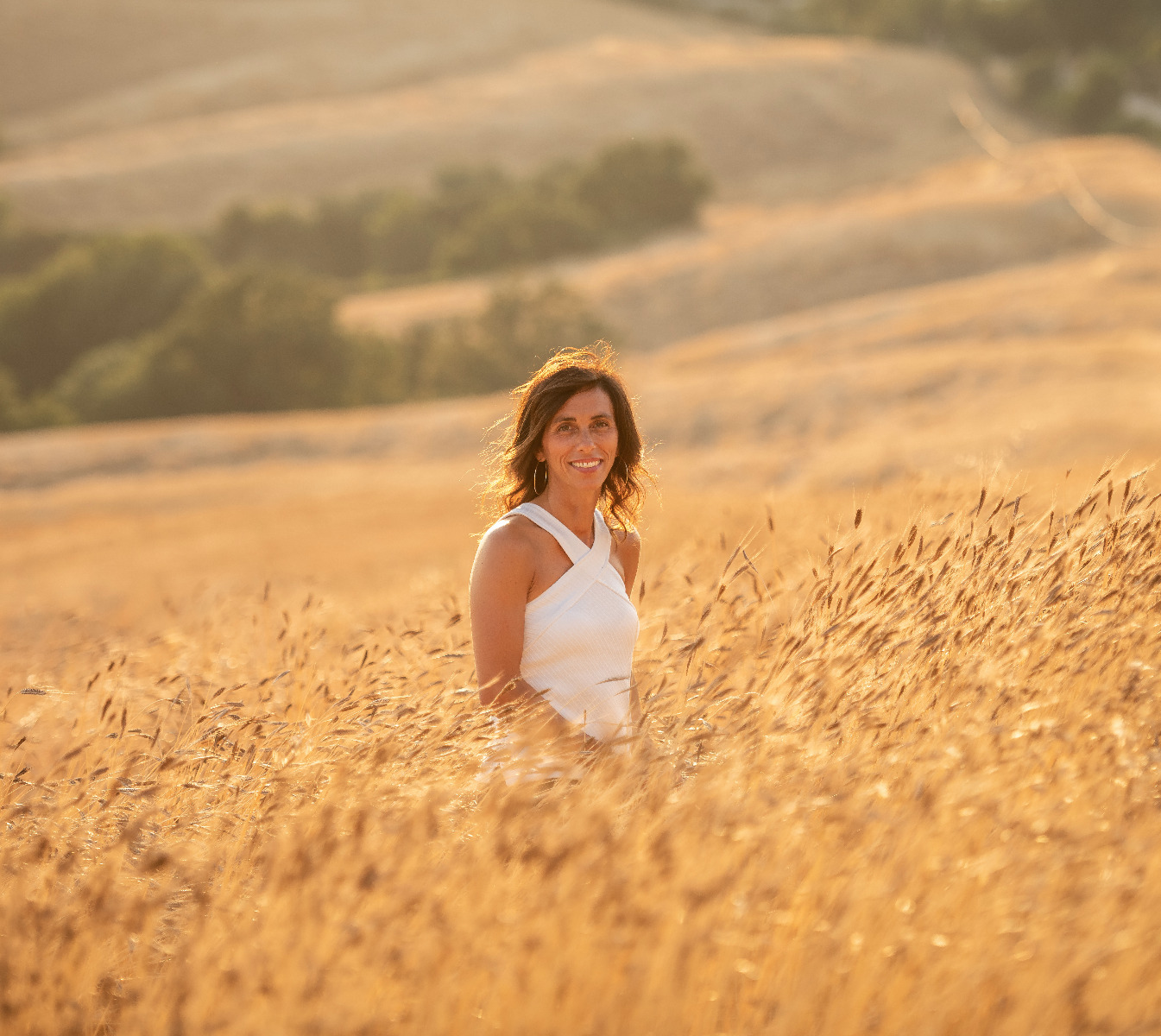
In late summer 2021, Jovial launched its revamped packaging—sadly, just a few months after Carla Bartolucci passed away from a brief illness. Though Carla never got to see the new design on store shelves, her influence can be seen clearly—and lives on through her daughter, Giulia, who has since stepped up to play a larger role in the company. “Her daughter had also been involved in the design process—including contributing many of the recipes gracing the brands’ new boxes—and it was the perfect passing of the torch from mother to daughter, from one generation to the next,” said Bergin.
 Carla Bartolucci in an einkorn field.
This sentiment rings especially true, given the remarkable success of Jovial’s fresh, new look. During the six months following the redesign, pasta sales increased by 27% compared to the same period during the prior year, significantly outpacing growth for the category overall. Designalytics’ consumer testing affirmed this result, with 69% of category buyers indicating that they’d prefer to purchase the new design over the old one.
During the six months following the redesign, pasta sales increased by 27% compared to the same period during the prior year, significantly outpacing growth for the category overall.
What’s more, the brand made no increases to its marketing spend given the rising supply and shipping costs during the Covid-19 pandemic, relying on the design alone to do the heavy lifting. “That's about as clean of a case as you're going to find for design impact because there was very little marketing investment at that time,” noted Bergin.
“Our growth since then has been tremendous across categories, and particularly for pasta. We now have 12 pasta items being nationally distributed through Whole Foods and seven pasta items in Walmart—plus three items with regional distribution through Target,” said Bergin. “That just doesn't happen if the design isn’t working, if it's not clearly separating the brand from its competitors,” he added.
When asked what made this redesign so successful, Dufour cited the importance of staying true to the brand’s authentic self. “We wanted this to be an evolution, not a revolution. I see a lot of redesigns these days that really just follow the trends, abandoning where the brand had been to try something a little extreme in an attempt to get noticed at the shelf,” she said.
"I see a lot of redesigns these days that really just follow the trends, abandoning where the brand had been to try something a little extreme in an attempt to get noticed at the shelf."
For Bergin’s part, taking the time at the start of the initiative to cement the creative strategy and achieve universal alignment played a key role. “That helped us move more quickly throughout and got us to a better place overall, especially since it wasn’t just our internal stakeholders we were consulting. We took the time to understand the consumer perspective as well, which was absolutely critical,” he reflected.