 Brand: Oikos
Manufacturer: Danone
Agency: Beardwood&Co. and Danone Design
How do you spice up an everyday, humdrum snacking experience? That was the question that Oikos, an OG of the Greek yogurt category, was asking itself in early 2020. “There are certain food categories you only eat once per month or a few times per year, but yogurt is a daily experience for many people,” said Julia Beardwood, founder of Beardwood&Co., the award-winning creative agency that would be chosen to partner with Danone Design on Oikos’ brand reinvention later that year. “That’s where the boredom factor comes in.”
The yogurt category’s insatiable appetite for novelty-seeking underscores Beardwood’s point. Every week, it seems there’s a new twist on this snacking staple: protein-enriched, keto, zero sugar, plant-based—the list goes on.
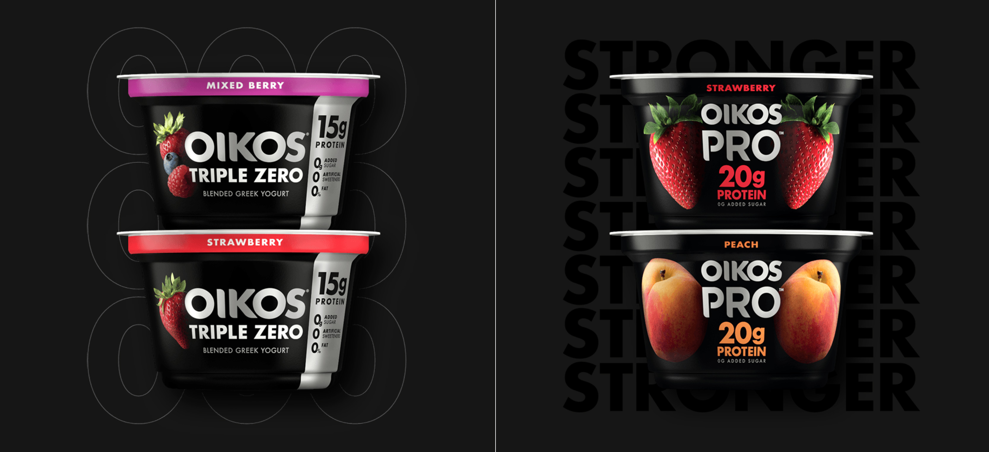
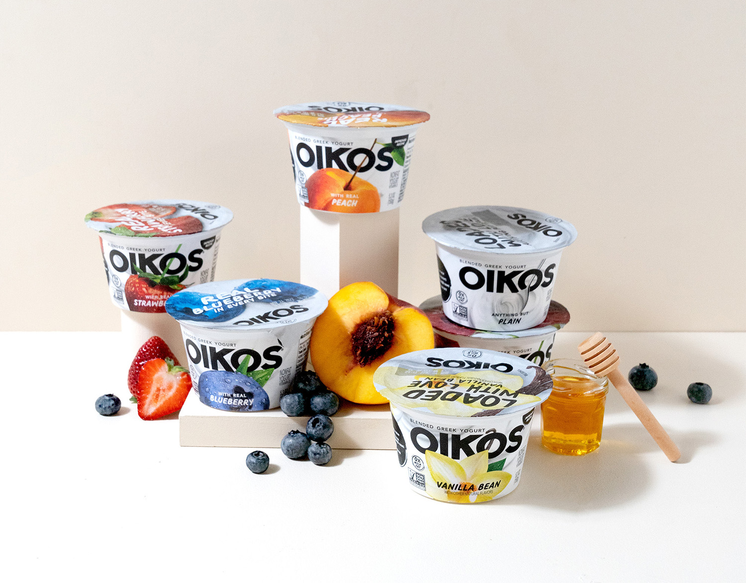
Some Oikos sub-brands have fared well by catering to consumers’ desire for more specialized yogurt offerings. For example, the Oikos Triple Zero product line—boasting zero sugar, zero artificial sweeteners, and zero fat—was regarded as the “successful sibling” of the Oikos core line at Danone, Oikos’ parent company, in 2020. Early the next year, Oikos Pro entered the scene as a protein-packed “performance” line for the fitness-minded. While sales of these sleekly-designed, highly-functional counterparts soared, those of the brand’s flagship line (also known internally as “Oikos Blue”) were falling.
“Oikos Triple Zero and Oikos Pro held a benefit-led, almost-masculine space—and then there was Oikos Blue. It wasn’t like, ‘This line is functional, and this one is beautiful’—they didn’t feel like part of the same brand, with the exception of a shared name,” said Lauren Koprowski Bodner, creative director of brand design strategy at Danone.
The challenge was two-fold: break through boredom without relying on the product’s functional benefits—and develop a look that jives with the bold, black-and-white aesthetic of Oikos’ other sub-brands. Or, as Bodner put it: “How do we create one Oikos experience that is super-intuitive and delicious that fits with what we have and doesn’t rely on saying, ‘Here we’ve got zero sugar and not many calories and lots of protein—and oh, by the way, more protein on the side’ while still having a big impact?”
The new positioning moved away from functional routines to more joyful, healthful habits—then layered on an edgy, supremely confident spirit. In visual terms, this meant taking a fruit-forward approach, and eschewing existing category conventions that embraced soft or sedate design choices. At the time, the design aesthetic of many non-functional brands in the category could be described as quaint, feminine, or charmingly bucolic. “We wanted to be much more bold and modern. Oikos was going to be the yogurt brand with a black leather jacket,” said Beardwood.
“We wanted to be much more bold and modern. Oikos was going to be the yogurt brand with a black leather jacket."
To achieve this, the brand chucked out its previous outfit entirely—no sacred cows, no holds barred. “Internally, we agreed that something needed to happen, and it wasn’t going to be a small facelift. It needed to be fundamentally transformative and meaningful,” recalled Bodner.
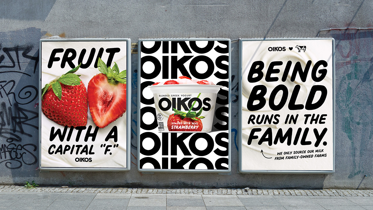
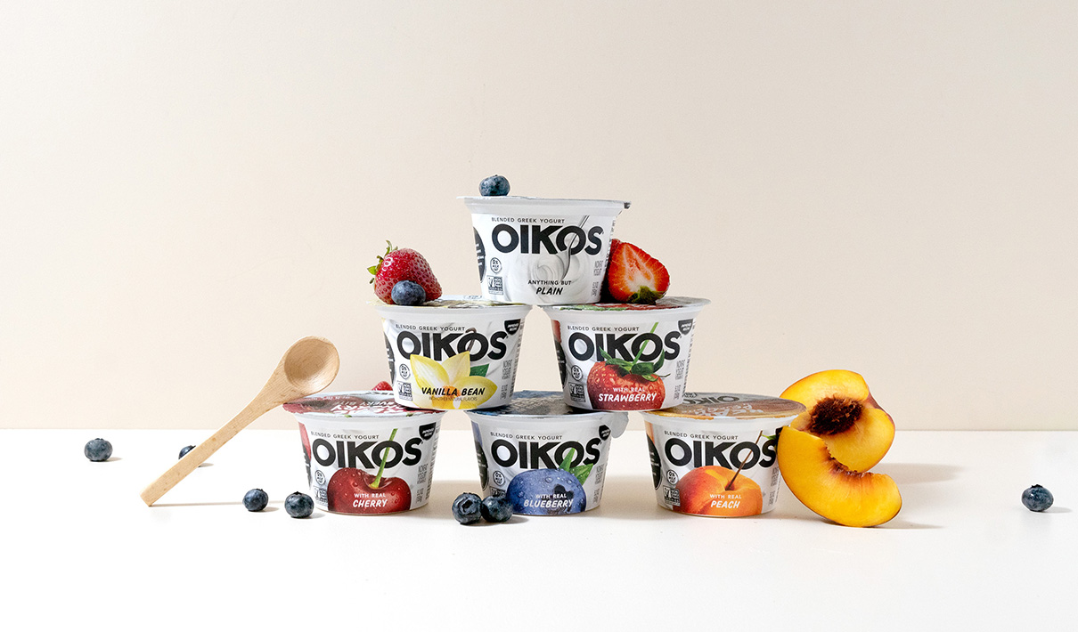
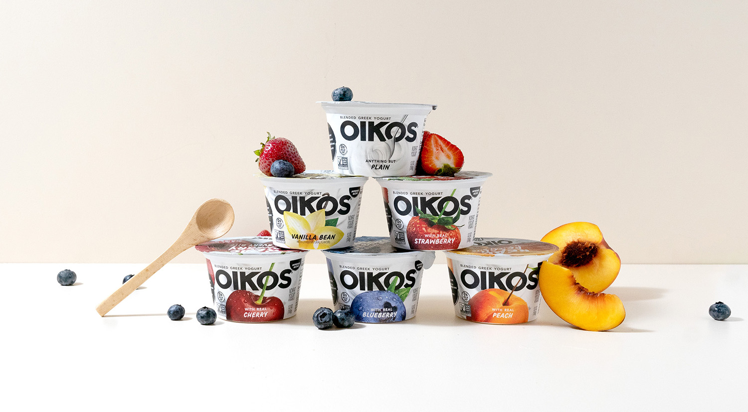
True to that dictate, the change wasn’t small in the least—and one can’t help but notice that the new fruit imagery isn’t, either. “It’s fruit with a capital F,” said Bodner. This design choice also reflects an update to the product itself, which Danone reformulated to include real fruit chunks and an extra-creamy, “forkable” texture. Fruit was no longer just flavor, but “an intrinsically-important part of the product delivery and a holistically different experience,” explained Bodner.
“It's fruit with a capital 'F.'"
The impact of Oikos’ formidable fruit imagery, captured by photographer Francesco Tonelli, is indisputable. When asked which design better conveys “tastes great”—the top-ranked purchase-driving attribute in the yogurt category—81% of consumers selected the new design over the old, according to research by Designalytics.
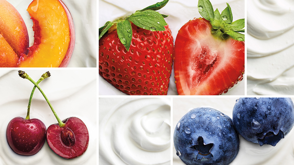
The upside of hyper-realistic food photography is its ability to communicate appetite appeal, but many brands struggle to pinpoint a photographic style that also feels distinctive to the brand. The approach to this challenge was brilliant: leverage the stalk (or a similarly-shaped appendage) of the fruit to create a strong diagonal element that could be replicated across each flavor variety. Inserted through the second “O” in Oikos, one can see the stem of a super-sized strawberry, a vanilla bean curling behind the flower, a leafy spear atop a blueberry, and so on. “It builds in a secondary moment of identity that’s truly distinctive,” commented Bodner.
“[The diagonal element of each fruit] builds in a secondary moment of identity that’s truly distinctive."
Allowing another visual element to encroach upon the logo is a well-established no-no when it comes to traditional branding rules. “Typically, there are guidelines specifying that there must be some amount of space around the logo, so it’s quite radical to say, ‘Nope—we’re going to violate our logo with this fabulous fruit, and we’re even going to poke the fruit through it,’” said Beardwood. “That fits with the brand’s goal of being bold and modern, and breaking classic rules,” she added.
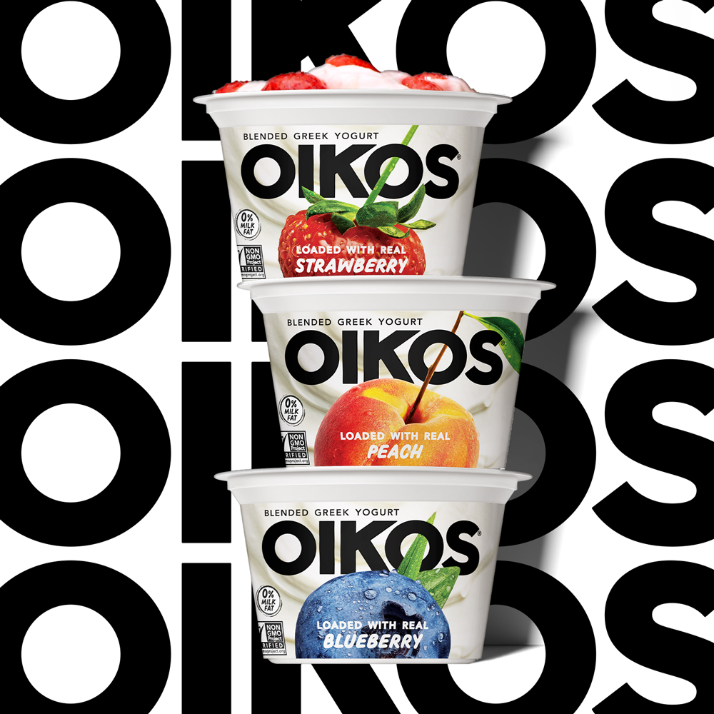
Fortunately, Oikos’ undeniably bold, new logo can afford to share space. The brand’s short name meant the mark could be upsized, while the typeface itself was chosen because it combines extreme legibility with a big personality. “The letterforms are simple, but the ‘K’ has some height, which allows the fruit to really grow big. It’s as if the ‘K’ is holding its breath and the fruit is plumping its chest. It’s a bold, proud brand identity statement,” remarked Bodner.
“It’s as if the ‘K’ is holding its breath and the fruit is plumping its chest. It’s a bold, proud brand identity statement."
Oikos’ “fabulous fruit” and reinvigorated brand mark required a more understated backdrop than the previous blue coloring—but even this element of the new design managed to communicate something meaningful about the product: its rich, creamy texture. “Rather than using a plain white background, we added some visual interest by representing the yogurt itself. It seemed like a fairly obvious, delicious idea, but nobody had done it,” recalled Beardwood.
Oikos’ new look launched in late spring of 2021, causing a stir with consumers. During the four months following its rollout, sales grew by 7% compared to the same period during the prior year. This represents a complete reversal of the brand’s declining sales, which had dropped 18% during the nine months before the launch compared to the same period during the prior year.1 Designalytics’ consumer research affirms this remarkable turnaround: When yogurt buyers were asked which design they’d prefer to purchase, 78% selected the new over the old.2
During the nine months before the launch, sales had dropped 18% compared to the same period during the prior year. By four months after the launch, they had grown by 7%.
The majority of these sales came from buyers who were new to the Oikos franchise—undoubtedly reeled in by the revamped branding. “We had one metric we were really focused on: driving trial. We wanted to get to 4% household penetration, which was a high bar—higher than for some of our biggest innovation launches. After several months, we’d hit 4.5%, and our repeat has been continuing to build as well,” said Surbhi Martin, vice president of Greek yogurt and functional nutrition at Danone.
Retailers alike were thrilled with Oikos’ reinvention. “The launch was really successful in driving distribution. We got distribution at all the top retailers, which was a very difficult thing to do during COVID. People would’ve said that’s not possible, but we were able to achieve it by better meeting consumers’ needs and communicating that effectively with a fantastic design,” said Martin.
When asked what made this particular redesign so successful, Bodner mentioned the role of collecting consumer feedback early and often. When an established brand launches a revolutionary redesign, it’s standard practice to conduct robust validation research at the end of the process—but Oikos took a different tack for this initiative. “Typically I would do some qualitative research during the exploration phase and a quantitative study at the end, but we engaged with consumers every two weeks, showing them very early territories and more concepts than we usually would,” she said. This strategy proved particularly effective, generating a high-performing design in record time while still conforming to the brand’s hyper-accelerated timeline.
Bodner also emphasized the importance of having an evocative, core idea to serve as the scaffolding for creative exploration—and as the criterion by which concepts should be judged. “For me, there were two guiding stars: breaking boredom and the black leather jacket. You can have an 18-page brief but, without a black-leather-jacket moment, it’s just a compilation of information and data that doesn’t necessarily coalesce for creatives,” she explained.
"You can have an 18-page brief but, without a black-leather-jacket moment, it’s just a compilation of information and data that doesn’t necessarily coalesce for creatives."
This concept of bringing crystalline clarity to the front-end of the design process (and then adhering closely to that strategy) isn’t new, but it may be underutilized in practice. In Oikos’ case, the brand set its eye on a black leather jacket, then translated that intent flawlessly in its design execution, and ultimately—perhaps inevitably—into stellar performance at the shelf.
1 IRI, total U.S., multi-outlet, latest 52 weeks ending 11/28/21 vs. year ago. Includes multiple package sizes for plain, vanilla, strawberry, blueberry, and cherry flavors.
2 This outcome ranks in the top 10% of Designalytics’ cross-category redesign database, which contains data for hundreds of recent CPG redesigns.