 Brand: Country Archer
Manufacturer: Country Archer Provisions
Agency: Interact Brands
There are a lot of things that can hamstring a growing brand, but one of the most insidious is complacency. The team at Country Archer recognized that, so when they saw a handful of negative indicators in their consumer research, they decided to act.
“We are one of the largest, fastest-growing, better-for-you brands in the meat snacks category,” said Eugene Kang, Co-Founder and CEO of Country Archer. “So, we’ve been doing pretty well. But our market research told us that brand recall and overall awareness were low. That’s when we reached out to the team at Interact.”
The Interact team is led by Fred Hart, partner and creative director at the Boulder-based design studio, who was intrigued by the unique challenge the brand’s situation presented. “Usually, when a brand is the fastest growing in its category, it’s not looking to do a redesign,” stated Hart. “But the Country Archer team saw clear areas for improvement in their package design. To their credit, they seized the opportunity.”
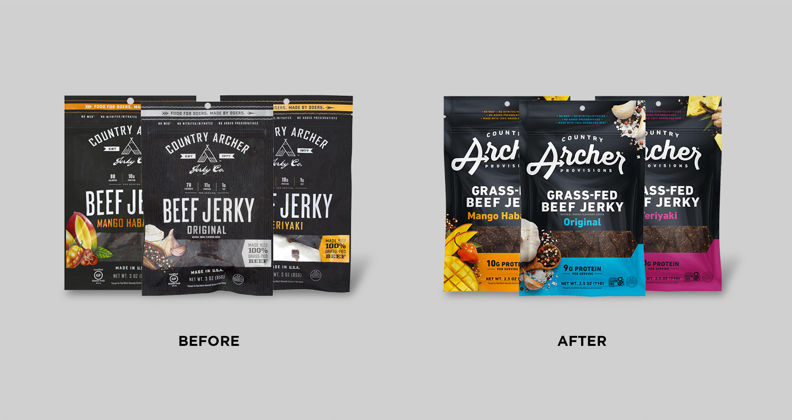
The brand started, appropriately, at the beginning: with an honest, baseline assessment of the brand and where it stood with consumers at the time. “In our initial research, the only real thing consumers could recall about our packaging was the black bag,” said Kang. “As a business that had grown as much as we had, this finding was humbling. We had a lot of work to do in building awareness.”
Of course, Country Archer was striking a chord with its target market—the brand’s success to that point had proved it. So, Kang wanted to find the “secret sauce” that had allowed it to resonate with consumers. “It became clear in both quantitative and qualitative research that our key point of differentiation was that our meat is grass-fed,” he stated. That distinction was very important at Country Archer internally, as it supported the brand’s mission to create sustainably-sourced, premium meat snacks—and “grass-fed” signaled to consumers that its product was exactly that.
While the old packaging called out that the product was grass-fed, it only did so in a banner at the bottom-right of the design. Neither the brand nor the agency thought that was enough. “Fred had talked to a guy on a plane who was eating our jerky. He loved the product but didn’t even realize it was grass-fed meat,” recalled Kang. “That was just anecdotal, but it was thoroughly backed up by our data. Driving that distinction needed to be a priority.”
Any change to the package design wouldn’t happen in a vacuum, so Interact also conducted a competitive assessment to find opportunities where Country Archer could, as Hart put it, “challenge the category, not the consumer.”
"Challenge the category, not the consumer."
“We realized the meat snacks category’s packaging was all hyper-masculine,” he noted. “It was sort of ‘men eat meat, so make it look manly’ across the board, with brands all mimicking each other. And the Country Archer brand had more depth than that—they cared about people through creating good products, they cared about the planet through sustainable practices. They were human. We wanted to lean into that.”
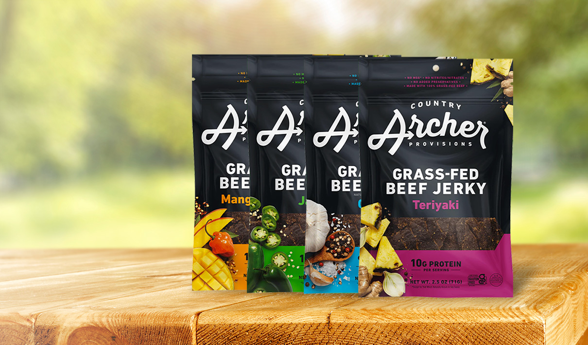
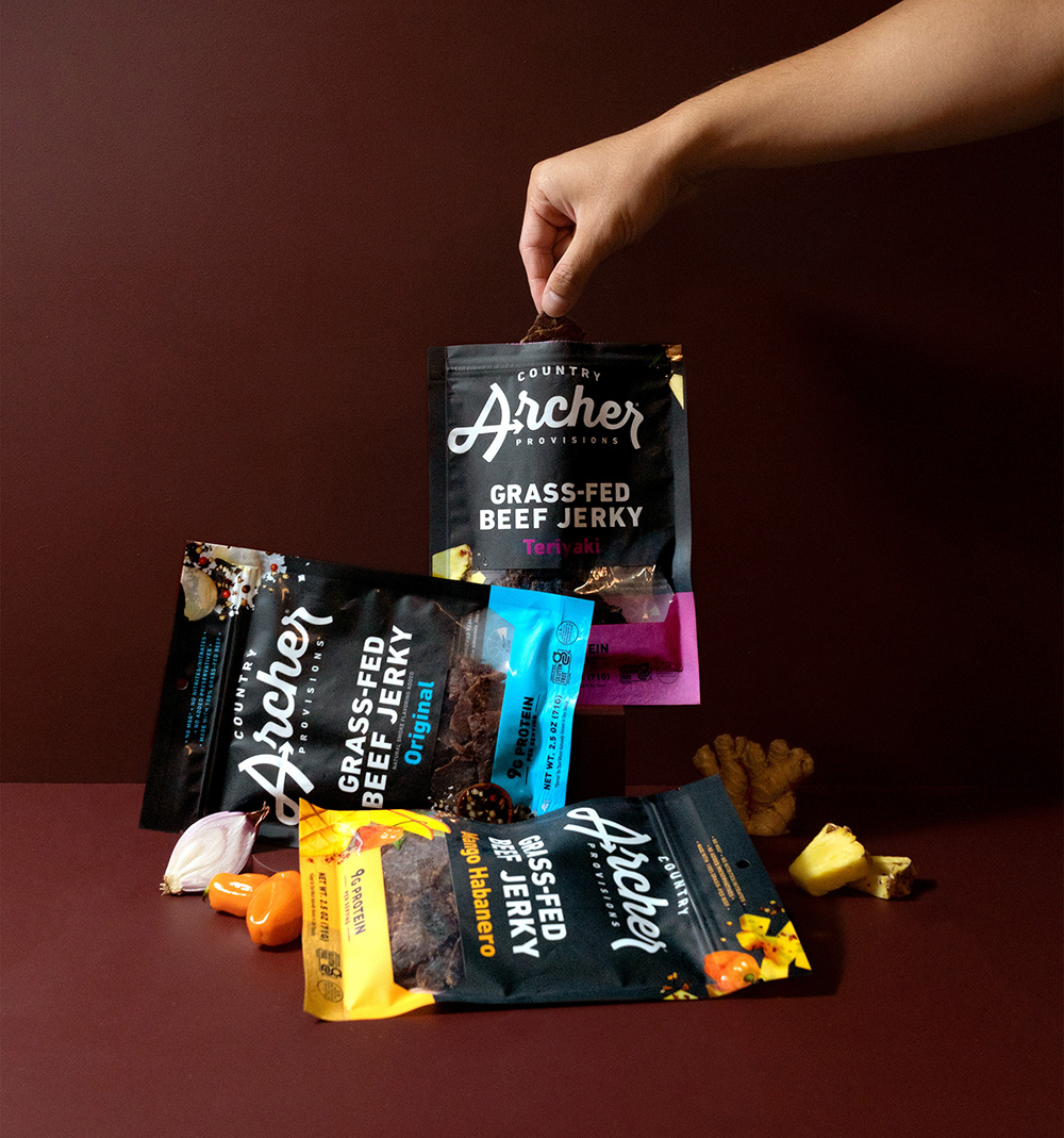
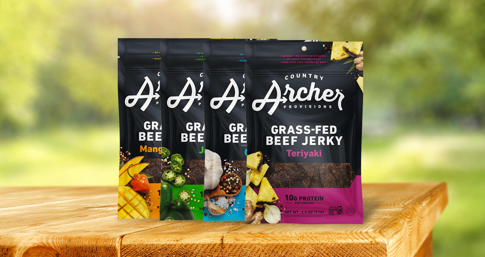
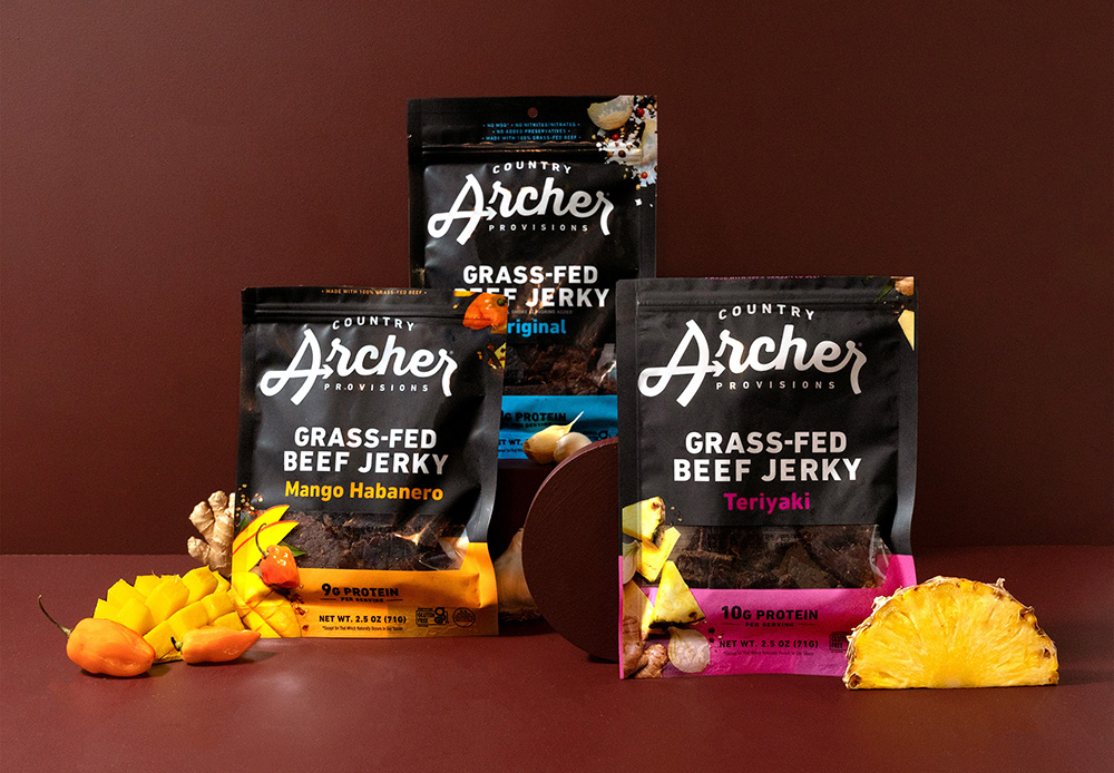
So, while maintaining the package’s most distinctive asset—the matte-black bag itself—Interact added splashes of eye-catching color to the new design that corresponded to each flavor. “We already had this beautiful black bag, and adding colors allowed the package to pop more,” said Hart. “Other brands in the category had just one color, and that does nothing to disrupt the monotony of the shelf. These colors on Country Archer’s new design added vibrancy while maintaining the black bag, which was a core equity of the brand.”
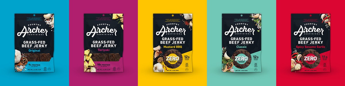
The prismatic palette helped with line navigation and taste appeal, but the agency knew that photography would really drive home that yum-factor. The new package used close-up photography of the ingredients (like onions and spices) on both the lower-left and upper-right of the package, instead of the illustrated visuals that were used on the lower-left of the previous design. “You can really taste the clean ingredients in this jerky, and we wanted that freshness to come through,” said Hart. “So not only did we shoot all new product photography, we really romanced the inclusions.”
Given that grass-fed meat was a true differentiator for the brand, that claim became central to the package. The call out in the lower-right side of the old package stating “Made 100% grass-fed beef” was replaced with a massive block of text in the middle of the new design “Grass-fed Beef Jerky” in addition to a mention at the top among other claims. The messaging seems to have resonated with consumers: In Designalytics assessment of the redesign, the new design bested the old in communication of the number one most important attribute to consumers, “tastes great.” It was the same story with the number two most important attribute, “made with real ingredients”, as well as for each of the other 10 most-important attributes to consumers, to varying degrees.
The name Country Archer Jerky Company was changed to Country Archer Provisions in part, Hart stated, “so that the brand didn't paint themselves into a corner from a high-level, brand identity perspective.” In addition to helping with brand recall, this new name would allow the brand to expand beyond its current product set in the future.
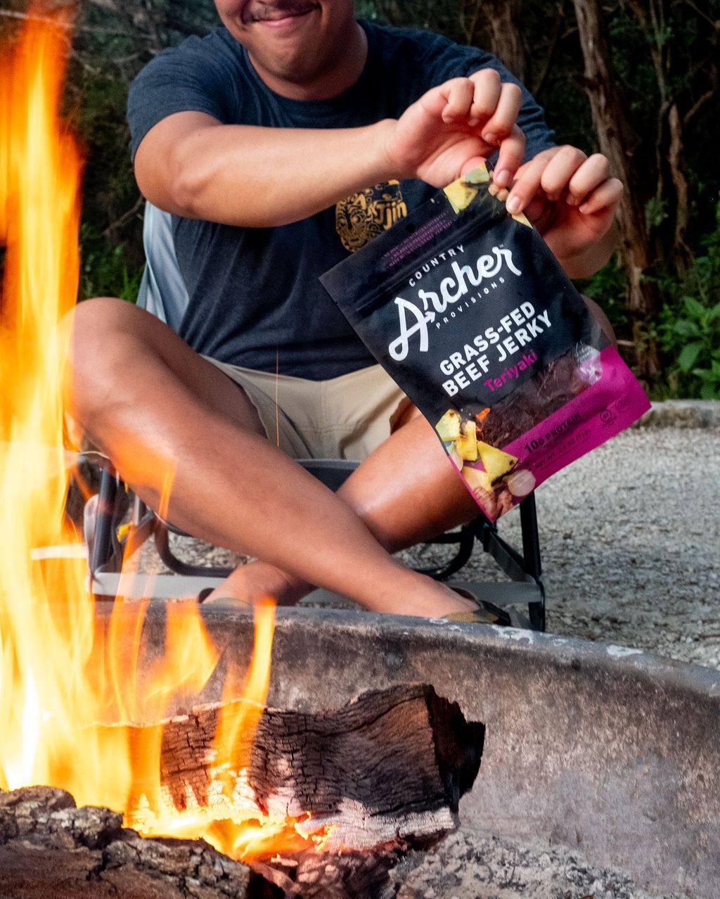
The name change corresponds with a new logo aesthetic as well. It was a major departure from the all-uppercase look of the old package, and was designed to reflect the brand’s new “Aim for better” tagline while challenging the masculine look-and-feel of the rest of the category. The “A” in “Archer” now resembles a bow and arrow which, in addition to being a clever visual play on the name itself, establishes an icon that Country Archer hopes can continue building brand recall. “Our logo is much more memorable and recognizable now,” noted Kang. “There are certain brands that you can recognize immediately just by their iconic symbols—Nike’s swoosh and McDonald’s arches come to mind. The goal is for our logo to become synonymous with the brand in that way.”
Kang remembers early response from retailers after the initial launch, and how that presaged positive market results. “Right off the bat, the design was incredibly helpful in creating engagement with retailers,” said Kang. “One retailer didn’t even wait for a shelf reset—they wanted to get the new design on the shelf as quickly as possible. And once they could see the design was having an impact sales-wise, it helped make the case for securing incremental distribution. So, this design has been the gift that keeps on giving.”
“One retailer didn’t even wait for a shelf reset—they wanted to get the new design on the shelf as quickly as possible. And once they could see the design was having an impact sales-wise, it helped make the case for securing incremental distribution."
Aiming for better, it turns out, pays off. In a head-to-head test of the old and new designs conducted by Designalytics, consumers preferred the new design for purchase. Apart from the wins in communication previously mentioned,consumers were able to find the new design considerably faster than the old (4.3 vs. 6.9 seconds, respectively) and with greater accuracy.
And the sales results? They were pretty cut-and-dry: During the 26 weeks following the new design's launch, sales increased by 28% compared to the same period during the prior year.1 That’s close to double the growth rate of the previous year.
During the 26 weeks following the new design's launch, sales increased by 28% compared to the same period during the prior year.
To Kang, the success of the design—and its visual virtuosity—was a good reminder of how pervasive and powerful packaging can be. “The new design has been really successful, and it’s also beautiful,” he said. “So, we want to celebrate it in our marketing efforts, putting it in as many places as possible. It deserves that prominence.”
1 Nielsen xAOC, latest 26 weeks ending 1/23/21 versus the same period during 2020 and 2019.