 Brand: Dove Men+Care
Manufacturer: Unilever
Agency: forceMAJEURE
It’s clear that there is a formula for success at Dove, and it includes the creative prowess of its agency, forceMAJEURE. With Dove Men+Care’s new redesign, the two organizations have perfected a delicate balance: being true to the brand while also keeping its design fresh and increasingly effective.
The Dove name is practically synonymous with the term “personal care,” but the Dove Men+Care team understands they need to remain vigilant in an increasingly crowded category. The brand’s success, in part, is likely due to the fact that it never gets complacent. “Dove is a well-known brand, but Dove Men+ Care is a ‘challenger’ among larger brands in the men’s space,” said Carlos J. Gil, global brand vice president for Dove Men+Care. “We know that we have very distinctive positioning, and we also know that we are under the wings of a remarkable Dove brand, which I call the ‘mothership.’ But we want to stay single-minded in conveying the superior care our products provide in the context of a changing shelf set.”
That changing shelf features a number of upstarts that helped to prompt this redesign. “Our brand was very successful, but there was a proliferation of direct-to-consumer (DTC) brands that were spilling over into the brick-and-mortar retail environment,” said Gil. “So the question became: How do we create distance from those competitors without putting at risk the strong, core equities that the brand had built during the previous 10 years?”
Easier said than done, but forceMAJEURE had handled this sort of thread-the-needle challenge before. Plus, they had worked on the original design, which was built around simplicity, functionality, and navigation—providing clarity about what the product was and making it easy to differentiate it from other sub-brands under the Dove name. Gil was clear that this would be the core of the new design; it would be an evolution, not a transformation.
That said, there were clear trends emerging in the space, and plenty of opportunities to leverage them. “We were realizing that there is an evolution of the definition of ‘care’ and what guys are looking for,” said Michelle Mak, creative director at forceMAJEURE. “It’s not just about a cleansing ritual anymore; the shower has become a place to ‘reset.’ So we wanted to bring a sensory experience in, even if it was subtle.”
The brand concurred, highlighting how even a slight change could help stave off the upstart arrivals in the traditional retail space. “We could see what was coming as the DTC brands were starting to pop with much more dynamic, colorful ranges,” commented Gil. “And that had us discussing how we could maintain our clean, minimalistic design but add more personality. In the context of a fragmenting and diversifying shelf, we wanted to modernize and add more vibrancy and depth.”
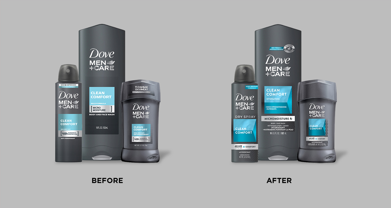
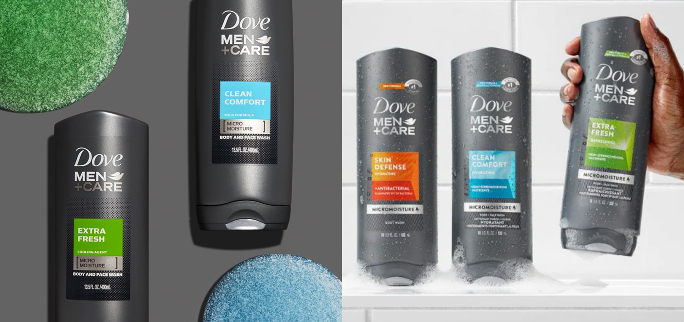 Dove's prior design (left) utilizes solid color-blocks, while the new (right) adds more depth and visual interest to this element.
Research helped light the way as the brand developed the creative brief. “We are very disciplined about research, particularly when we are trying to evolve our design, rather than fixing something that’s not working,” said Gil. “We needed to know how much to push without breaking something that is truly working. That’s always a very risky proposition, and research helps us to navigate that.”
“We needed to know how much to push without breaking something that is truly working. That’s always a very risky proposition, and research helps us to navigate that.”
And it wasn’t an easy task for forceMAJEURE; given a limited space within which to operate creatively, details would need to drive this redesign. “In the brief, we were asked to ‘break the box’ without breaking the box,” said Mak with a good-natured laugh, referring to the well-recognized blocks of color that delineate varieties in the body wash and deodorant lines. “So it would clearly be an evolutionary balancing act. We needed to maintain those elements of color that were so iconic to the brand in terms of navigation and creating a memory structure. At the same time, we wanted to evolve the design so that consumers were still engaged. Plus, there was news to share—there was a new formula—and we were moving to a bilingual design.”
Knowing that changes would be limited, it might be tempting for an agency to stay close-in when presenting design options. ForceMAJEURE’s experience has taught them that’s not the way to go, even with evolutionary changes. “Our process always starts off with exploration–really trying to break things and bring them back together,” said Mak. “Even though we knew we were going to end up with something that didn’t diverge too far from the current design, that pie-in-the-sky element ultimately helped guide the process.”
Gil concurred. “The forceMAJEURE team generally provides a very wide range of options, some of which are purposefully pushing it way too far. In the midst of that provocation, you start deciding together: How far is too far? How close is too close?”
“The forceMAJEURE team generally provides a very wide range of options, some of which are purposefully pushing it way too far. In the midst of that provocation, you start deciding together: How far is too far? How close is too close?”
“Finding that balance was key,” added Laurent Hainaut, founder & CEO of forceMAJEURE. “Balancing the amount of color on the package, the equities the brand had built in the past, with how it needed to evolve to compete in today’s marketplace. These were all factors. So there was a lot of trial and error to arrive at the result.”
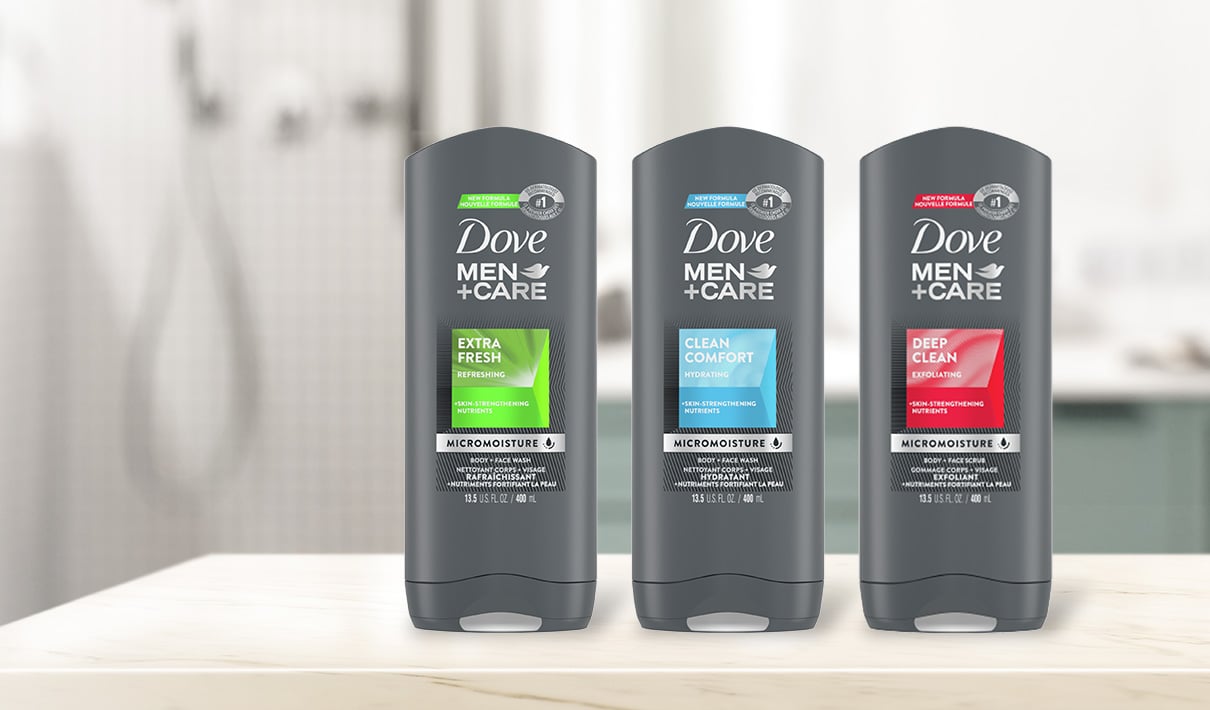
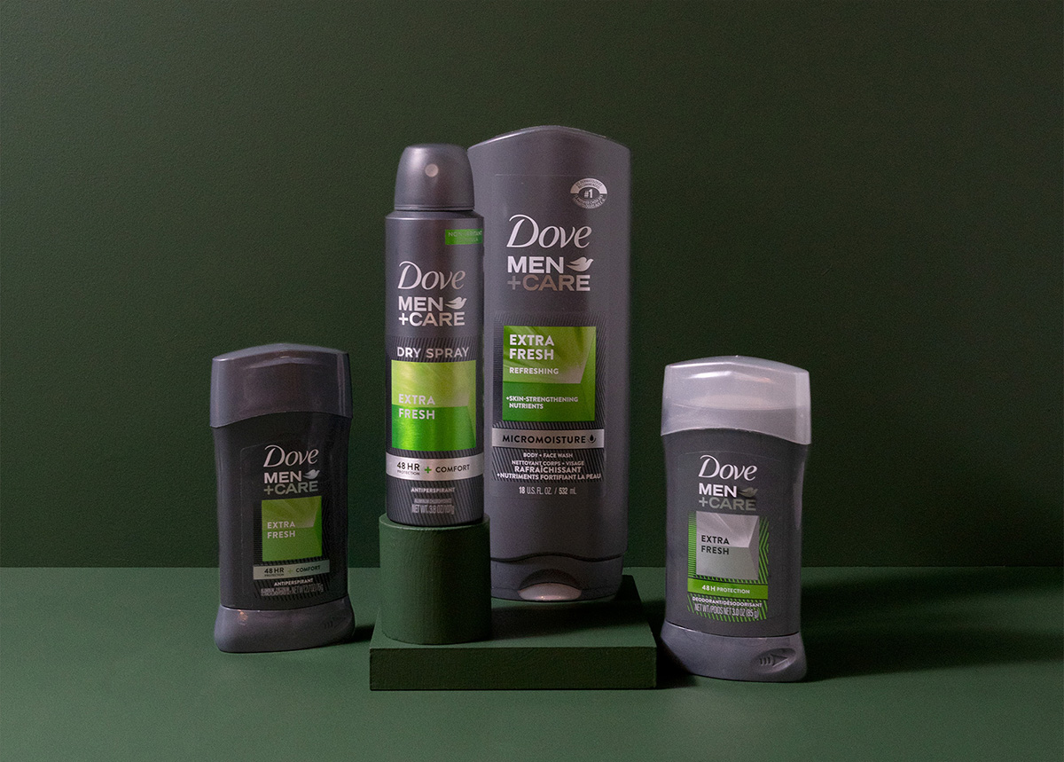
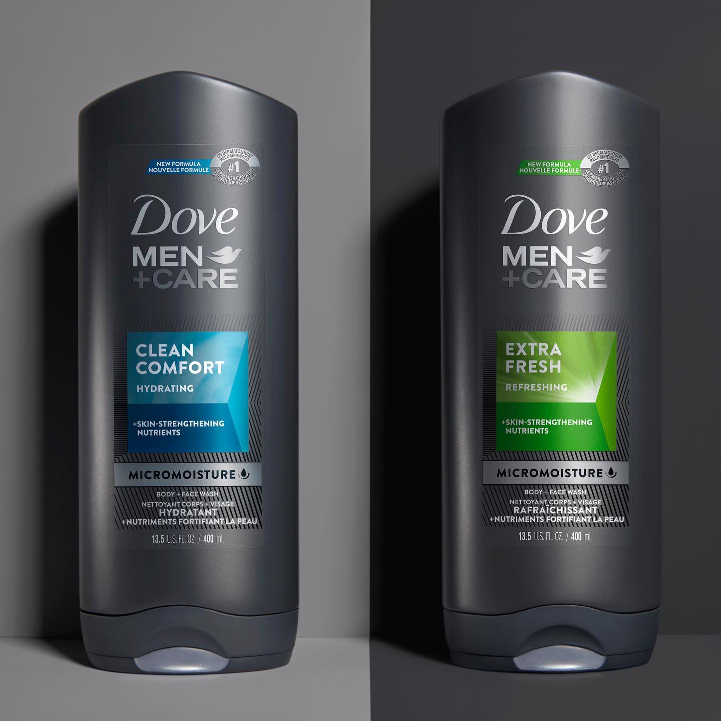
The process led to a familiar-yet-fresh look for each package design in the series. The body wash variants maintained their established colors, but the boxes were more glossy, vibrant, textured, and featured a few shades of the variant’s signature color.
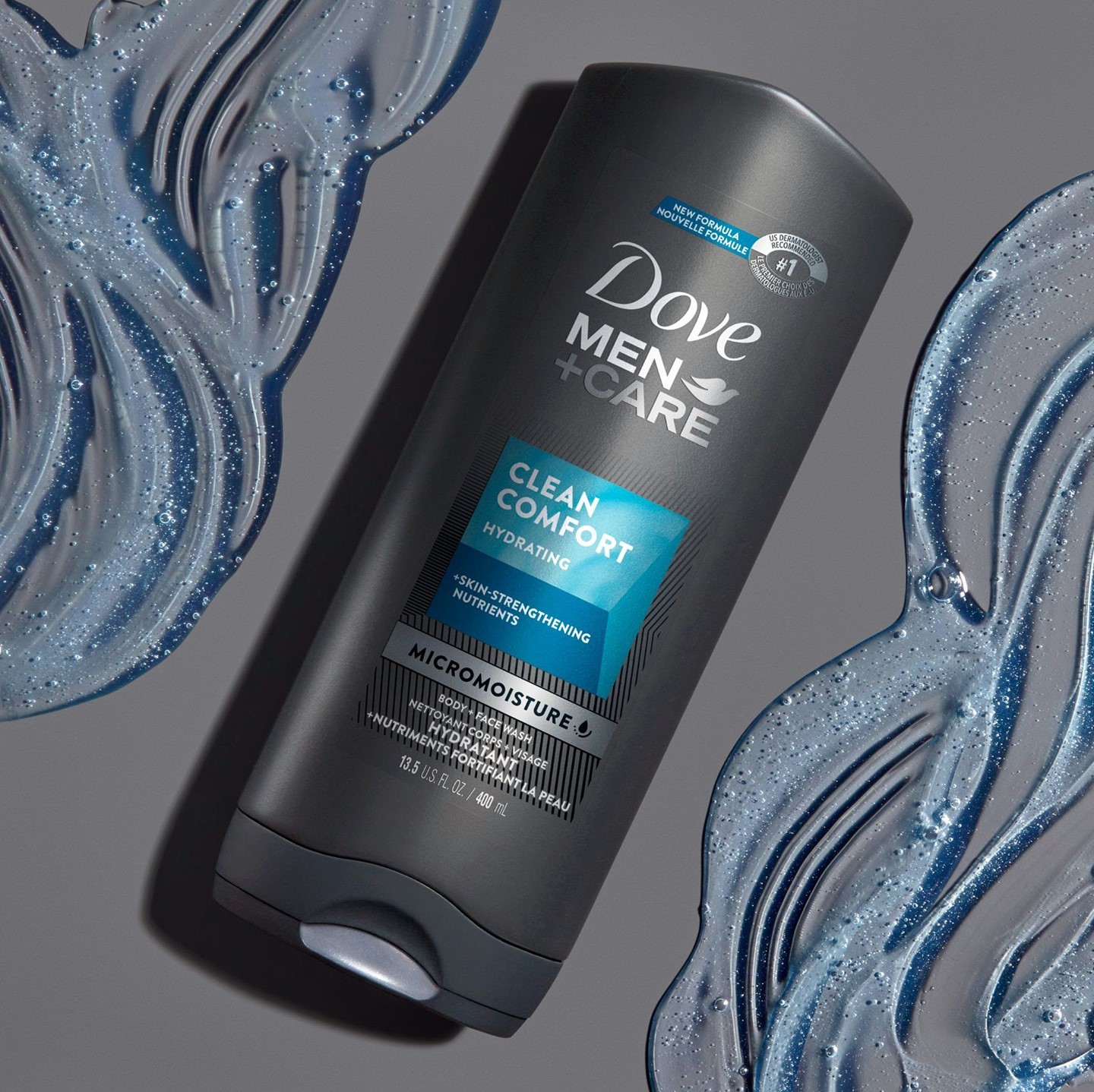
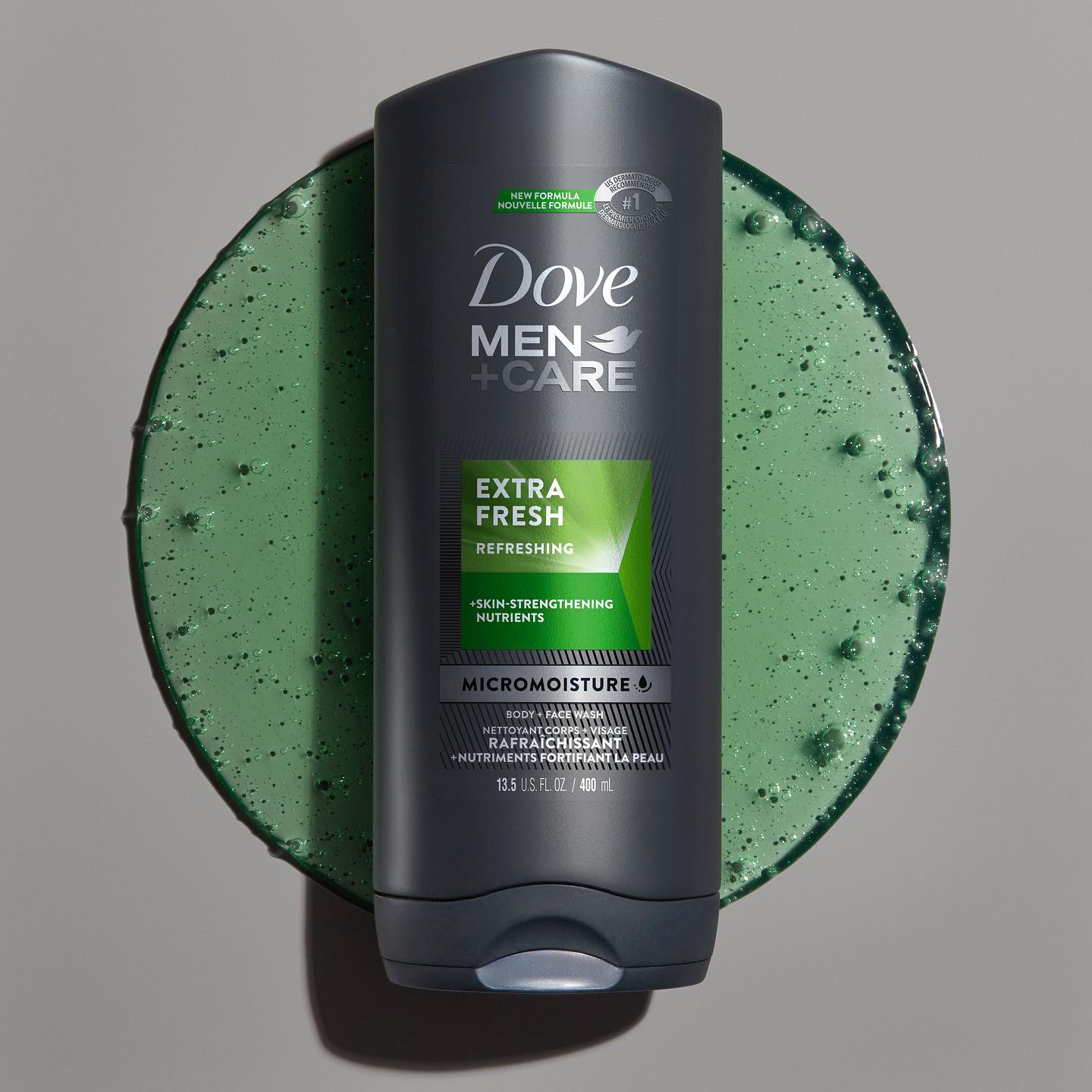
Both Dove and forceMAJEURE also realized that the simplicity they had cultivated with the original design could be complemented with more color and evocative descriptions like “hydrating” and “refreshing,” as well as adding call-outs on “skin-strengthening nutrients.” These additions made a quantifiable difference: The new design bested its predecessor in communicating all 12 top purchase-driving attributes in its category. When asked to choose which design best communicated “leaves skin moisturized,” for example, consumers strongly favored the new design over the old (75% vs. 25%, respectively). The new design also improved in “helps me feel fresh” (62% vs 35%).1
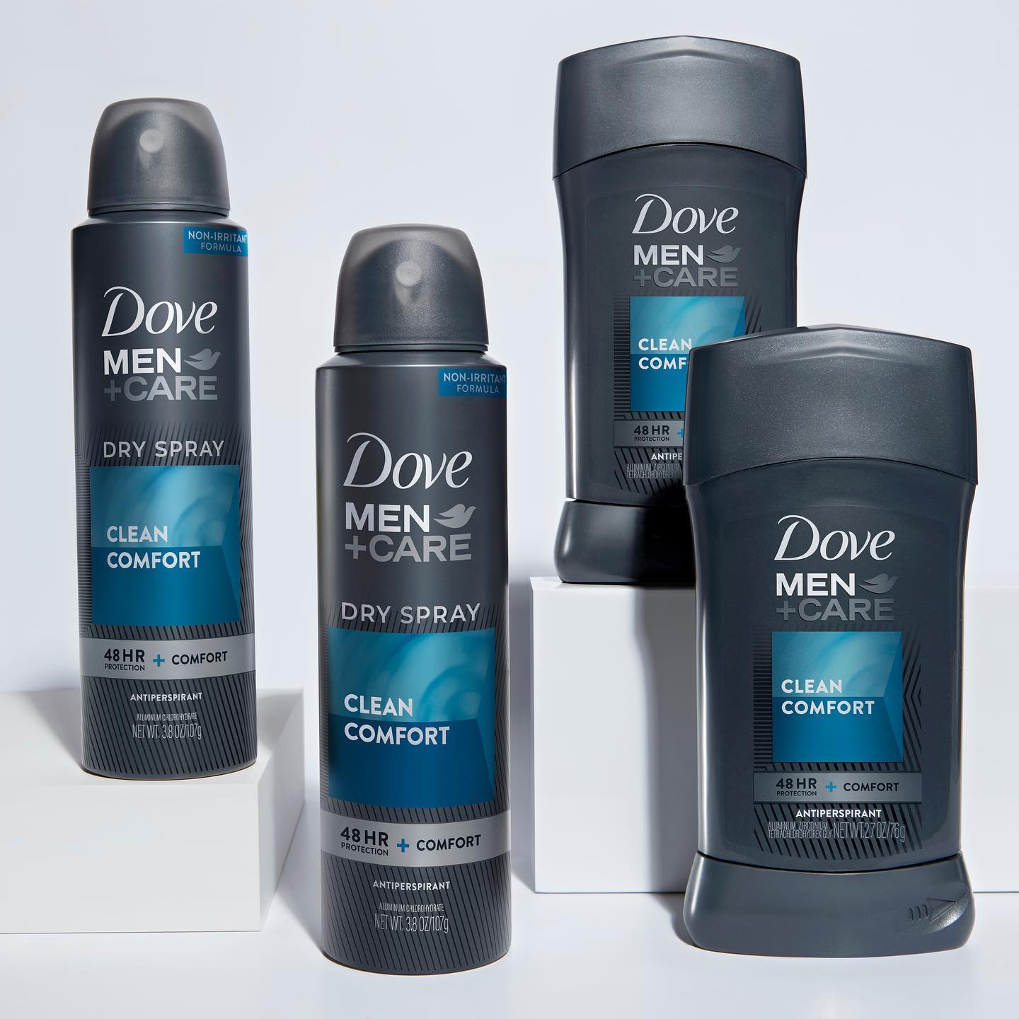
The deodorants adopted a similar aesthetic, adding a “new formula” claim and highlighting the benefits and sensory appeal of each variant. “We were trying to build the portfolio so that the box for each variant had a unique sensory story to tell,” said Mak.
In the case of the body washes, there was a clear effort to remind consumers of the trust the brand had earned. The “new formula” language was paired with a “#1 dermatologist recommended” claim, showcasing that it was still preferred by the experts.
“Fine-tuning was also a very important part of this process,” said Hainaut. “In this age of digital media, it’s easy to forget that these designs are printed on the package, so it needs to maintain that emotional connection not only on the store shelf but in the shower or in your bathroom cabinet. It’s important to make small refinements throughout.”
The approach worked. In Designalytics’ analysis of the new and old designs, 62% of category buyers preferred to purchase the new design over the previous version—a significant improvement for a brand whose original design was already best-in-class. During the 26 weeks following the new design's launch, sales increased by 17% compared to the same period during the prior year.2
During the 26 weeks following the new design's launch, sales increased by 17% compared to the same period during the prior year.
“I think that we struck the right balance with the new design. It allowed us to appeal to our current base of consumers while also captivating new ones,” said Gil. “And that’s magic."
1 These percentages do not add up to 100% because the small percentage of consumers who equivocated when choosing between the two options are not included here.
2 Nielsen xAOC, latest 26 weeks ending 12/12/20 vs. year ago.