In the consumer-packaged-goods (CPG) world, getting attention is arguably the most important "job" of package design; after all, consumers can't purchase products they don't notice. We’re always told not to judge a book by its cover, but consumers like to throw those words of advice straight out the window when it comes to the packages they’re plucking off the shelf. Judging a product based on its taste or functional benefits comes later, after the product has been purchased—but judging based on looks is fairly unavoidable when deciding which product to purchase in the first place.
So how do you make your product pop in a competitive context? Here are five strategies that have consistently proven successful at grabbing consumers' attention, based on the hundreds of package designs we've tested to date across CPG categories.* (These insights are included in our recent report, 16 Ways to Win With Design.)
-
Deviate from your category's norms.
This principle is fairly intuitive—products that differ in some marked way from the majority of their competitors will tend to stand out. There are many ways to accomplish this—picking an unusual color, novel package shape, larger package size, or a markedly different personality or design approach (e.g., going vintage in a category dominated by modern aesthetics, etc.). For example, fa!rlife is the top-performing package in the milk category for attention-getting power. It manages to adhere to category color cues for reduced-fat-milk (i.e., blue), but adopts an unusual medium-blue background and a slightly unique package format to help it stand out from the pack.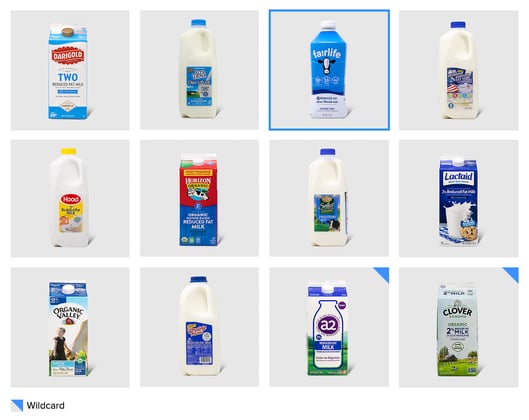
-
Use high contrast within your own design.
Just as contrasting with competitors' designs can capture attention, so too can employing high levels of contrast within an individual package design. In the refrigerated lunch/snack kits category, two up-and-coming brands score very differently on attention-getting power; Applegate Naturals, with its transparent packaging and relatively tame color scheme is among the bottom-ranked brands for attention-getting power, while Cracker Barrel ranks number one on this metric thanks to its bold black-and-yellow color scheme. Interestingly, Cracker Barrel makes use of the product within (i.e., bright yellow cheese slices) to amplify its color scheme.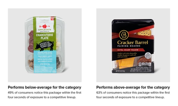
-
Employ visual symmetry.
Countless academic studies have validated that symmetry holds a certain appeal to the human eye—in nature, in faces, in architecture, and so on. In addition to being attractive, symmetry has attention-getting power, at least in the context of package design. In the flavored-malt-beverages category, the three top-performing designs on this metric all have well-balanced, symmetrical compositions, while many of the designs that perform average or below-average utilize asymmetrical compositions.

-
Go for distinct geometric shapes.
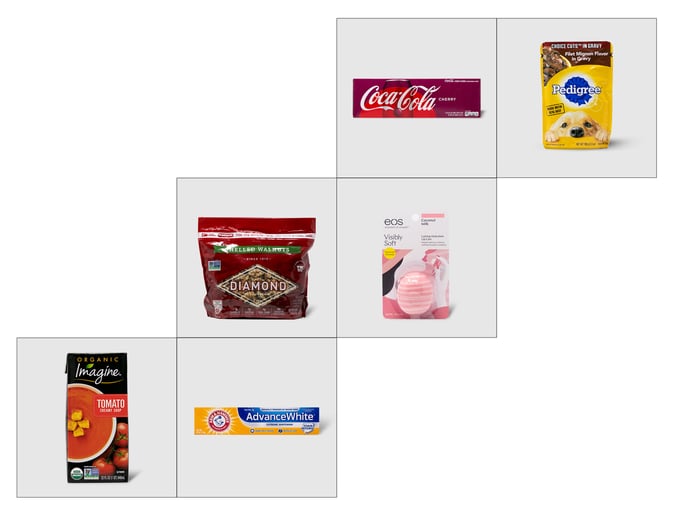
Fun fact: circles are particularly effective at drawing consumers’ eyes, as are other basic geometric shapes. In the context of package design, shapes needn’t be perfect or completeto attract attention; take Imagine’s partial soup bowl, Pedigree's scalloped blue ribbon, or eos' signature oval chapstick. All the packages below rank number-one in their respective categories for attention-getting power. The common thread? The inclusion of prominent geometric shapes.
-
Go big.
Intuition suggests it, and data confirms it: packages that take up more space also claim more attention initially. For example, in the adult multivitamin category, all boxed products with an extra top panel perform above-average on attention-getting power.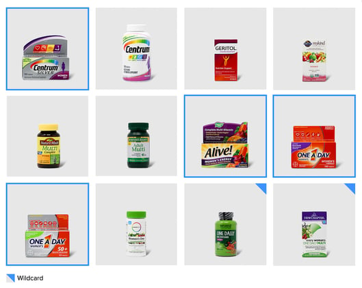
With so many products vying for consumer attention these days, standing out from the pack can be challenging—but utterly critical for securing a spot in consumers' limited consideration sets. The strategies outlined above have consistently helped brands to boost their standout performance; however, standout success depends largely on the category and competitive context, and it can be difficult to predict how a particular design will fare with consumers. For brands considering a redesign to boost visibility, be sure to begin with a data-driven assessment of the category.
Want to read the full report with tips for improving on several design performance measures? Download it here.
*The principles shared here are based on the hundreds of package designs that Designalytics has tested to date. However, none of these principles always holds true. As all designers know, there are no universal rules for developing effective designs. Design success depends heavily on the specific category and competitive context, as well as a particular brand’s positioning and design objectives.

