 Brand: Goslings
Manufacturer: Gosling Brothers
Agency: Klim Design
Raise your hand if you’ve ever had a Dark n’ Stormy cocktail.
If so, you know Goslings, the 200-plus-year-old, family-owned beverage brand from Bermuda. Its legendary Black Seal rum is a requisite ingredient in that drink with island roots–legally, in fact. In 1991, the company obtained a trademark stating that any cocktail with that name must be made with Goslings Black Seal rum and ginger beer.
For a long time, though, Goslings didn’t make ginger beer. “We never included a specific ginger beer for the Dark n’ Stormy recipe, because we never made one ourselves,” said Malcolm Gosling Sr., CEO and the seventh member of the clan to helm the company. That changed in 2009, when its distribution arrangement with another ginger beer came to an end, leaving the brand with an opportunity to create their own. “It just made sense for us,” he said.
The opportunity, however, required acting quickly—so Goslings decided to keep the package design for its new beverage (called Goslings Stormy Ginger Beer) in house… quite literally. “My wife Caroline is quite artistic,” Gosling Sr. said. “So she actually illustrated what’s on the original package.”
As impressive a job as Caroline did on the original package design, Gosling Sr. always had an eye toward changing it—especially since the process was somewhat rushed the first time around. There were other reasons for doing so too: an incipient wave of competition. The ginger beer space has been growing in recent years, and that growth is expected to continue. As of this year, the industry is valued at around $4.7 billion, and it is slated to reach $9.3 billion by 2032, according to Future Market Insights.
While competitive pressures were a factor, Gosling Sr. noted that the ultimate impetus for the redesign was sustainability. The plastic rings that Goslings used for its six packs were bad for the environment and wildlife, and Gosling Sr. and his son, Malcolm Gosling Jr., decided the company needed a change. ”In Bermuda, we can see firsthand the negative impact the plastic rings have,” said Gosling Sr. “We just realized: We can’t stay in the rings. It’s irresponsible. There was no way we could continue with those.”
“We just realized: We can’t stay in the rings. It’s irresponsible. There was no way we could continue with those.”
With that decision made, a heavier one awaited: How should Goslings, with centuries of history, balance protecting its status as a historic brand and a pioneer in the ginger beer space with a need for more modern packaging?
The shifting dynamics of the market constituted a key part of the creative brief. When Goslings Stormy Ginger Beer first launched, the brand focused primarily on distribution to bars and restaurants (to whom the brand was most familiar, given Black Seal rum’s popularity on-premise) rather than in stores. As ginger beer became more popular, that changed; today, about 70% of the brand’s sales come from retail stores. “We've gotten into these big box stores like Walmart and CVS and Rite Aid,” said Gosling Jr. “And you're seeing a lot of people just drink it by itself, rather than as a cocktail mixer.”
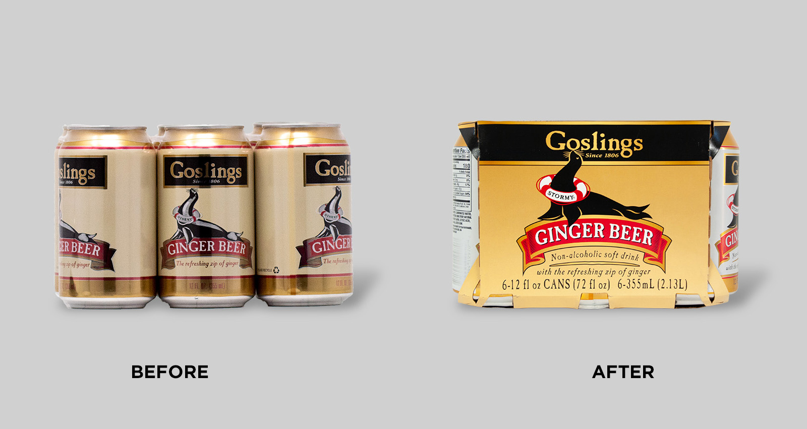
The brief also highlighted a need to maintain the equities of the brand itself: the signature gold, red, and black colors, as well as the playful seal and the life-preserver with his name (“Stormy”) emblazoned on it. This would preserve key distinctive assets, and help to avoid confusion among current consumers. “A lot of times when a brand changes its packaging, consumers assume you've changed the product inside, which wasn’t the case here,” said Gosling Sr. “And I’m very much of the mind that you don’t change a winning game. So we mostly just highlighted and perfected what was already there, keeping our design fresh.”
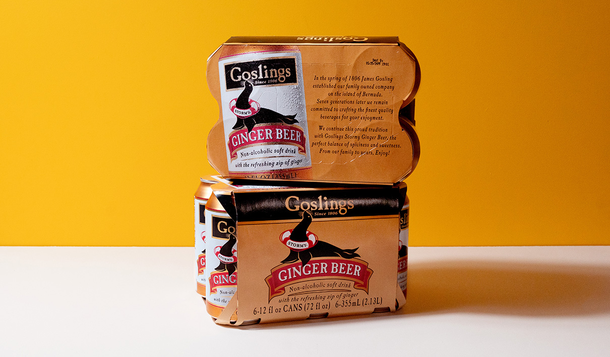
To help revitalize the design, Goslings turned to Connecticut-based Klim Design, a firm with experience working on high-end beverage brands. It became clear early in the process that a cardboard container for the cans would be a much more responsible and sustainable approach for packaging that could also serve another purpose: improving standout and communication. The cardboard container offered considerably more “canvas” with which to grab attention and tell the story of the brand.
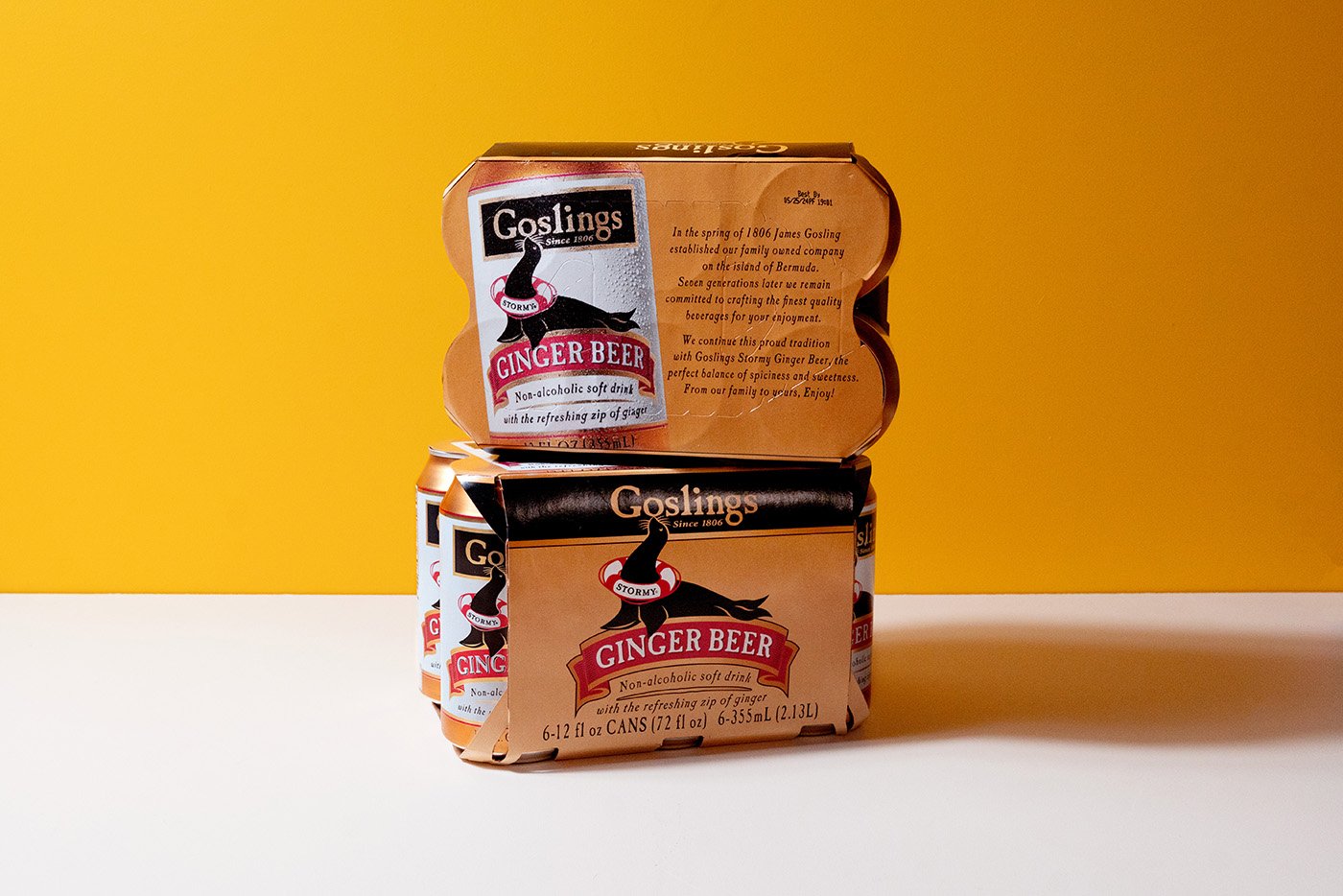
“With this new package, we realized we had an opportunity to expand our brand’s impact on the shelf,” Gosling Sr. said. The top of the new six-pack holder also gave them the opportunity to tell the story of Goslings. “We are the oldest existing business in Bermuda,” he said. “Still 100% family owned, too. This new packaging could allow us to share our history, which is an important part of our brand.”
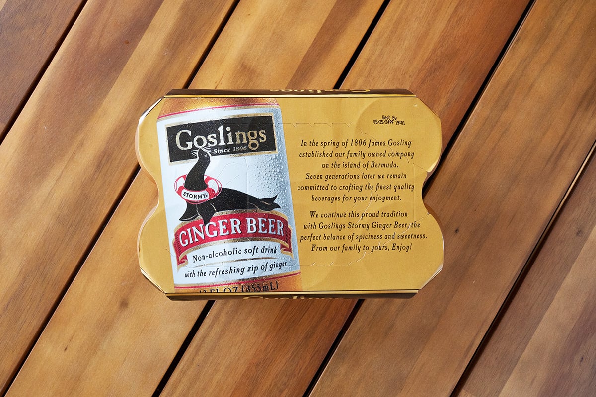
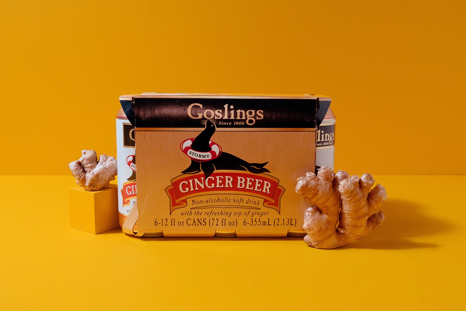
As stewards of a family business that dates back to 1806, the Gosling family was hoping the redesign would reinvigorate the brand while maintaining its spirit—and the results impressed them. “First, we accomplished our main goal: there are no more plastic rings in our inventory,” Gosling, Sr. said. “But while solving that sustainability issue, we now had a whole ‘billboard’ to allow the product to stand out on the shelf. With the cans, you never knew how they were going to be facing. It was very inconsistent. With the cardboard packaging, it’s naturally going to be placed on the shelf in a way that allows us to capture attention for the product and tell the Goslings story better.”
“While solving that sustainability issue, we now had a whole ‘billboard’ to allow the product to stand out on the shelf.”
Goslings also made a small tweak to the design to address a misconception among some potential consumers. Because “beer” was in the name (and perhaps because Goslings' reputation blossomed in bars and restaurants), the ginger beer was perceived to be an alcoholic drink by some consumers. The brand realized it could help educate would-be buyers by adding a simple message to the packaging: non-alcoholic soft drink. “We wanted to reinforce that this is not a traditional ‘beer’ and it can be enjoyed anytime,” said Gosling, Jr.
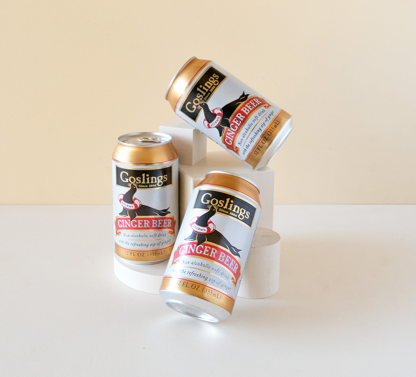
In addition to these practical improvements, the brand’s new design made simple but powerful aesthetic changes. The team didn’t alter the logo or images in any major way; they simply made each more colorful and clear. The gold is now more vibrant, the reds richer, the blacks deeper, and each, by virtue of its vitality, increases contrast with the others. The result? The package is snappier and more noticable, and it underscores the brand’s premium stature.
“The new design just makes everything ‘pop’ more—from the metallic gold to the depiction of Stormy the Seal” said Gosling, Jr. “Before, it could be hard to figure out what was around his neck, and now it’s perfectly clear that it’s a life preserver.”
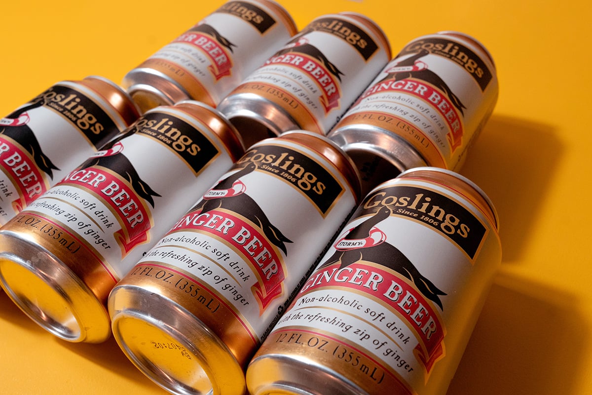
The input from outside the organization only served to support the Goslings’ conclusions: This was a winning redesign. “It was insane how many people—from friends to customers—were texting me pictures of the new design in stores, and going on and on about how good it looks,” Gosling, Jr. remarked. “And so I wasn't too surprised when I saw the results from Designalytics’ consumer testing.”
Those results? A striking 71% of category buyers preferred to purchase the new design over the previous version. During the 26 weeks following the new design's launch, sales increased by 6% compared to the same period during the prior year.1
During the 26 weeks following the new design's launch, sales increased by 6% compared to the same period during the prior year.
Improvements in the sustainability of packaging is an obligation many conscientious brands undertake, but as Goslings proved, it can also be an opportunity. Creatively applied, these changes—such as the “billboard” the brand utilized to amplify its brand and its story—can actually help brands grow.

