These days, it seems like there’s always a new emerging trend in CPG package design. Brand storytelling. Cause-driven packaging. Minimalism. Retro designs. It goes on.
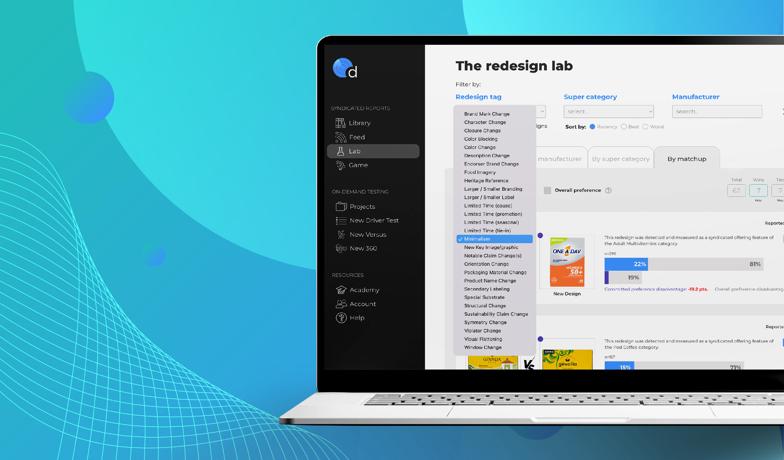
It can be hard to keep up. It’s even more difficult to decide whether to follow (or set) a design trend… and if so, how to execute such a change. Of course, this ultimately depends on your brand, but the key questions are easily answered with our first-of-its-kind design measurement platform, Designalytics Edge.
There are two questions in particular any brand that is considering a design trend should ask, starting with:
How are consumers responding to the trend?
There’s often a flawed assumption built into the follow-or-don’t-follow conundrum: If so many brands are doing it—and winning awards as well as generating buzz in the industry—we must be missing out on a good thing. In fact, it’s often not a good thing, and many brands find that out the hard way when they launch a trend-following design and then watch sales dip.
With Designalytics Edge, you can immediately see what percentage of trendy redesigns were actually successful and hear directly from consumers about the reasons why. As an example, let’s take a look at one of the most popular trends in recent years: minimalism.
Of the dozens of minimalist redesigns we’ve tested, a vast majority lost ground compared to the previous design, and few bested the prior version (as measured by committed purchase preference of consumers). This is striking, especially considering how prevalent this movement has been in the CPG design space. Of course, this doesn’t mean that minimalism can’t be done well—it definitely can—but poor performance like this can have a real impact on a brand’s bottom line, so it’s important to be wary.
Here’s one of the minimalist redesigns that didn’t resonate with consumers: Late July multigrain sweet potato tortilla chips. The brand’s latest redesign was cleaner and simpler and, in our testing with more than 200 consumers, some did choose the new look because it was “less busy” and “less cluttered.”
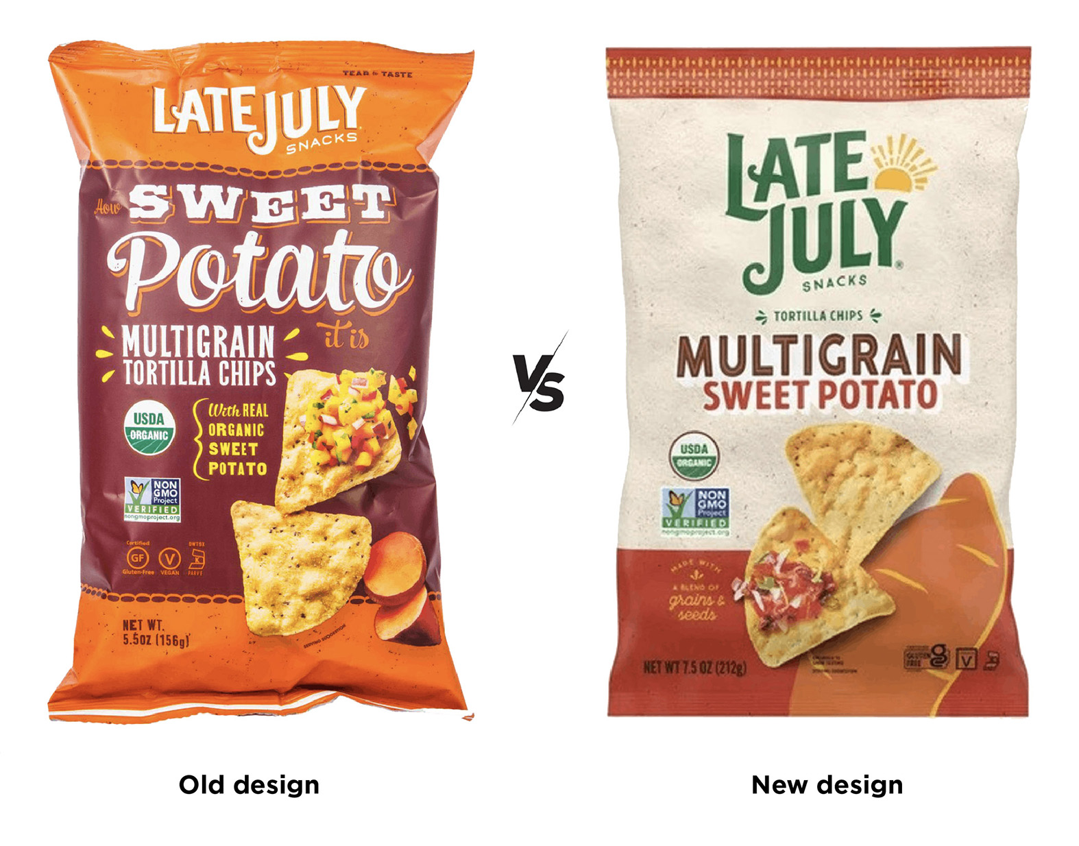
These were in the minority, though. The previous design was clearly preferred overall, as it bested the new in committed purchase preference (the metric most closely aligned with sales outcomes) by a wide margin.
A deeper dive within Designalytics Edge shows some reasons why: consumers preferred the old design on the basis of overall aesthetics, appetite appeal, standout, and more. One consumer described the previous design as “perfect,” saying it looked “vibrant, delicious, and ready to buy.” That version may have been busier, but the extra elements added to the design’s effectiveness. Ditching these elements seems to have weakened the package overall.
Redesigns like Late July’s happen regularly because brands often see existing designs as “too busy” and without a clear hierarchy of communication. It seems like simplifying would clarify and strengthen the package design–and seeing so many minimalist designs winning awards does nothing to disabuse brand managers of that notion.
In fact, consumers rarely express a preference for a clean, simple design because it is clean and simple—when asked why they chose a redesign with more (or less) white space, only a small percentage cite aesthetics as a reason, according to our data. Designers often love these clean designs but, as it turns out, consumers rarely do (or at least, not for the same reasons).
This is barely scratching the surface—there are dozens of other case studies available to Designalytics Edge members that provide data-centered evidence and consumer responses. Because if your brand does decide to make a change like this, the design choices you make will be pivotal and such insights can be invaluable. Which brings us to the next question…
Which brands are executing trends well, and what are they doing right?
If you want to be successful with a trendy new design, it makes sense to learn from brands that have done it well before you.
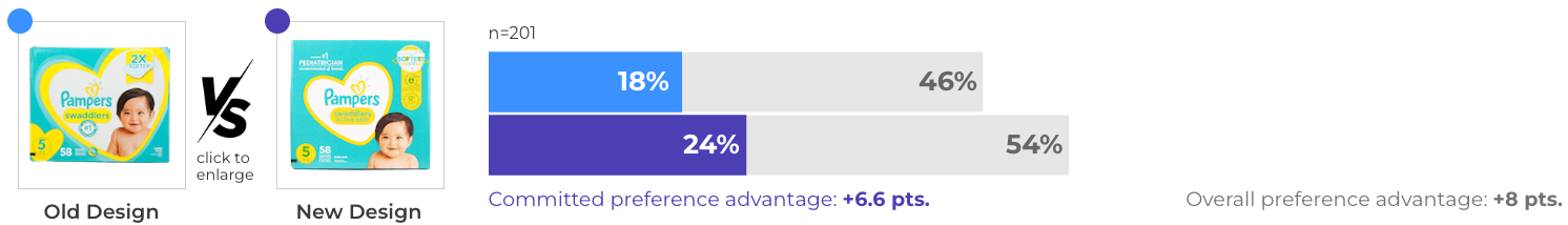
Consider Pampers. The brand undertook a redesign for their popular “swaddlers” product, and clearly understood the value that minimalism—when executed well—can have.
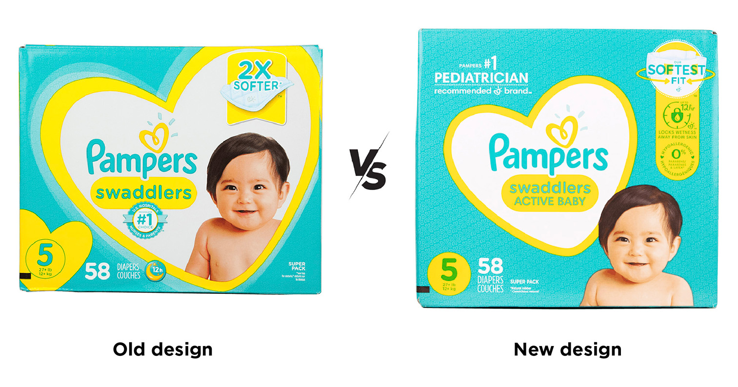
The new design features the same adorable baby and signature heart assets for which the brand is known; it just communicates much more to consumers. By reducing the size of the heart in the center of the package, Pampers’ new design has a cleaner look. But it also opens up real estate to make important claims, such as highlighting its 12-hour protection and the fact that the diapers are hypoallergenic.
The extra space also allowed the brand to make its most important claim “#1 Pediatrician recommended” much more prominent, and the redesign allowed them to turn a vague reference to softness (“2x softer”) into a superlative (“Softest fit”). One consumer was very clear: “Softest fit is what I would be looking for in a diaper product, as well as the fact that it is recommended by pediatricians.”
Overall, these changes resulted in a more than five-point increase in committed purchase preference compared to the previous design, which bodes well for Pampers since it is our most predictive metric for in-market success.
Another chip brand, PopChips, actually went in the other direction… and to advantageous effect. The brand’s erstwhile look was simple, before PopChips purposefully added more design elements to its package in a subversion of minimalism that has become its own trend: maximalism.
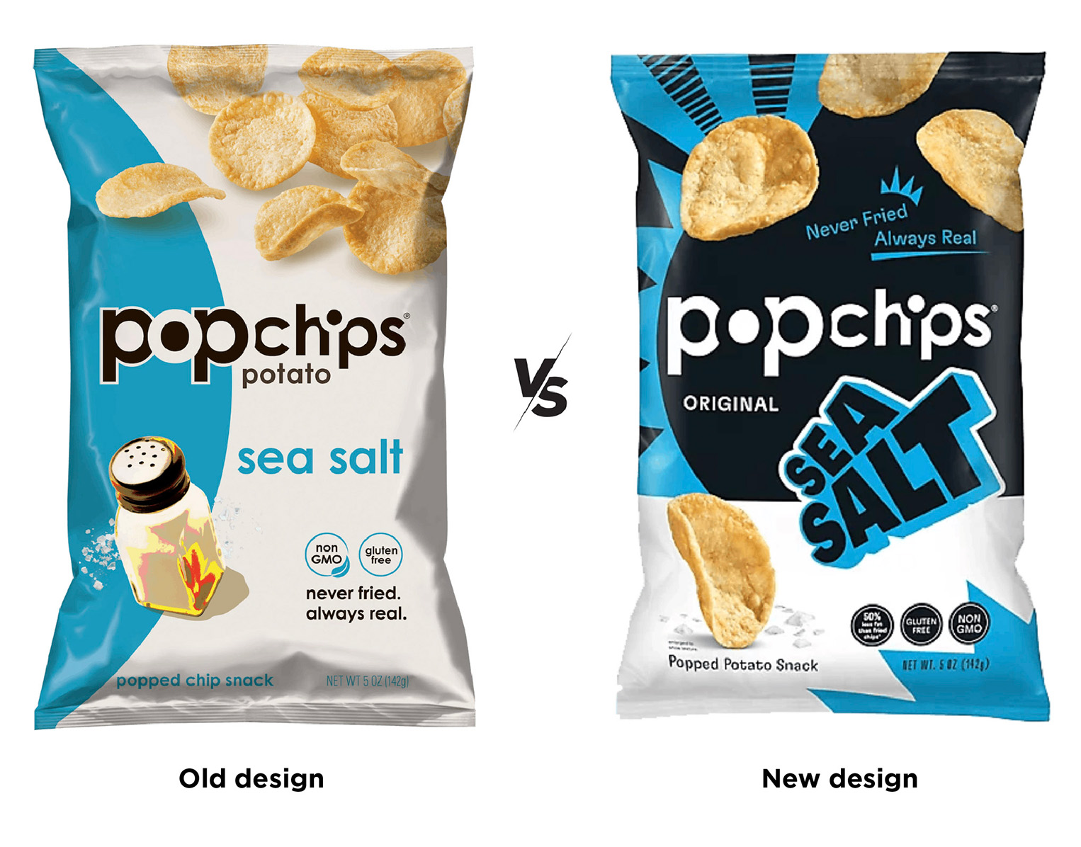
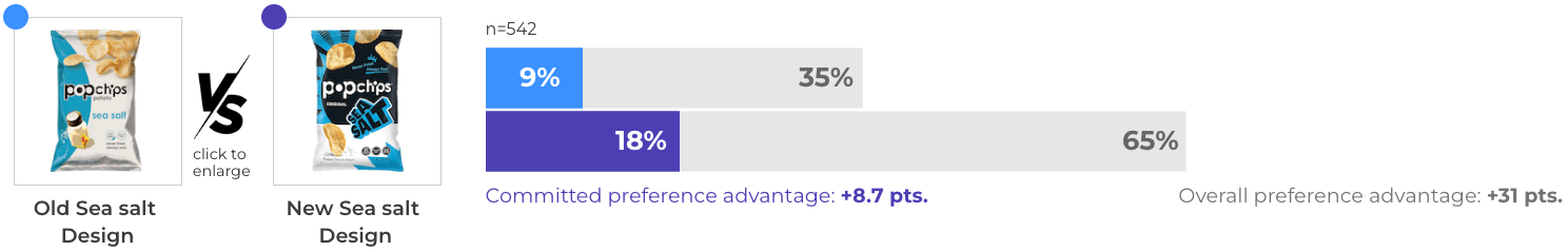
Consumers called it “a more exciting design,” and said “the boldness caught my attention” and “it seems more fun.” As it turned out, the redesign outperformed its predecessor by nearly nine points in committed purchase preference, which bodes very well for an increase in sales. Which goes to show that for some brands, going against the prevailing trends might be a better choice.
Minimalism is just one example of many such en-vogue design movements. The truth is that bold, on-trend redesigns capture attention in CPG. They are lauded and shared in the industry echo chamber, and can create a self-reinforcing impression that a design is strong. But the market follows what consumers want, not what brands may think of as the next big trend.
In these cases, Designalytics Edge offers a reality check. It provides instant access to data on how these trend-driven designs actually performed with consumers, along with their responses to help illuminate the "why" behind their choices. Our members are uniquely positioned to spot trends, analyze their effectiveness, and decide which approach might be best for their brand.


