 Brand: Icelandic Provisions
Manufacturer: Icelandic Provisions
Agency: Turner Duckworth
When it comes to consumer trends, few food categories have proven more capricious than yogurt. The various permutations of this nutritious nosh—ranging from protein-rich Greek yogurts and plant-based alternatives to more indulgent dessert substitutes—have been stirred up countless times in recent decades. The parade of new products is never-ending, despite the fact that sales have remained static for the past few years. (Non-dairy offerings, Icelandic styles, and shakes are currently in vogue, according to McKinsey & Company.1) In a fast-evolving category with more competition fighting for the same sales, how can a brand hope to nourish its bottom line?
That’s the question Icelandic Provisions was grappling with in 2020. This purveyor of premium Skyr—thick, creamy, mild-flavored yogurt hailing from Iceland—had developed a strong following over the past several years, but needed a way to bring more consumers into the brand. “Once consumers try our product, they love it and come back for more—so awareness was our biggest issue and opportunity. We needed to pop on the shelf,” said Dan Hickle, chief marketing officer at Icelandic Provisions.
Given that Icelandic Provisions’ product is nutritionally virtuous—high protein, low sugar, no artificial ingredients—it’s tempting to use these attributes as the strategic foundation for a stand-out redesign. The problem? Many of these features are table-stakes in the yogurt aisle. “So many of our competitors were focused on specific claims. We asked ourselves, ‘How can we stand for something more?’” said Hickle.
“So many of our competitors were focused on specific claims. We asked ourselves, ‘How can we stand for something more?’”
That “more” turned out to be the brand’s authentic, Icelandic heritage and premium-quality product. A dramatic design change would be required to communicate these concepts effectively—a “risk” the team embraced with aplomb. “We were excited about the opportunity to really capture the spirit of Iceland, and we knew it’d be a challenge to do that with an evolutionary redesign. We needed something disruptive,” explained Hickle.
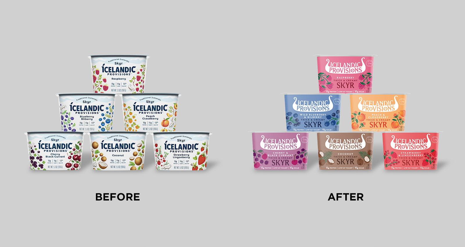
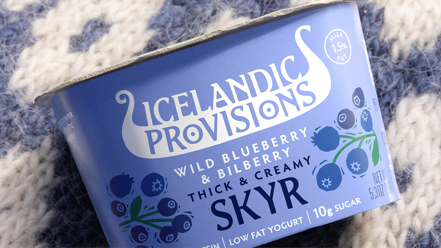
The first order of business? Ensure consumers are referring to the brand accurately. The brand’s prior design emphasized “Icelandic”—a style of yogurt not unique to the brand—and downplayed “Provisions,” the more ownable part of the name. The new brandmark corrected for this imbalance, and conveyed additional benefits in the process: “‘Provisions’ really speaks to the product promise—that this is something essential and good for you,” said Hickle.
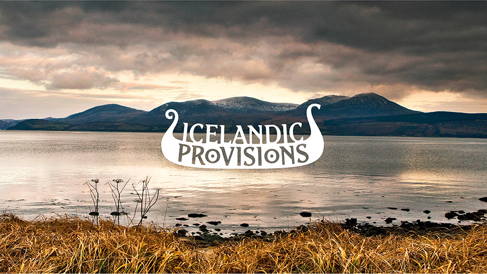
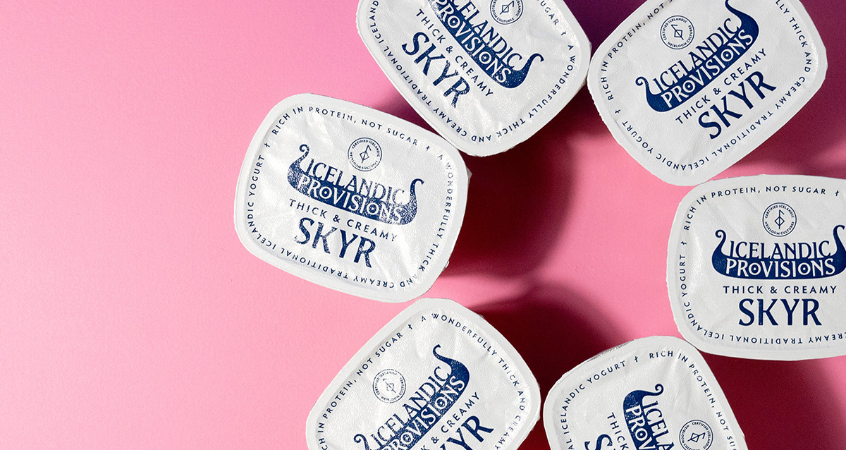
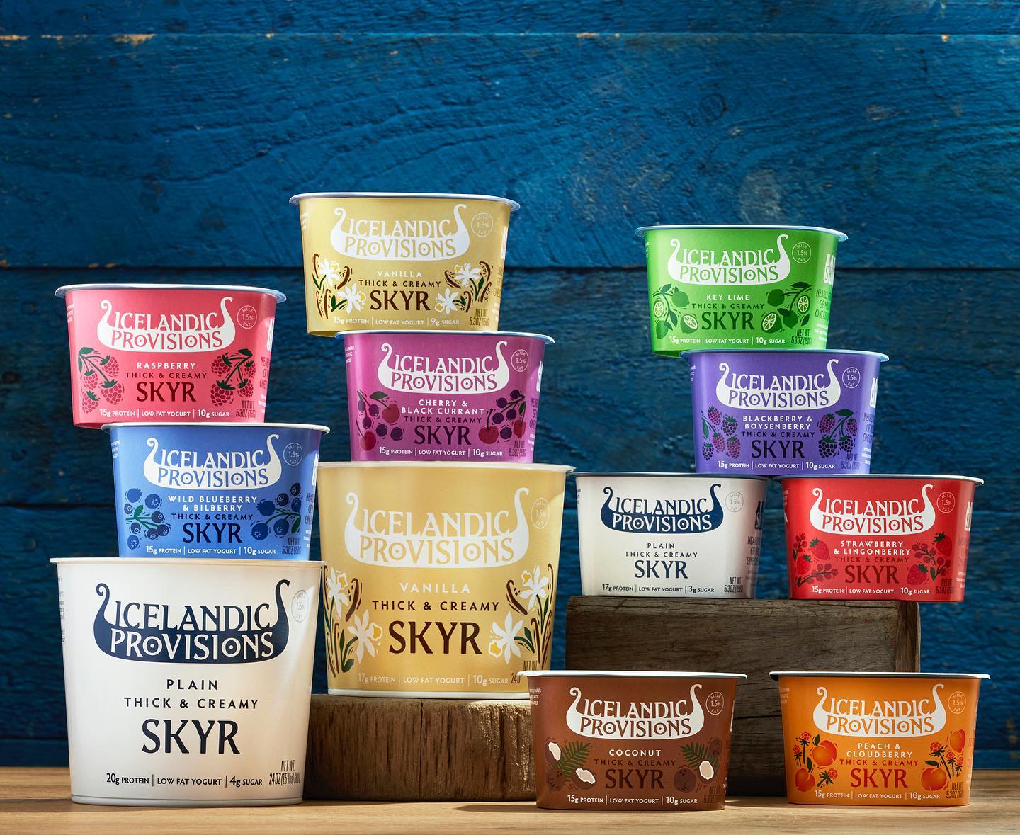
The completely reimagined logo goes beyond upsized “Provisions,” incorporating a monotone illustration of a Viking longboat—a visual that resonated as authentically Icelandic to surveyed consumers. “There's only so much heavy-lifting a wordmark can do, and a symbol has other benefits. The brain registers colors and shapes before it reads words,” said Matt Lurcock, creative director at Turner Duckworth, the London-based agency who led the redesign. “The beauty of the mark is that it created a very distinctive anchor point that offers impact at the shelf, but also works well in other contexts,” he added.
The whimsical brandmark is chock full of Easter eggs, too. The hull of the ship is packed with “Provisions”; “Icelandic” sits on top, where Viking settlers would’ve been located on their voyage; the taller side of the boat forms a dragon’s head—a common embellishment on Viking vessels; the “O’s” represent Viking shields hung from the side of the ship; and the bespoke typeface was inspired by runes, traditional Icelandic letterforms.
Leaning further into its Icelandic roots, the new design scales up “Skyr,” which the lid describes as “a wonderfully thick and creamy traditional Icelandic yogurt” for the benefit of the uninitiated. “We’re the only brand in the United States that uses an heirloom Icelandic Skyr culture. That's an important point of difference for us, and we're proud of it,” said Hickle.
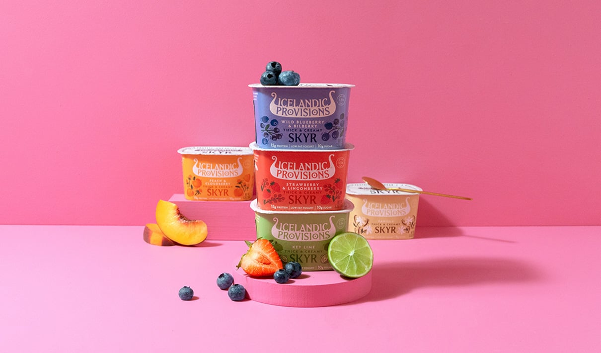
Perhaps the most striking aspect of the new design is the brand’s bold use of color, where each flavor variant features a different hue. The result is a color riot in a category where white reigns supreme. Not only is this pleasing palette grabbing more attention at the shelf, it’s also encouraging more sharing in the digital sphere. “We’re seeing so many more consumers post user-generated content with this new packaging design than we saw previously,” remarked Hickle.
“We’re seeing so many more consumers post user-generated content with this new packaging design than we saw previously.”
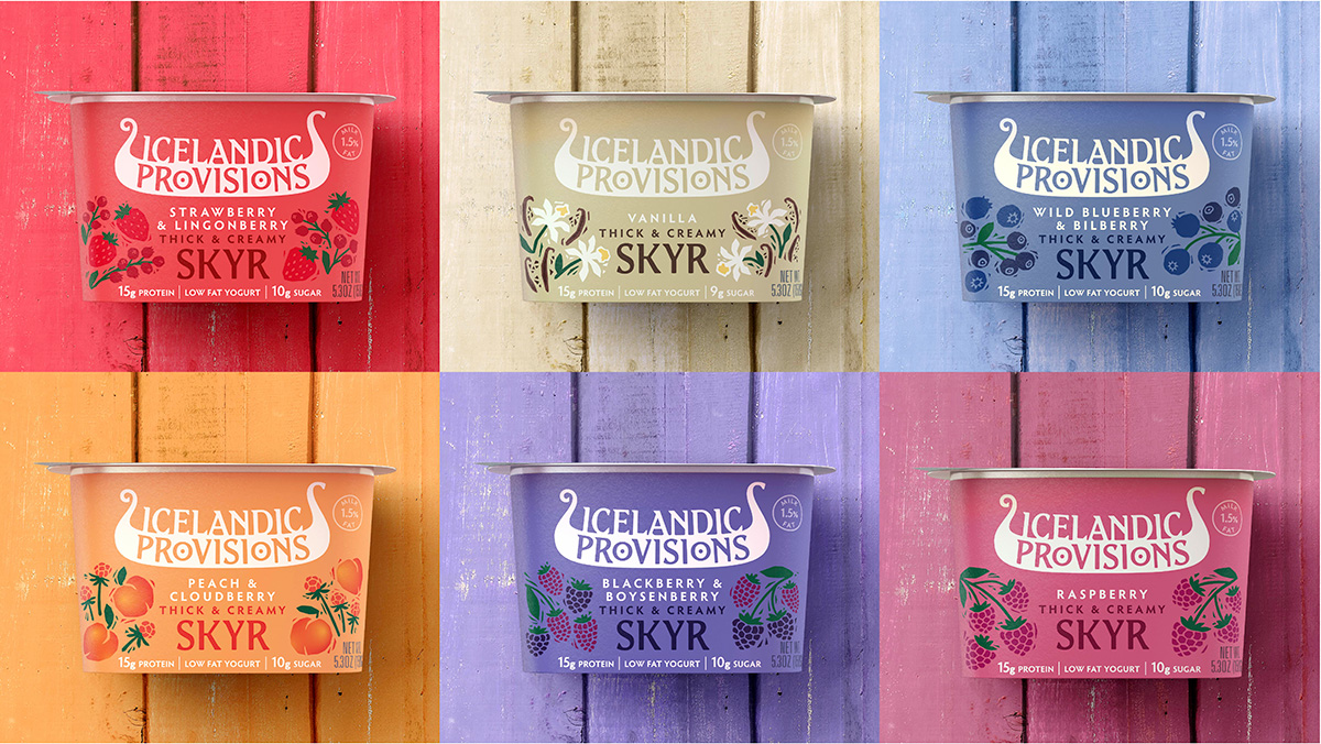
Utilizing a different color for each variant has the added benefit of communicating the flavor variety without needing to rely so heavily on ingredient imagery. “This goes back to a more primitive process, when humans were scanning an environment and color signaled food. I think humans haven't necessarily outgrown that; it’s why the produce section looks so appealing, and why it’s always at the front of a store,” explained Lurcock.
Given that taste appeal is the preeminent purchase driver in nearly every food category, the brand’s decision to continue employing fruit illustrations over more realistic representations could be considered a risky one. The agency, however, viewed it as another path to differentiation. “A lot of competitors fall prey to generic depictions of yogurt on spoons or ingredients scattered about,” said Lurcock. “We saw the flavor imagery as part of the design aesthetic we wanted to create. The woodcut illustration style has a strength-giving quality, and it reflects the handcrafted quality of the product,” he continued.
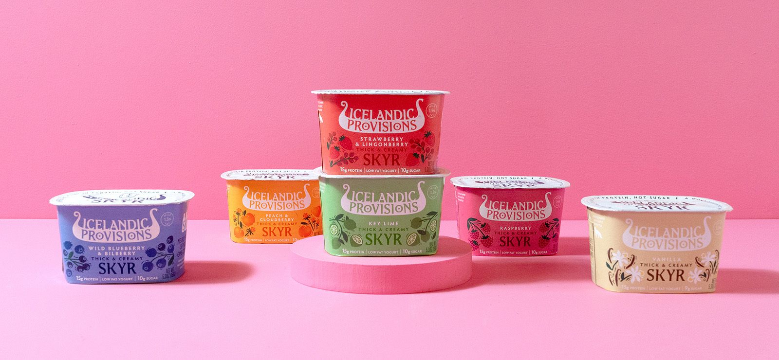
The new design utilizes copy to remind consumers of Icelandic Provisions’ superior taste and texture—”thick and creamy” appears on both the front and top of the package. The combination of vivid, flavor-matched colors and on-point descriptions is serving the brand well; when asked which design best communicates “full-flavored,” category buyers were more likely to select the new packaging, according to research by Designalytics.
When it comes to yogurt shoppers’ priorities, health benefits tend to follow closely on the heels of appetite appeal. Being naturally high in protein and low in sugar, Icelandic Provisions wisely kept its key nutritionals on the front of the package. “They help us reinforce the notion that this is hearty sustenance. If it’s good enough for the Vikings, it’s good enough for you,” quipped Hickle.
In the summer of 2021, Icelandic Provisions launched its new look, eliciting praise from designers and consumers alike. During the six months following, sales grew by 16% compared to the same period the prior year.2
During the six months following, sales grew by 16% compared to the same period the prior year.
The new packaging also garnered rave reviews from retailers. “We've had a lot of success gaining additional distribution and getting retailers excited about our brand since the redesign,” said Hickle. The new design wasn’t just instrumental in expanding the brand’s footprint, though—it also drove more sales at stores that had been carrying Icelandic Provisions’ products prior to the change. Sales per point of distribution grew by 6.4% following the launch.3
When asked to reflect on why this redesign was so successful, Hickle emphasized—in fittingly nautical terms—the importance of a well-defined creative brief. “We had to determine what we wanted our brand to stand for, and how to elevate it beyond attributes and claims. Having that clear North Star was extremely important,” he said.
[The new design] also drove more sales at stores that had been carrying Icelandic Provisions’ products prior to the change. Sales per point of distribution grew by 6.4% following the launch.
Lurcock cited the necessity of clients recognizing just how transformative design can be, and of being willing to rock the boat to achieve greater rewards. “There was no point where we felt handcuffed to something that would prevent us from making the changes necessary for success. That’s not to say you should disrespect where a brand is today—but you should be open-minded about where creativity can take you, and be willing to go on that journey,” he said.
Lurcock’s migrational metaphor feels especially apt for a Viking-inspired brand embarking on a revolutionary redesign, but there are plenty of brands who can benefit from this approach to design: Honor the past—yes—but don’t shy away from a much bolder, more bountiful future.
1 McKinsey & Company, “How to stay cool as competition heats up in ice cream and yogurt,” May 2022.
2 Nielsen xAOC, latest 26 weeks ending 1/22/22 vs. year ago.
2 Nielsen xAOC, latest 13 weeks ending 7/17/21 and 11/6/21. Applies to non-promotional sales.