 Brand: La Mexicana
Manufacturer: Lakeview Farms
Agency: Cornerstone Strategic Branding
Growth is never easy for a consumer-packaged-goods company, and it can be an especially precarious prospect when you’re taking a big leap in distribution. As a regional refrigerated salsa brand looking to launch nationally, La Mexicana was acutely aware of this fact, but believed it could achieve success on a larger scale.
“There's a misconception out there that refrigerated salsa is regional,” said Byard Ebling, vice president of marketing, Dips at Lakeview Farms (which owns La Mexicana). “The truth is: The taste of salsa is actually enjoyed universally, across the country. It's just that nobody had the ability to distribute fresh salsa on a national basis.”
Thanks to its production facilities on both the east and west coasts of the United States, La Mexicana was able to buy fresh produce, process it, and have it in the container within 48 hours. The brand realized, though, that making the jump to national distribution would require a substantial redesign.
The team decided to start at the beginning: with research. “When you’re trying to grow a brand, you want to make sure what you’re doing is heavily researched and based on the consumer,” Ebling commented. “It doesn’t matter what I think. I’m only interpreting what our consumers’ wants and needs are. When you tie into that idea, you’re much more successful.”
The brand included its agency partner, Cornerstone Strategic Branding (CSB), from the outset. “As an agency, it’s vital for us to understand what the consumer is thinking when they're making a purchase,” said Jerry Corcoran, creative director at CSB. “Clearly, taste was the most important attribute—which made sense—and they gravitated toward salsa that seemed ‘authentic’ and was ‘farm-fresh.’” As it happens, the number one driver for refrigerated salsa is “tastes great” and the number two is “tastes fresh,” according to research by Designalytics. La Mexicana was clearly focused on what was most important to consumers.
This was advantageous for La Mexicana, since freshness was their main competitive advantage and the brand’s salsa was rooted in an authentic Mexican recipe. The question remained, though: How could the design generate more awareness among the other salsas in the refrigerated case, including any regional ones with which consumers were likely already familiar?
A potential opportunity emerged from their competitive assessment: Many brands in the refrigerated salsa space emphasized flavor and heat level, with the brand name taking the proverbial back seat. “A lot of salsas at the time were really interchangeable,” said Corcoran. “We wanted more consumers to begin saying: I'm looking for La Mexicana. We wanted to differentiate ourselves from other brands.”
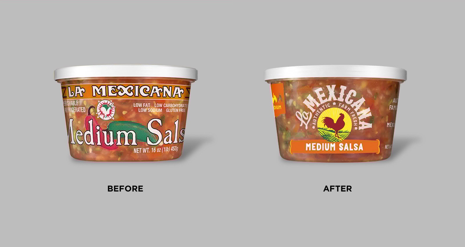
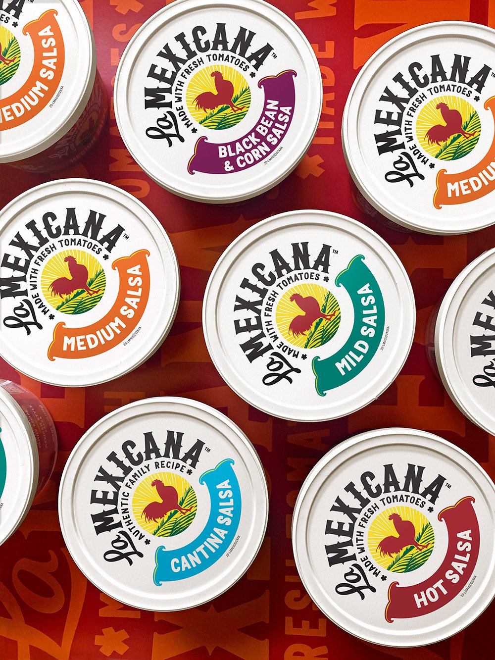
Armed with clear objectives—bolder branding and better communication of "fresh" and "authentic"—the team took a hard look at the existing design. Which elements served these objectives and should be kept, and which could be eliminated? To the brand’s delight, it appeared that there was already an element of their current design that was recognized by consumers: a rooster.
“There was a very clear awareness of the rooster as an iconic symbol,” said Ebling. “People said things like: ‘When I send my husband shopping, I tell him to get the salsa with the rooster on it.’ As a marketer, that's a win. I have a consumer who's laser-focused on getting the product I manufacture.”
"People said things like: ‘When I send my husband shopping, I tell him to get the salsa with the rooster on it.’ As a marketer, that's a win."
There was further proof that the rooster was a distinctive asset, in spite of the fact that it was a relatively small part of the old package. “We asked consumers why they thought the rooster was on the package,” said Corcoran. “Many of them said it was an element found in an authentic Mexican kitchen—there are pictures of roosters or sculptures of roosters. And this was played back to us unprompted.”
The creative team tested 12 different design concepts, a considerably higher number than in a typical redesign. “There was a lot to explore,” said Corcoran. “Unique brand architectures, new logos, letterforms, colors… there were all of these systemic theories to test out. Thank goodness we did the testing beforehand, because we knew where we needed to be. Then, we could just focus on the tactics to get there.”
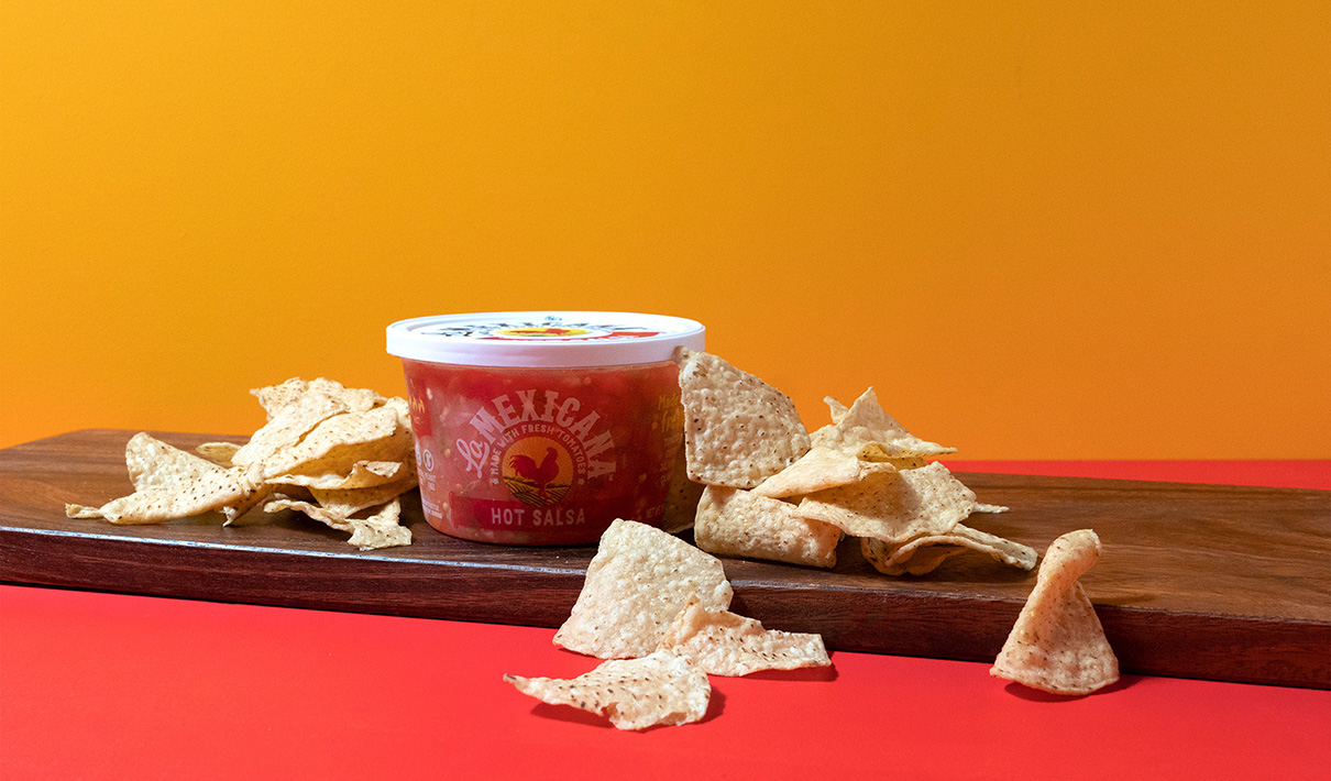
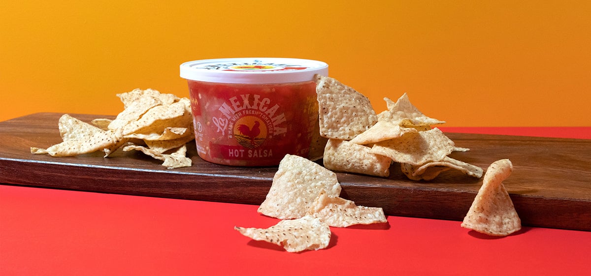
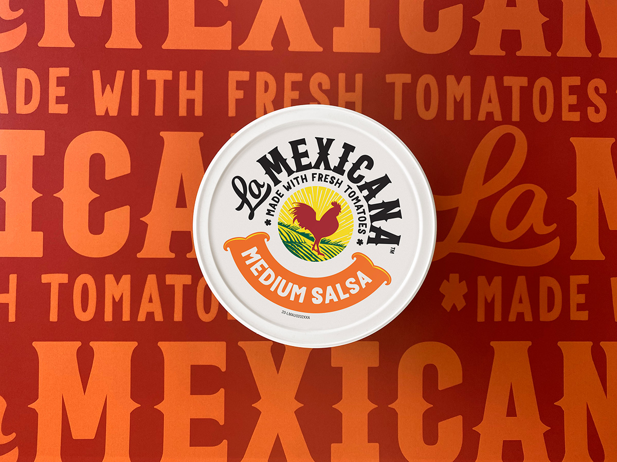
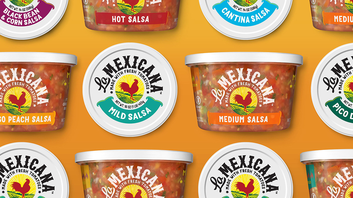
All that research and exploration paid off with the final design route. First job: Making the rooster logo a focal point of the design. The brand increased the size of the bird, added some vibrant color, and placed it at the center of the package. The brand name curved around the logo, and the team experimented with a number of typefaces in order to capture the spirit of a farm market in Mexico.
“We had to tell a big story with the typeface, so we considered every little aspect,” said Corcoran. CSB even reviewed a number of actual Mexican market scenes to see what the signage was like, and this informed their approach. “The script we chose has slight imperfections, lending itself to a more personal touch. But we also really needed something that would be bold and really stand out in that competitive cooler case.”
![]()
The increased prominence of the logo and wordmark left less space for some of the claims featured prominently on the old package. Ebling was just fine with that. “If you look at the old package design, it looks like the side of a NASCAR car,” he joked. “We had all kinds of claims: weight, flavor, no gluten, low fat, low carbs… it's crazy. We needed to cut that down.”
The reasoning? By saying “everything,” the brand was obscuring the one key message consumers were most interested in: That La Mexicana was the best-tasting salsa. “Taste was the vehicle through which we made all the design decisions,” commented Corcoran.
"Taste was the vehicle through which we made all the design decisions."
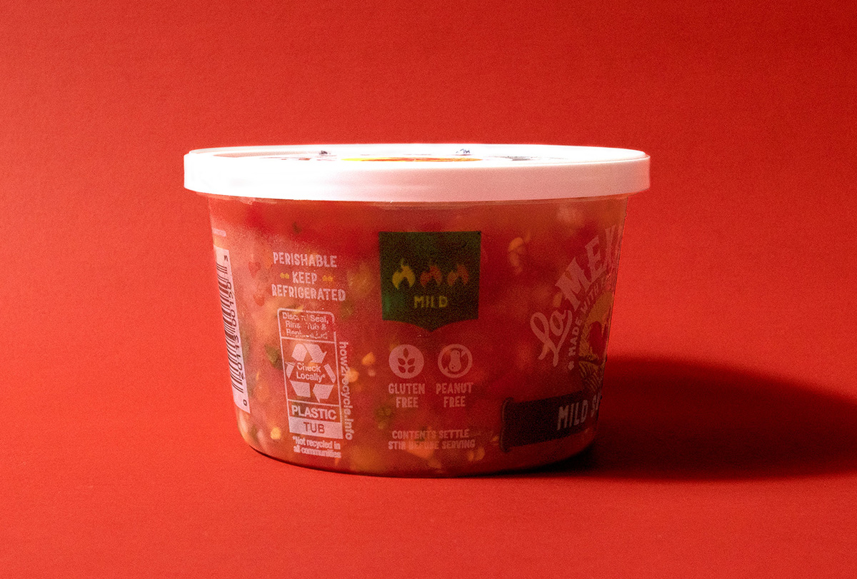
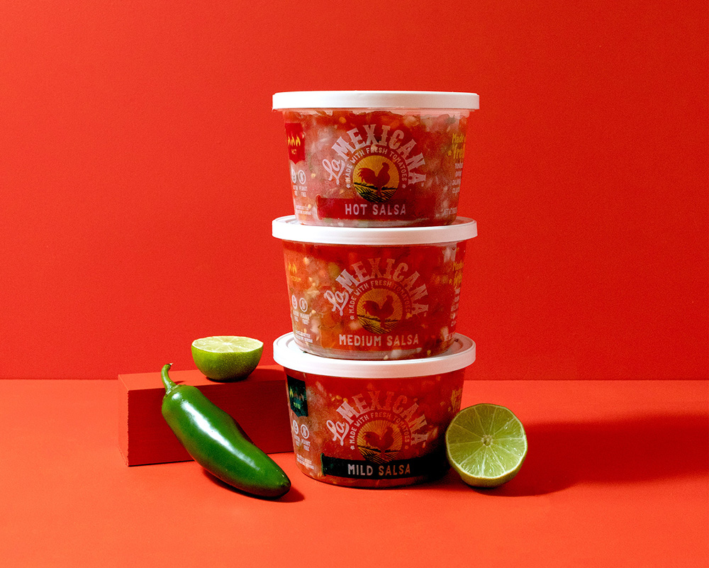
In the new design, everything but the logo, wordmark, flavor designation, and distinguishing attributes—”authentic” and “farm fresh”—were removed from the front of the package. In addition, the flavor/style, which had dominated the face of the package before, was made more colorful but much smaller. Other claims, such as “gluten-free,” were moved to the side of the package or omitted altogether. And even in these secondary spaces, the brand doubled-down on claims related to taste, adding language about the freshness of the ingredients and the authenticity of the recipe.
The side of the package also now showcases a new color-coding system for the heat levels for each of the varieties. Using three flame icons and corresponding colors for mild, medium, and hot, the agency created an architecture that would allow consumers to see how spicy the product would be. “For some flavors like mild, medium, and hot, the heat level is evident,” said Corcoran. “But for varieties like Mango and Cantina, it wasn’t as clear. So we've designed an at-a-glance architecture to help consumers navigate the heat levels of each variety. Plus, it positions the brand well for adding different flavors in the future.”
In deciding which information to emphasize on the package, the brand had to consider all the possible surfaces (top, back, etc.), and what consumers would be likely to see depending on the shelving setup. Unlike in the tortilla-chip aisle, refrigerated salsas have to deal with an orientation question: From which perspective will consumers view the package? “There are stores where consumers are looking at the front of your package—as is the case with most consumer-packaged goods sitting on a shelf—and others where they are looking down at your package in the cooler,” said Ebling. “So the branding had to work both on top and in the front. That's why everything was centered around this rooster icon, and it was the same message.”
The redesign had a profound impact on La Mexicana's sales, halting a decline and returning the brand to growth. During the 26 weeks before the packaging change, sales for La Mexicana had declined by 8% compared to the same period during the prior year. During the 26 weeks following the new design's launch, year-over-year sales increased by 15%.1 The results of a consumer evaluation by Designalytics support this outcome: more category buyers preferred to purchase the new design over the old one. What makes this even more impressive is that over that same period, there was actually a slight decrease in spending on other marketing efforts, meaning the design was the primary growth driver.
During the 26 weeks before the packaging change, sales for La Mexicana had declined by 8% compared to the same period during the prior year. During the 26 weeks following the new design's launch, year-over-year sales increased by 15%.
When asked what he thought was a key to design successes like La Mexicana’s, Corcoran was clear: “I think it’s about understanding the most important thing you want to communicate to your consumer,” he said. “And then the design will tell that story visually. You just need to be very clear on the story you’re telling.”
For Ebling, that all starts with actually listening to the consumer through research. “I go into projects with assumptions just like everyone else. But if the research proves me wrong, I don't care. It's not about me,” he said. “Some marketers conduct research not to find out what the consumer wants, but to defend a position they’ve taken in a meeting. If you approach it that way, you’ll never win.”
“Some marketers conduct research not to find out what the consumer wants, but to defend a position they’ve taken in a meeting. If you approach it that way, you’ll never win.”
1 Nielsen xAOC, latest 104 weeks ending 3/28/20.