 Brand: NadaMoo!
Manufacturer: Little Red Rooster Ice Cream Company d.b.a. NadaMoo!
Agency: Moxie Sozo
Over the past few years, sweet-toothed consumers have undoubtedly noticed some changes in the ice cream aisle—the proliferation of plant-based offerings chief among them. Traditional ice creams have been forced to cede considerable cooler space to their dairy-free counterparts. The sheer variety of vegan ice creams on offer is staggering; bases include soy, coconut milk, cashew milk, oat milk, sunflower seeds, and even avocado—to name just a few. Of course, with innovation comes growth: Sales of plant-based ice cream and frozen novelties grew by 41% from 2018 to 2021.1
That surge represents an opportunity for all contenders—but also significant pressure for an early mover in the category. NadaMoo! is one such brand, having first launched its coconut-milk-based concoctions in 2005. By 2019, the category was packed with competing brands and attracting a steady stream of new consumers, highlighting a need to boost brand awareness. “There was a lot of competition entering the marketplace, and we hadn’t touched our packaging in about five years. We were coming up on our 15-year anniversary, and the timing felt right to refresh the brand and make some changes to our hierarchy of communication,” said Becky Parks, vice president of marketing at NadaMoo!.
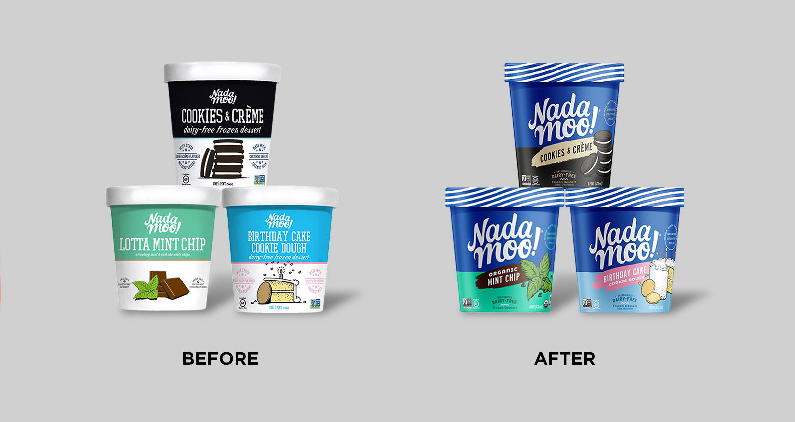
The NadaMoo! team engaged Moxie Sozo, a Boulder-based creative agency, to lead its redesign efforts. When evolving an existing brand, one of the first tasks is to audit that brand’s visual assets. Which elements can be modified or eliminated? Are there any “sacred cows” that should be kept as-is? Logo aside, the answer to this last question was “nada.”
That’s a lot of creative license, and the agency took full advantage. Nate Dyer, senior designer at Moxie Sozo, estimates that the agency developed upwards of eight initial designs. As it happens, the chosen direction—a bold, revolutionary redesign—was the closest-in concept. “The rest were even further out. There was a lot of variation in imagery—photography, different illustration styles—as well as in layout and hierarchy of communication,” said Dyer.
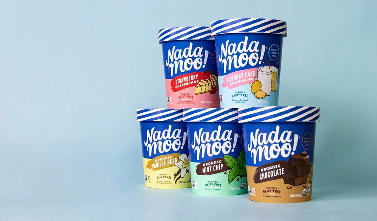
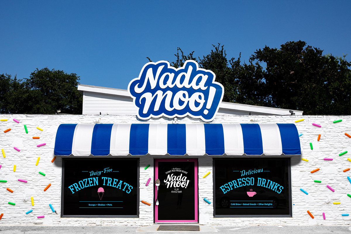
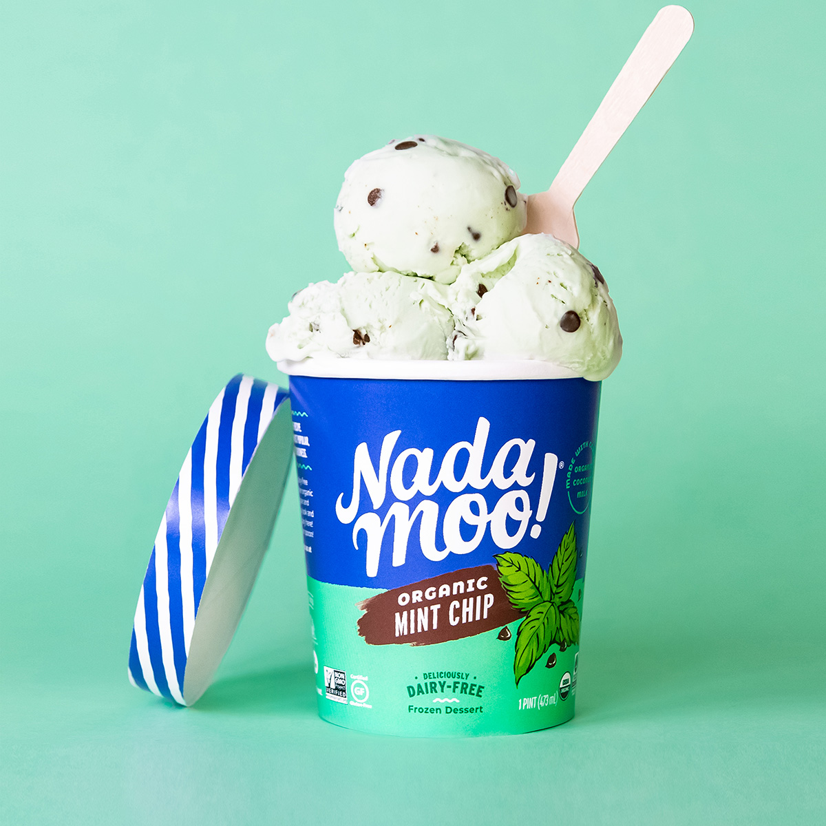
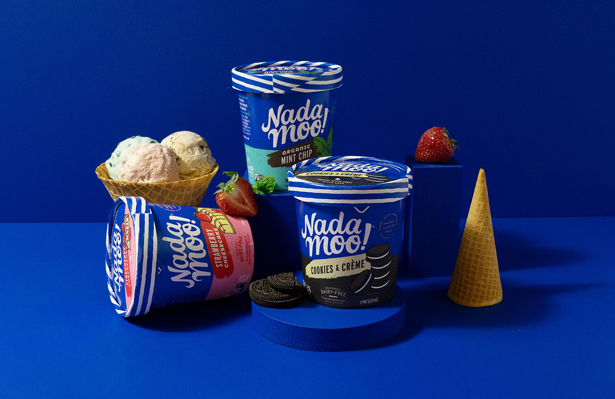
Perhaps the most striking aspect of the new design is the use of a consistent brand color: a rich, royal blue. The intention was to create a solid brand block on store shelves to draw consumers’ eyes and assist with brand recognition. To build on this effect, NadaMoo! decided to level-up its lid too. The blue-and-white striping takes inspiration from the brand’s scoop shop, located in Austin, Texas. “When we looked at the category, competitors with a really strong lid presence held the brand together from a blocking perspective—a difficult task when you’re behind glass and only have a few facings to work with. Tying the lid pattern back to the brand’s physical shop created a nice sense of connectivity,” said Derek Springston, chief creative officer at Moxie Sozo.
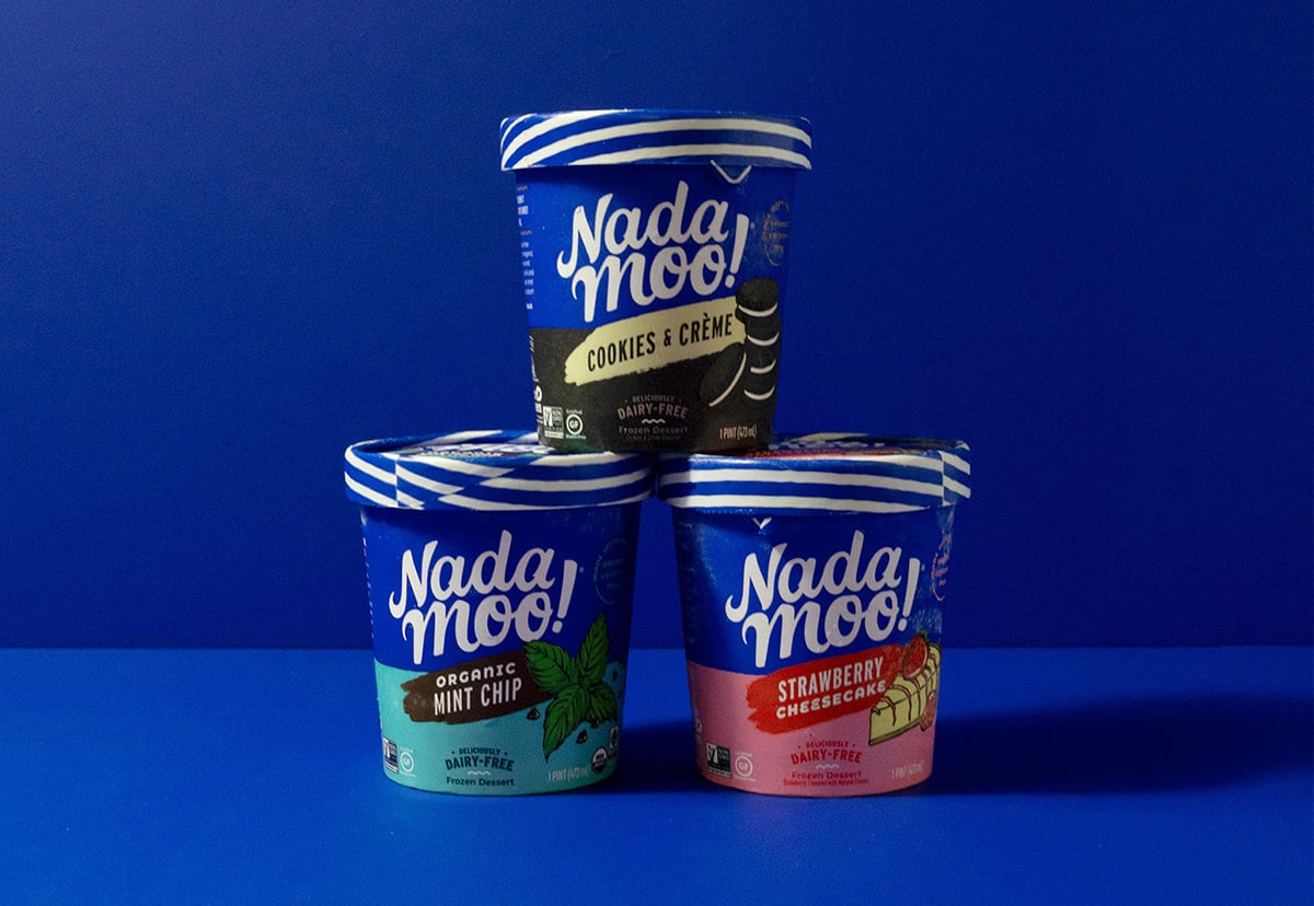
Beyond colors and patterns, a dramatically enlarged logo helped to amplify the brand’s presence. As intended, consumers could identify the new packaging as belonging to NadaMoo! from a greater distance than the prior design (8.1 feet vs. 5.1 feet, respectively), according to research by Designalytics.
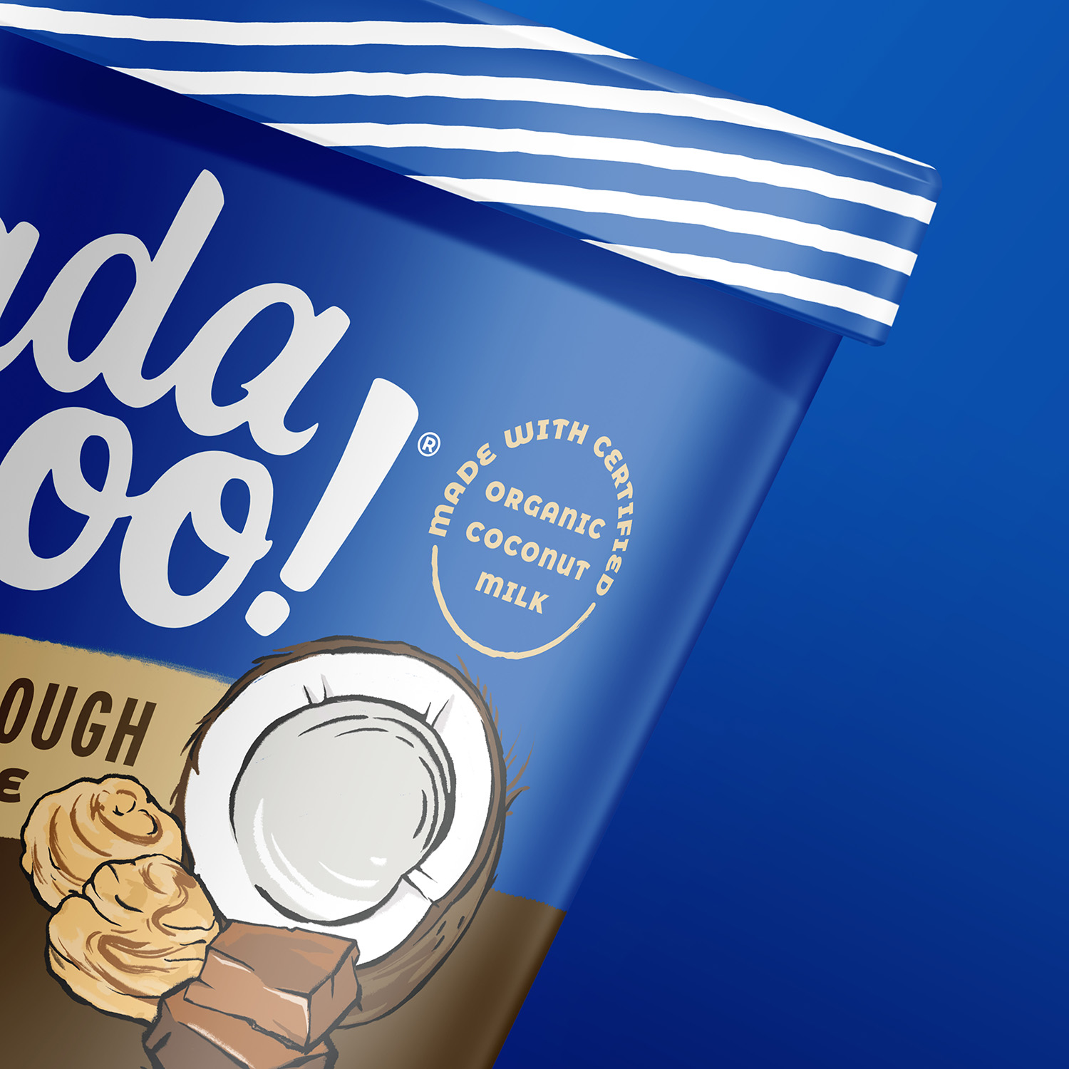
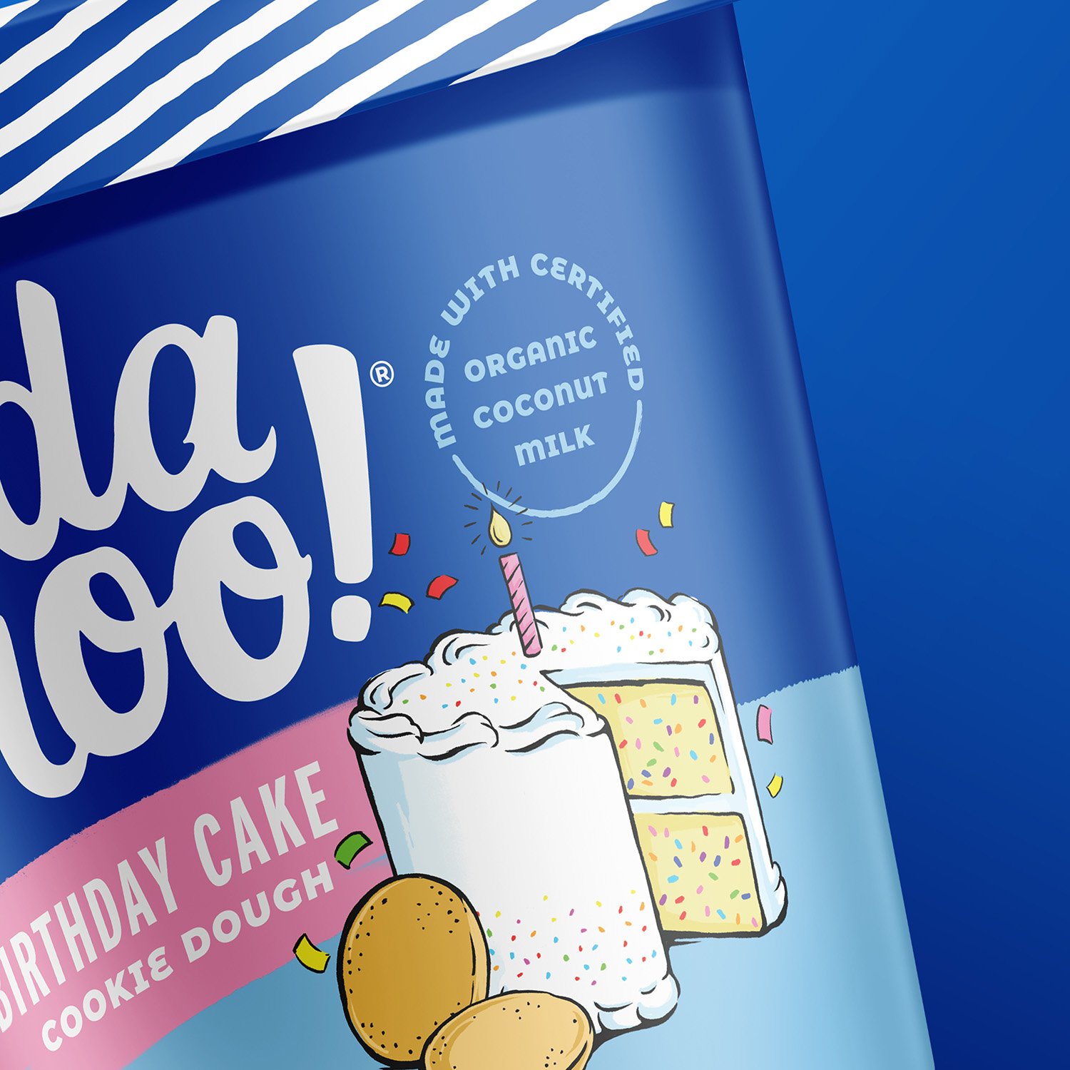
With its branding considerably boosted, the team turned to the next communication priority: conveying taste appeal. Some might raise an eyebrow at the brand’s decision to rely on illustrations over photography for its flavor visuals. “Why not photography? Illustrations are more ownable, and you can dictate the style more easily. They were an aspect of the previous design we wanted to preserve,” explained Dyer.
“Why not photography? Illustrations are more ownable, and you can dictate the style more easily."
“This is a great example of why brands shouldn’t automatically chase trends. Pretty much every ice cream brand used photography on its packaging. A lot of brands would be too timid to use illustration, so it became a way to differentiate NadaMoo!” said Mike Bowman, group account director at Moxie Sozo.

Parks sees the illustrations as a key vehicle for communicating the brand’s exuberant personality too. “We're conveying taste appeal, but in a playful manner; we’re not just using beautiful photographs of food. The illustrations, along with some of the copy, help to communicate that our brand is friendly and has a good sense of humor,” she said.
Alongside its illustrative exploration, the agency conducted an overhaul of the packaging’s hierarchy of communication. This included avoiding redundancies; for example, they downsized “dairy-free” (doesn’t “NadaMoo!” say it all?) and shrunk the flavor name (visuals—especially tasty ones—tend to speak louder than words).
Springston thinks about communication hierarchies in terms of approaching a physical shelf. “At six feet, what does the consumer need to know? That all these products belong to the same brand, and what that brand is. At three feet, what’s the product and the flavor? At one foot, what’s the base of the ice cream? Is this product non-GMO? What other bonuses does it offer?” he said.
Downplaying “dairy-free” may also have strategic benefits—namely, driving trial among consumers who haven’t yet taken the plant-based plunge. The longer it takes to register “dairy-free,” the greater the opportunity for the product’s other virtues—such as its clean ingredients and tasty flavors—to catch the eye of would-be converts.
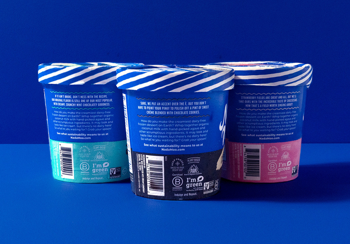
The brand utilized the sides and back of the packaging to communicate its other virtues: its status as a B-corporation; its packaging made from sugarcane, which is sustainably-sourced, tree-sparing, and biodegradable; and its high-quality ingredients.
In the summer of 2020, NadaMoo! celebrated its 15th anniversary by releasing its bold, new look. During the six months following the launch, sales grew by 27% compared to the same period during the prior year, representing an annualized impact of approximately $3.5 million. “The design did a fantastic job of foregrounding our brand personality, taste appeal, and the attributes that really matter to consumers,” said Parks.
During the six months following the launch, sales grew by 27% compared to the same period during the prior year, representing an annualized impact of approximately $3.5 million.
The new packaging quickly took center stage on the brand’s social media channels. “Packaging is the one thing consumers are going to experience in the store. They might hear about us online, but we need to ensure they notice and remember the package so they can make that connection. As a smaller company without a big marketing budget, packaging is the number-one asset we have right now,” said Parks.
The brand takes packaging’s role in connecting the digital and physical spheres very seriously. For instance, NadaMoo!’s Instagram page often features “shelfies”: shots of its products on actual store shelves to remind consumers to look for the brand next time they’re shopping.
Springston echoed Parks’ sentiment about the importance of effective packaging, citing its incredible reach in today’s attention economy. “Packaging is the only asset all of your consumers interact with, right? You can’t guarantee that an advertisement will be seen by every single one of those potential buyers,” he said.
When asked to reflect on what made this initiative so successful, Parks and Springton both emphasized the importance of intrepidity. “Recently, I heard something that resonated strongly with me, as applied to smaller brands: ‘If you don’t take risks, you risk losing your business.’ Large CPG brands have more to lose, but if you’re a challenger brand, you need to act like it—including from a creative perspective,” said Springston.
"Large CPG brands have more to lose, but if you’re a challenger brand, you need to act like it—including from a creative perspective."
For Springston, “finding the edges” during creative exploration is an essential part of approaching risk strategically. “Ask yourself, ‘What does close-in really look like? How far out am I willing to go—and at what point do things stop working?” he advised.
NadaMoo! managed to strike the right balance between authenticity and audacity—remaining playful and taste-forward, while evolving enough to seriously boost its bottom line. And the results? They couldn’t be sweeter.
1 Good Food Institute, “2021 Retail Market Insights: Plant-Based Foods,” 2021. SPINS natural enhanced channel, SPINS conventional multi-outlet channel (powered by IRI).
2 Nielsen xAOC, latest 26 weeks ending 11/28/20 vs. the same period during the prior year.