Category: Yogurt (Greek)
Agency: Unknown
Our Redesign of the Month series spotlights a deserving brand that is harnessing the power of design to make an impact, tell a story, and outshine its previous packaging.
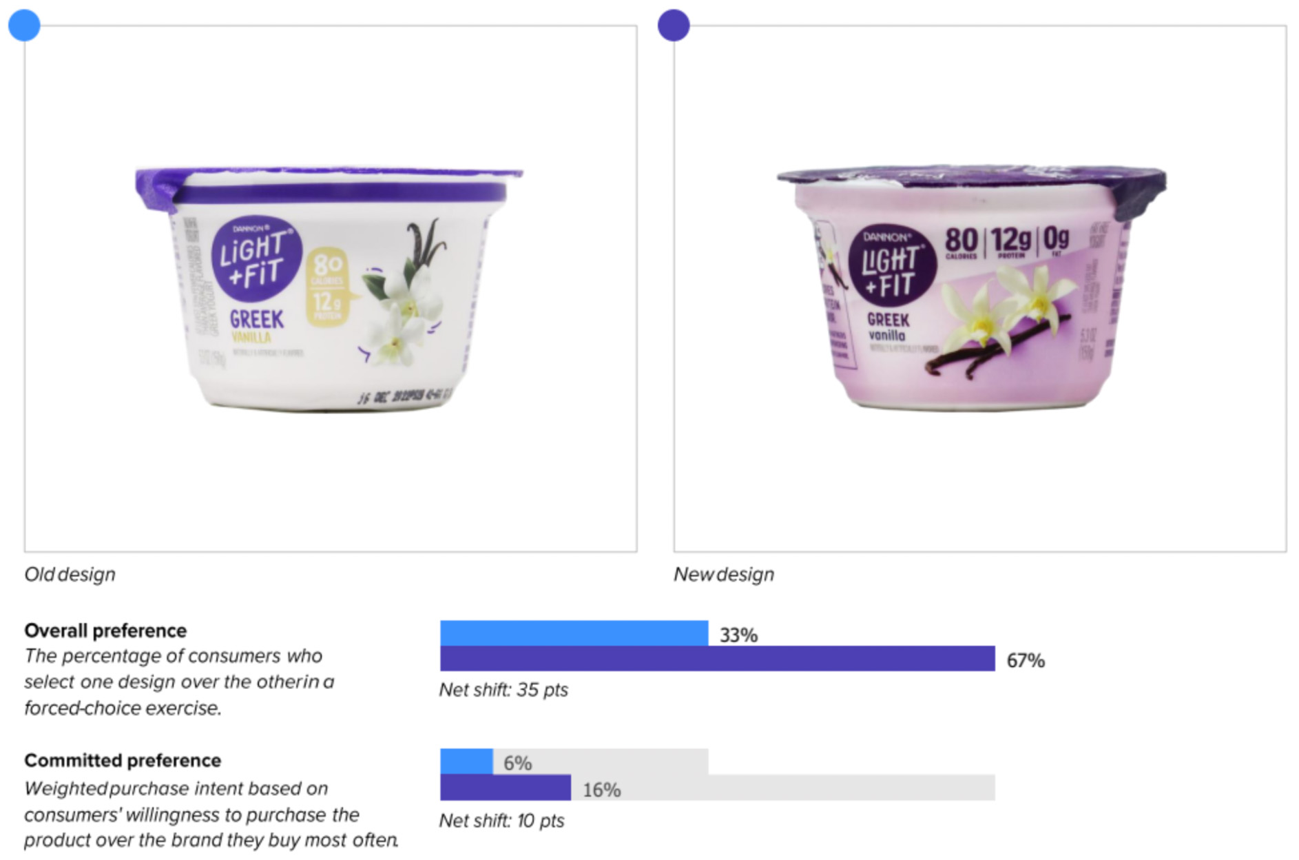
Hundreds of current category consumers evaluate the old and new designs across a wide range of performance areas, including purchase preference, communication, mental availability, and design-element resonance. Notably, Designalytics’ testing outcomes align with actual sales performance more than 90% of the time, which bodes well for this month’s winner: Dannon Light + Fit yogurt.
Background
A lot has changed in the U.S. yogurt market over the past 30+ years. It has ballooned into a multibillion-dollar market, and what was once a fringe snack has become dairy-case dominator with scores of flavors and varieties. Through it all, Dannon Light + Fit has been there.
In this ever-expanding and fragmenting space, Dannon needs to not only grow its product lines but broaden its appeal to protect market share. For an established player in a dynamic category, a package redesign made sense.
Key creative changes
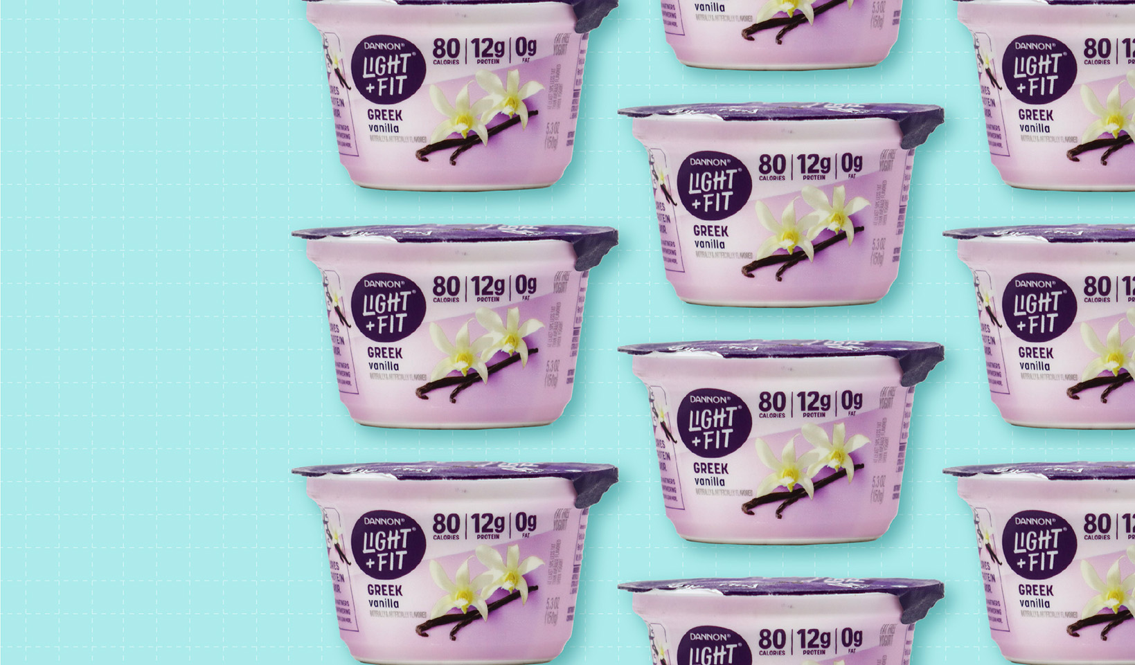
It’s easy to spot the most significant change right away: color. Previously, light purple accents had adorned the otherwise-white packaging… now, various shades of purple (which the brand calls “unmissable”) are predominant across flavor varieties. The intent was clearly to jump outside of white-like-the-product category norms, which the brand chose to complement with, in its words, “bold, expressive typography.” (Side note: This isn’t the only stellar redesign from Danone and its agency, Beardwood & Co. This duo—which teamed up for the Designalytics Effectiveness Award-winning Oikos revamp—seems to be injecting life and confidence into Danone’s yogurt portfolio one brand at a time.)
While the flavor imagery is similar to the previous package, it has been enhanced—there are noticeably larger photos with sharper contrasts. Dannon also moved the nutritional information (centered and off-white in the old version) to a prominent place above the taste imagery and added “0g fat” to the listing of calorie and protein content.
The bottom line
This Dannon Light + Fit redesign may very well give competitors fits. The new look topped the old in consumer purchase preference, 67% to 33%, which bodes well for an increase in sales.
Wins and opportunities
With this redesign, Dannon made it easier for consumers to see what mattered to them when it comes to yogurt. The brand amped up taste appeal with imagery that was larger, bolder, and more evocative of the sensory experience. What’s more, the larger font and sharper contrast of the nutritional information—calories, protein, and the addition of a “0g fat”—ensures this information is easily seen.
Consumers loved this more prominent presentation of this information—in fact, it was the most-liked element of the new design overall. “It shows you nutritional content up front,” said one consumer, while another said “The calories aren’t too high and I don’t feel guilty eating it.”
Improved communication was clearly an area of focus for the brand… and it was successful across the board. The updated look bested its predecessor in communicating every one of the top 12 most important attributes, and by an average of 32 points. The biggest improvement was for “full-flavored” (+46 points) which means the updated taste imagery definitely amplified the yum factor.
Interestingly, the purple backdrop seemed to be a polarizing component of the design. While some consumers liked the new hue, a nearly equal amount didn’t. For some, it was merely a preference issue (“too dark” and “too strong” were themes expressed), but others noted that it didn’t jibe with the color they’d expect for the flavor they were viewing (vanilla). “The color makes me think it might be grape flavored,” said one consumer. This is not likely to be a major issue for the brand—all flavors now carry this purple shading, and buyers will likely use enhanced imagery to navigate to their preferred flavor—but it is worth noting.
Wins
- Consumers were able to spot the design from 4.3 feet away versus 3.6 feet for its predecessor. (Greater distances equate to greater mental availability and better legibility.)
- They also had more positive feelings about the new design; the updated version elicited more positive associations.
- Logo resonance increased slightly from the old to the new. The deeper purple seems to have made a slightly stronger connection with consumers.
- The more-prominent nutritional information clearly struck a chord. It was the number-one most-liked element of the new design by far, with 57% of consumers calling it out. In their open-ended responses, different consumers pointed to specific nutritionals that were important to them; for many, it was protein, for others, calories, and yet others noted that zero fat was a clincher for them. One element spoke clearly to diverging interests: If there was a “design element MVP” for this package, the bolder nutritional information would be it.
Consumer highlights:
“I liked seeing the nutritional content right away.”
“The image that shows the flavor makes it look fresh and tasty.”
About our data
Our goal behind highlighting impactful redesigns is to help brands understand market reactions to design changes and make intentional design decisions. We create a full report of these insightful case studies for every brand redesign in our cross-category database. These value-add tools are created automatically for our clients who subscribe to syndicated category data. For more information on this redesign report or others, contact us.


