Brand: Hershey’s
Category: chocolate (single-serve)
Parent brand: The Hershey Company
Agency: Soulsight
Welcome to our Redesign of the Month series—where we spotlight one deserving brand harnessing the power of design to make an impact, tell a story, and outshine its previous packaging. Hundreds of current category consumers evaluate the old and new designs across a wide range of performance areas, including purchase preference, communication, mental availability, and design element resonance. Notably, Designalytics’ testing outcomes align with actual sales performance more than 90% of the time.
Cheers to this month’s redesign winner: Hershey’s.
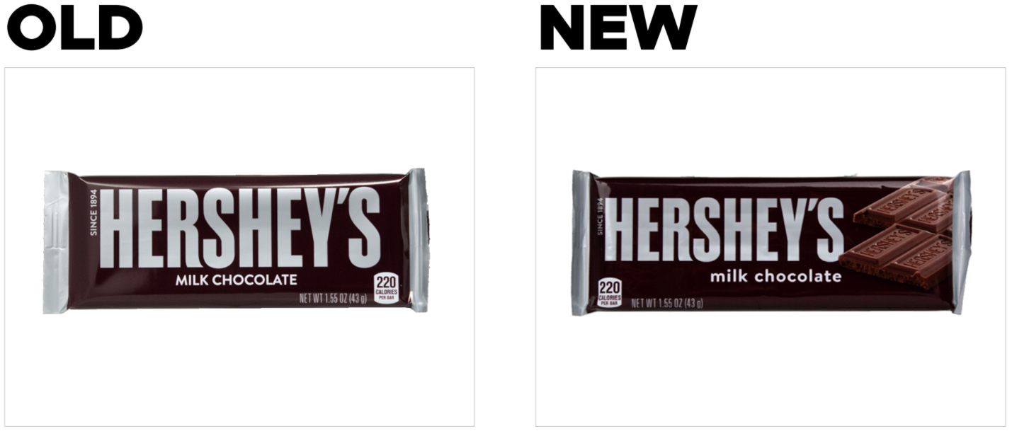
Before and after
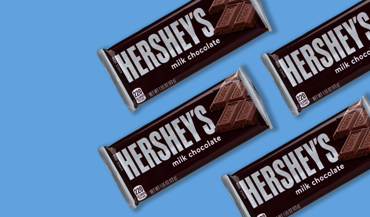
There are few things in life that we expect never to change—the sun rising in the east, the consensus that Comic Sans should be permanently retired—and, yes, Hershey’s iconic packaging. The brand’s minimalist brown wrapper has remained the same since 1951, with only relatively minor evolutionary updates in the years since. However, this candy legend recently rolled out packaging that features tasty product imagery—a major change for a brand that has seemed charmingly immutable for seven decades.
Hershey’s prior design ranked second in a recent single-serve chocolate category report, with high marks across all design performance areas relative to direct competitors, according to Designalytics’ syndicated database. So why risk a change? This chocolate icon represents one more example in an increasingly long line of category captains who believe they can make a really good design even better—and reinforce their competitive standing in a rapidly-evolving landscape. (Other recent examples include Dove and Dark Horse, to name just a couple.) And they weren’t wrong; Designalytics’ quantitative redesign testing strongly suggests that consumers are sweet on the new design.
Key creative changes
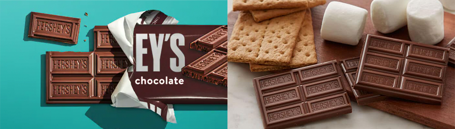
The new design includes a sizable, photorealistic image of the delicious product within—a consistently successful tactic across food and beverage categories. (Think: Oikos’ high-fidelity fruit imagery and Boulder Canyon’s close-up chips.) Notably, the squares themselves, embossed with “Hershey’s,” are iconic and highly recognizable to consumers. In fact, when consumers were asked which visual elements they considered distinctive, 38% mentioned the chocolate bar. This asset ranked second for “distinctiveness” behind the Hershey’s logo, beating out even the signature brown and silver coloring of the wrapper.
To make room for the scrumptious chocolate squares—rectangles, really—the brand downsized its logo. It also updated the typeface for “milk chocolate,” choosing a softer, friendlier font and lowercase letters.
The bottom line
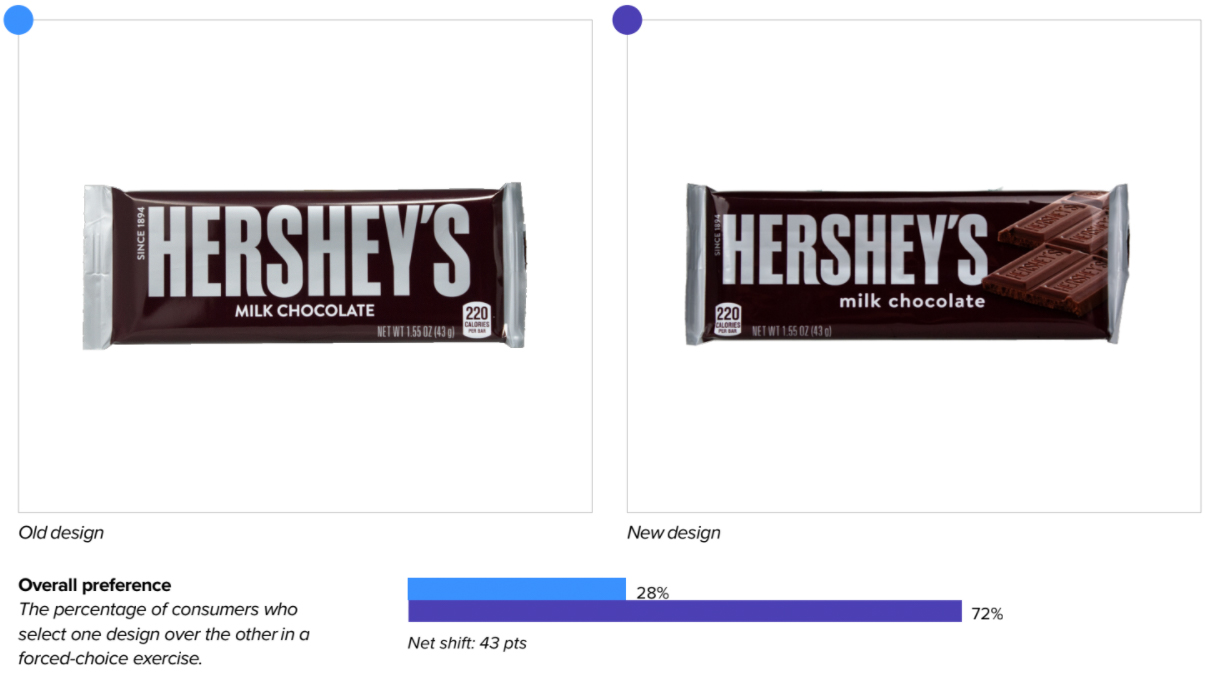
Let’s face it: It’s difficult to go wrong when adding a chocolate visual to product packaging. Consumers vastly preferred the new design to the old one—with 72% indicating they’d prefer to purchase the updated version, and only 28% sticking with the classic design.*
Redesign wins and opportunities
Not surprisingly, the new, chocolate-laden covering improved taste perceptions. When asked which design better communicated top purchase-driving attributes—many of which are predictably taste-related—in a forced-choice exercise pitting the old and new designs against each other, consumers chose the new packaging at a much higher rate: “tastes great” (76%), “satisfies a sweet craving” (61%), “great for treating myself” (75%), and “authentic taste” (71%).
Moreover, when asked which words or phrases immediately came to mind upon viewing the two packages, the new design evoked more experiential, taste-related associations (“delicious,” “indulgent,” “sweet,” “tasty,” “yum”). By comparison, the old design tended to conjure more generic associations like “chocolate” and “candy.”
When asked which elements of the new design they liked and disliked, consumers were most likely to engage with the chocolate bar—and their reactions were overwhelmingly positive; 82% of those who engaged with the imagery “liked” it, while only 4% “disliked” it.
Not only did consumers appreciate its tastiness and the fact that they “can see what they’re getting,” many commented on the fact that the pieces are breakable, which is convenient and facilitates portion control. Others noted that the bar itself is uniquely “Hershey’s”—with the brand effectively making use of a new distinctive visual element on the package.
Despite the downsized logo, the brand’s findability didn’t suffer. Consumers were able to find both designs within a competitive set in approximately two seconds with near-perfect accuracy.
Wins
- Adding sizable, realistic product imagery to drive taste appeal and emphasize important functional benefits (i.e., easy-to-break squares).
- Newly incorporating an existing distinctive asset—the logo-embossed chocolate pieces—onto the packaging.
- Improved communication of all key purchase-driving attributes in the category, including those related to taste (“tastes great,” “satisfies a sweet craving,” etc.) and quality (“high quality,” “brand I trust”).
- Sustaining strong findability performance, despite scaling down the logo.
Opportunities
- No obvious weaknesses to address—the new packaging performed well across design performance areas. Sweet!
Consumer highlight
“The chocolate looks delicious—in one quick look, I see Hershey's with easy-to-break chocolate pieces. It’s a teaser of the delectable treat within.”
About our data
Our goal behind highlighting impactful redesigns is to help brands understand market reactions to design changes and make intentional design decisions. We create a full report of these insightful case studies for every brand redesign in our cross-category database. These value-add tools are created automatically for our clients who subscribe to syndicated category data. For more information on this redesign report or others, contact us.
*In addition to measuring overall purchase preference, Designalytics also evaluates “committed preference”—consumers’ willingness to purchase the brand in question over the brand they currently purchase most often. This measure has proven to be highly predictive of in-market sales outcomes (95%+ accuracy), with increases in 4% or more (from the old design to the new) signifying that the new design will likely drive sales gains. In Hershey’s case, committed preference for the old design was 8%, and 17% for the new design. Since this difference of 9% far exceeds the 4% threshold observed by Designalytics for sales predictability, Hershey’s is very likely to see an uptick in sales over the next few months.


