As the only provider of syndicated package design data, Designalytics evaluates the top-selling and fastest-growing designs across hundreds of consumer-packaged-goods categories. We measure and analyze a wide range of design performance areas, including visibility, communication, mental availability, element-level diagnostics, and more.
Designing packaging for children’s products is a balancing act—brands need to appeal to both kids and parents while communicating key information. These five recent redesigns demonstrated how it’s done, with updates that included engaging colors, kid-friendly graphics, and thoughtful, consumer-focused messaging.
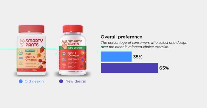
SmartyPants Kids Organic Multi & Omegas
Category: Multivitamins (kids)
65% of consumers preferred the new SmartyPants Kids Organic Multi & Omegas design over the old version. The refreshed packaging utilizes bolder bursts of color to capture attention (many consumers said the new design “stood out more”), and additional information on the included vitamins allowed consumers to assess the product with a glance. One consumer shared, “This one had more information listed on it, so I can know better what I'm putting in my kids' bodies.”
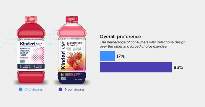
KinderLyte Electrolyte Solution
Category: Sports drinks
The updated KinderLyte design features dynamic fruit imagery, a modern, approachable look, and more noticeable product claims. Overall, 83% of consumers chose the new design, noting that it feels less like medicine and more like a kid-friendly drink. One said the new design, “looks more like a sports beverage, whereas the other looked like cough medicine."
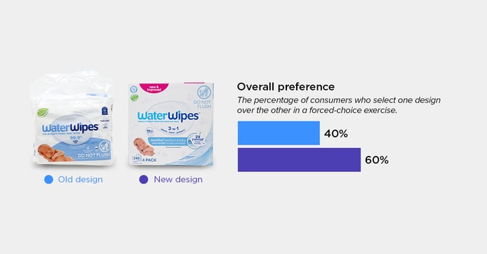
WaterWipes
Category: Baby wipes
WaterWipes utilized a cleaner layout and enhanced callouts to improve its design. One consumer said that packaging “highlights multiple benefits…which makes it feel like a more comprehensive and gentle option for delicate skin.” Consumers also appreciated the box and felt that it was sturdier, easier to store, and more premium. Overall, 60% favored the new design over the previous versions.
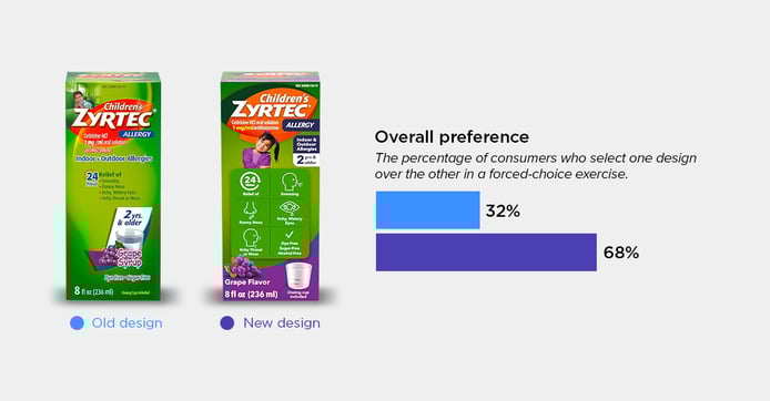
Children's Zyrtec
Category: Medication (allergy)
The new Children’s Zyrtec design seems to have struck a chord with consumers—68% chose it over the previous design. The updated look not only features updated, more prominent imagery of a kid, but has added icons that illustrate benefits and claims more clearly. One consumer stated: “It was nice how the information was easy to understand. The pictures showed the relief it provided for a child with allergies.”
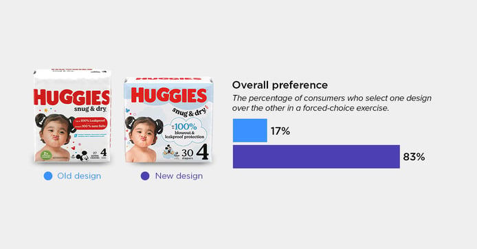
Huggies Snug & Dry Diapers
Category: Diapers
Huggies’ refreshed packaging better emphasizes product benefits and improves visual appeal and readability. Overall, 83% of consumers chose this new look over the old, noting playful visuals and better legibility of benefits. One consumer said: “The benefits of the diapers are larger and easier to read.”