This article was originally published in Packaging Technology Today.
Let’s face it: looks matter—a lot. In recent years, new market and consumer dynamics have turned the consumer-packaged-goods (CPG) industry on its head, further elevating the importance of strong package design. These include media fragmentation and the role of social media, an explosion of bold, new challenger brands enabled by e-commerce, and the rise of design-conscious Millennial shoppers—to name a few.
Despite the fact that it’s more important than ever to win over consumers at the shelf, there are still many ineffective, if aesthetically pleasing, designs in the marketplace. So which recent trends have actually led to strong design performance for many food and beverage brands, when executed well?
1. Maximalism
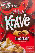
Over the past several years, minimalism has enjoyed rising popularity, dazzling consumers with clean typography, concise copy, and white space for miles. However, dynamic designs are making a comeback. These days, more packages are packed with long claim lists, layered elements, and large illustrations. While minimalism often lends a refined, premium air, maximalism’s strength can lie in grabbing consumers’ attention and communicating big personalities more emphatically. For example, Ben & Jerry’s “louder” design outperforms Talenti’s notoriously stark appearance on measures of standout, findability, and communication, according to data from Designalytics, a company that evaluates designs across hundreds of CPG categories. Notably, Ben & Jerry’s ranks number one in the ice cream pints category for communication of “authentic”—an increasingly important attribute to younger consumers.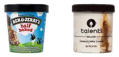
Despite the growing popularity of less minimalistic designs, it’s important to remember that competitive context matters—in a category that predominantly adopts maximalist designs, it may be the minimalist contender that stands apart.
2. Quality-over-quantity product photography
Food and beverage manufacturers know that, regardless of their specific product category, taste appeal is invariably one of the most important attributes to communicate. With this in mind, some brands have begun to employ larger, more detailed food photography on their packaging—often featuring a delectable close-up of one chip or one stunning square of chocolate in favor of an entire bowl or bar.
For example, Boulder Canyon recently redesigned its packaging, replacing its pile of potato chips with three high-definition specimens. The new design’s food imagery proved to be more much engaging and well-liked, with consumers citing strong appetite appeal, according to an evaluation by Designalytics. Incidentally, Boulder Canyon’s redesign also succeeded in halting a significant sales decline and returning the brand to growth.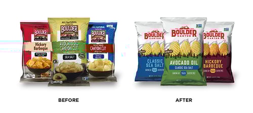
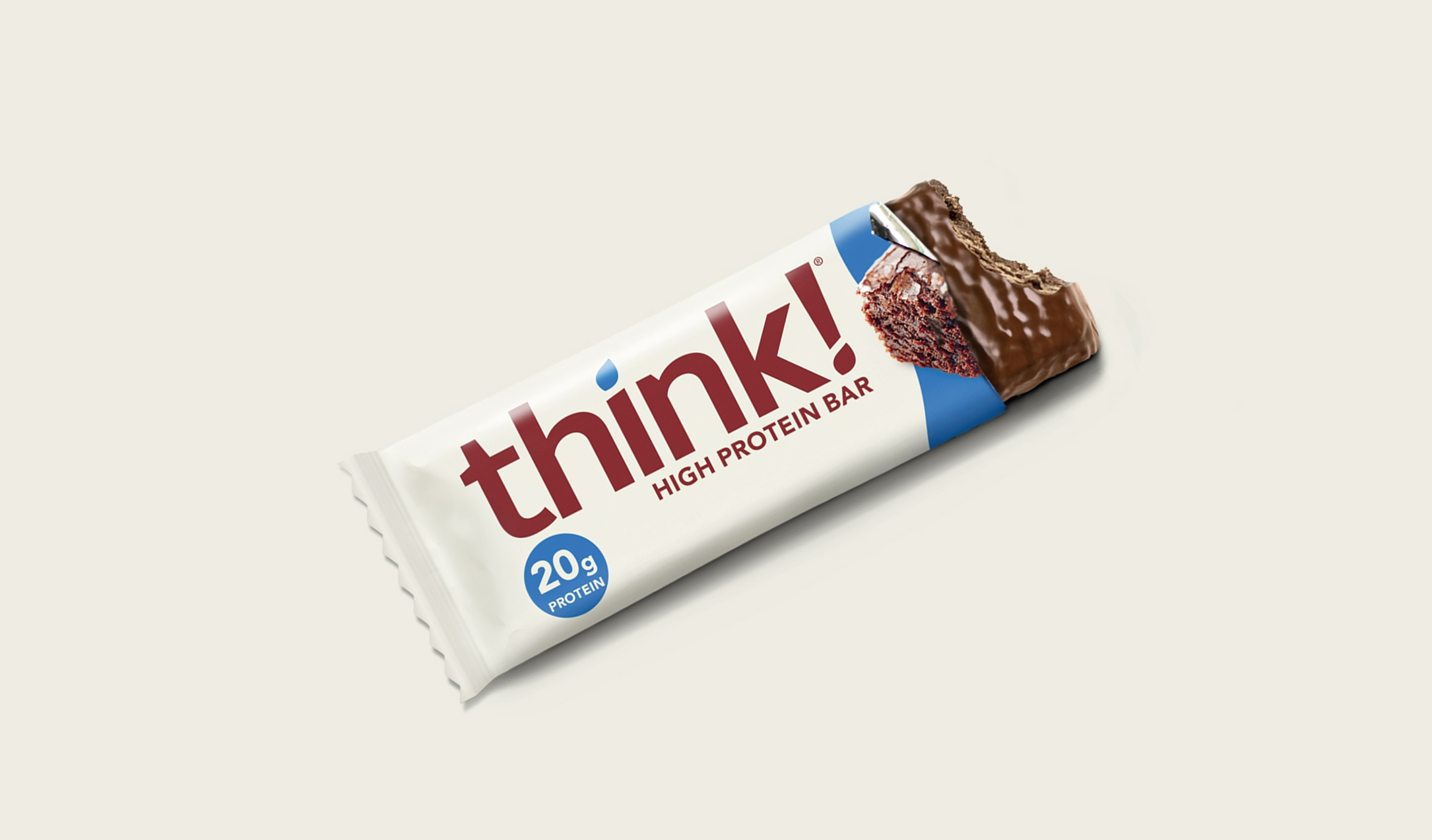
3. Large and legible branding
Every designer has encountered those clients who will inevitably ask, “Can you make the logo bigger?” While this strategy isn’t always advisable, it’s hard to argue with certain benefits of outsize branding, such as improved findability and mental availability. In the case of think! (previously thinkThin) protein bars, shortening the brand name meant that the logo could be enlarged on the package. This reduced the average time it takes for consumers to locate the brand within a competitive set by nearly six seconds—from 8.5 to 2.7 seconds, according to data from Designalytics. This is significant, given that most consumers are willing to spend a relatively short span of time scanning store shelves, and products that can’t be found can’t be bought.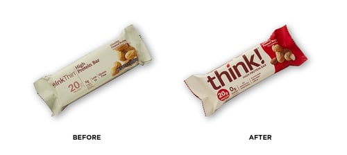
4. Unique package formats
For brands willing to consider creative package formats, shape can be a powerful differentiator. Moreover, it can reinforce a particular design aesthetic, provide functional benefits, and signal specific usage occasions. For example, single-serve cups are a relatively new package format in the macaroni and cheese category—and brands who adopt this format, including Velveeta and Kraft, are top-performers on measures of standout, and more likely to evoke associations of “convenient” and “easy” from consumers, according to Designalytics.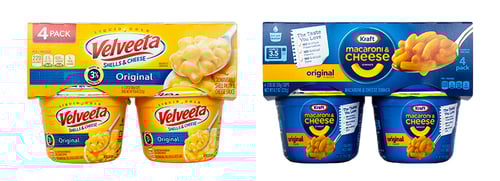
5. Names that allude to a specific benefit
It’s tempting to focus only on visual elements when developing designs, but words play an important role too. On-point names that explicitly evoke a functional or sensory benefit serve as mental short-cuts for consumers, and can have a profound impact on how well a package communicates. For example, consumers are much more likely to associate the word “refreshing” with Corona Refresca than with the typical hard-seltzer brand. In the frozen entrees category, Healthy Choice Power Bowls outperform nearly all category competitors when it comes to communicating “healthy,” “balanced meal,” and “filling.”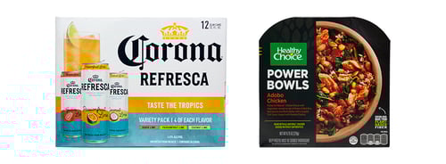
These trends are certainly worthy of consideration by all brands, but it’s important to remember that there is no one-size-fits-all approach to effective design. Design success depends heavily on the specific category in question and the competitive context, as well as a particular brand’s positioning and design objectives. Perhaps the most important trend, increasingly adopted by design-led companies, is making evidence-based design decisions—which rely on having a firm, data-driven understanding of one’s current design performance, established brand equities, strengths, and areas of opportunity. With this foundation, strong creative talent can work wonders, and ultimately deliver significant design-driven brand growth.


