Designalytics tracks and evaluates package redesigns launched to market as part of its syndicated data offering. This often includes seasonal packaging, which can be incredibly effective at bringing new buyers into a brand, meeting additional usage occasions, and forging strong emotional connections with consumers.
Hundreds of current category consumers evaluate the package designs across a wide range of performance areas, including purchase preference, communication, mental availability, and design element resonance. From this, we can understand which design is ultimately preferred by consumers and why exactly—gleaning useful principles that can often be applied across brands and product categories.
Background
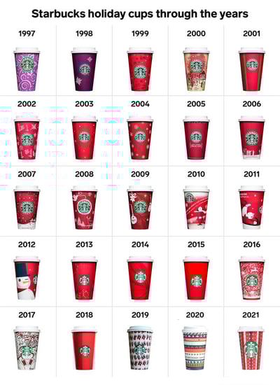
There’s a long-standing tradition of cheer-inducing coffee cup designs. In fact, Starbucks has been dressing up its to-go cups since 1997 according to the internet annals, with a wide range of approaches: hand-drawn doodles, modern vector graphics, bold backgrounds with few embellishments, wrapping-paper-inspired prints, typographic designs, and colorful geometric patterns.
Every year, holiday cup designs are covered by the press with much fanfare—and occasionally dismay. (Some readers may recall outrage over Starbucks’ 2015 release: a solid red cup whose apparent lack of cheer—intended to strike a culturally-neutral chord—invited backlash from some patrons who had been hoping for a more Christmas-y feel.) At the very least, consumers enjoy seeing what their favorite brands have created each year to maximize their seasonal merriment.
As a design research company, we’ve added a little rigor to the process—taking an objective look at consumer reactions to the designs of two coffee giants: Starbucks and Dunkin’.
Holiday designs for 2021
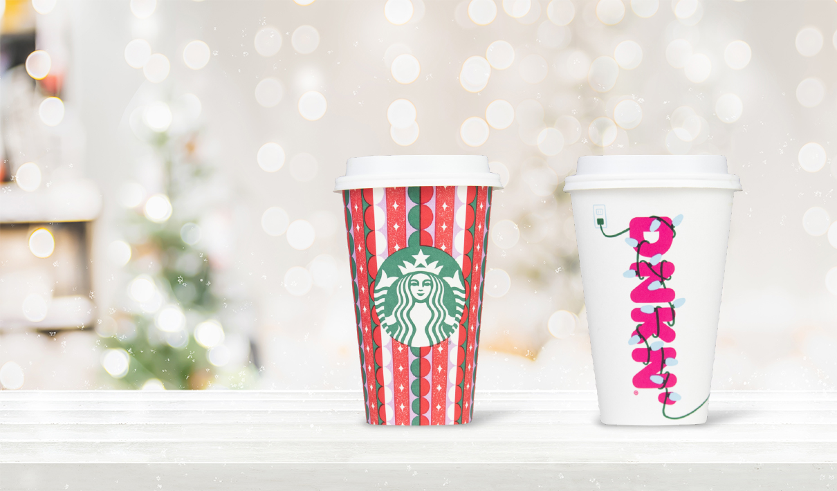
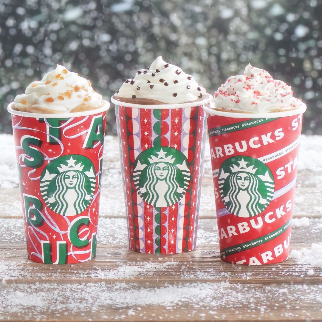
This year, Starbucks has opted for bold, red-and-green designs, reminiscent of gift wrap. The trio borrows elements from recent years' designs, including the typography-centered approach from 2019 and the striped, geometric print from 2020. The java giant went big on branding in 2021, with an enlarged logo and additional "Starbucks" copy on two of the three designs.
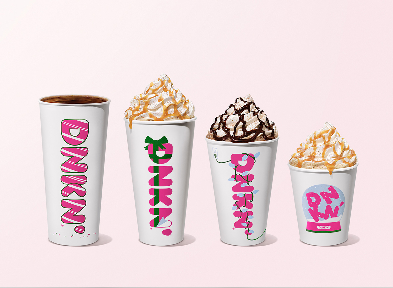
For the past couple years, Dunkin's cups sported an eye-poppingly pink backdrop with its signature "bubbly" typography displaying festive words, such as "Celebratin'" and "Cheersin.'" This year, the brand reinstated the white background of its standard packaging, leaning harder on its logo (which didn't even appear on its 2019 and 2020 holiday designs). To heighten the cheer factor, the brand decorated "DNKN'" with seasonal trappings: candy cane stripes, a bow, holiday lights, and a snow globe.

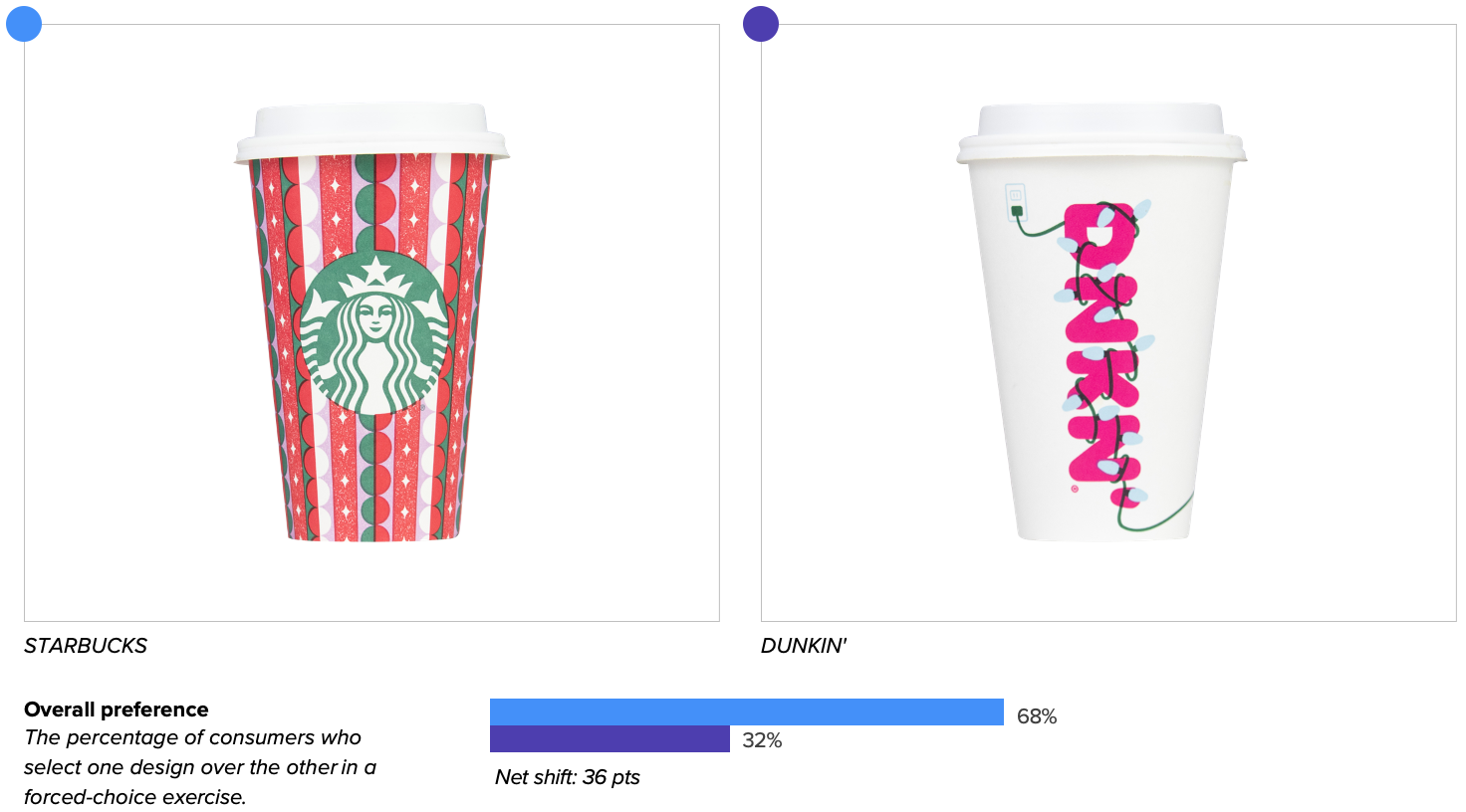
The bottom line
When seeking caffeination with a splash of holiday cheer, more than two-thirds of consumers prefer Starbucks’ holiday design to Dunkin’s.
Design strengths and opportunities
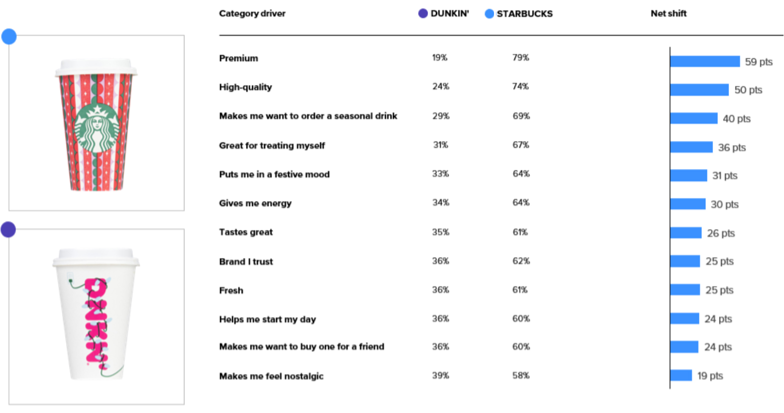
Starbucks trounced Dunkin' on communication of all 12 purchase-driving attributes we measured. While some findings weren't wholly surprising given each brand's respective equities—for example, at least three times more consumers felt Starbucks' cup was more "premium" and "high-quality" than Dunkin's—others were less obvious.
Notably, coffee quaffers were more likely to associate Starbucks than Dunkin' with seasonally-relevant attributes: "makes me want to order a seasonal drink" (69% vs. 29%), "puts me in a festive mood" (64% vs. 33%), and "makes me want to buy one for a friend" (60% vs. 36%).* When asked their impressions upon first viewing the designs, consumers were also more likely to associate seasonal words, such as "holiday" and "Christmas," with Starbucks' design.
Communication of key purchase-driving attributes
Starbucks' design also scored much higher on measures of likability—earning 6.2 "likes" for every dislike, compared to 2.9 for Dunkin'. While likability isn't a particularly predictive measure of success, it can help to diagnose why a design may be succeeding or failing on other metrics of importance.
Consumers felt that Starbucks' red-and-green color scheme was highly brand-consistent and holiday-appropriate, with one consumer commenting: "I really enjoy this color scheme. It's seasonal, and also seems to suit Starbucks well." The geometric print conjured associations with gift-giving—perhaps one reason the brand excelled at communicating "makes me want to buy one for a friend"—with some noting that the cup "looks like a wrapped Christmas gift."
"Festive" was a word often repeated by consumers when evaluating Starbucks' design, and a number noted the "retro pattern," which had the effect of being "fun, festive, and nostalgic all at once."
Dunkin's design proved more polarizing—it was more likely to conjure associations such as "messy," "cluttered," "busy," and "confusing." One consumer commented, "The lights look cluttered and like they were haphazardly thrown on. It's not very pleasing to the eye."
Many cited more practical concerns regarding the logo's legibility, complaining that it's "unreadable," and that it "takes a minute to even realize it's Dunkin' coffee." (Notably, when asked the first words to come to mind upon first viewing each cup, 39% said "Starbucks" while only 22% said "Dunkin'." Consistent with consumers' open-ended feedback, this suggests that Starbucks' seasonal design possesses clearer, truer-to-self branding.)
Dunkin' also struggled to compete with Starbucks' merrymaking mood, with some consumers expressing that the design wasn't striking enough. In particular, the white backdrop and significant open space felt "not festive" and "kind of drab for a seasonal cup."
Despite these downsides, consumers awarded points for Dunkin's overall concept and attention to detail. Legibility issues aside, they appreciated the logo decoration (a common no-no in branding best practices books). One consumer wrote: "I like the Christmas lights wrapped around the letters—it's cute and Christmas-y."
The detail of the power outlet was very well-received—proof that consumers pay attention to the little things. A number of them recognized and appreciated the energy-driven metaphor: "It’s very inventive—coffee will charge you!"
The winner of the 2021 Holiday Cup War is Starbucks, thanks to its ability to scream both "Starbucks!" and "merriment!" with equal fervor. Seasonal packaging can be a powerful tool for engaging consumers' emotions, meeting different usage occasions, and reaching new audiences. For these reasons, optimizing limited-edition packaging is a worthwhile endeavor—capable of driving double-digit sales growth over prior seasonal designs.
To receive more data-driven articles on package redesigns and limited-edition packaging, subscribe to our monthly newsletter.
Recommended read: Theo Chocolate's Holiday Redesign Looks Like Christmas and Tastes Like Success
*The combined percentages for Starbucks and Dunkin' may not total 100%, as consumers who expressed ambivalence are not included.


