 It's that time of year: The air turns crisp, holiday hits dominate the airwaves, ugly sweaters are fleetingly in fashion, and retailers deck the aisles with limited-edition, holiday packaging. Even grocery shopping takes on a slightly more emotional air—an ineffable buoyancy—as consumers absorb the festive atmosphere and scour for gift-worthy stocking stuffers.
"People who are shopping for holiday products are in a different mindset and have a different reason for buying than an everyday chocolate buyer; They’re in a seasonal mood and want to celebrate. It’s an opportunity for brands to amp up the gifting potential and channel more cheer—and, ultimately, to bring new buyers into the brand,” said Monique Heineman, brand manager at Theo Chocolate, the first organic, fair-trade, bean-to-bar chocolate producer in the United States.
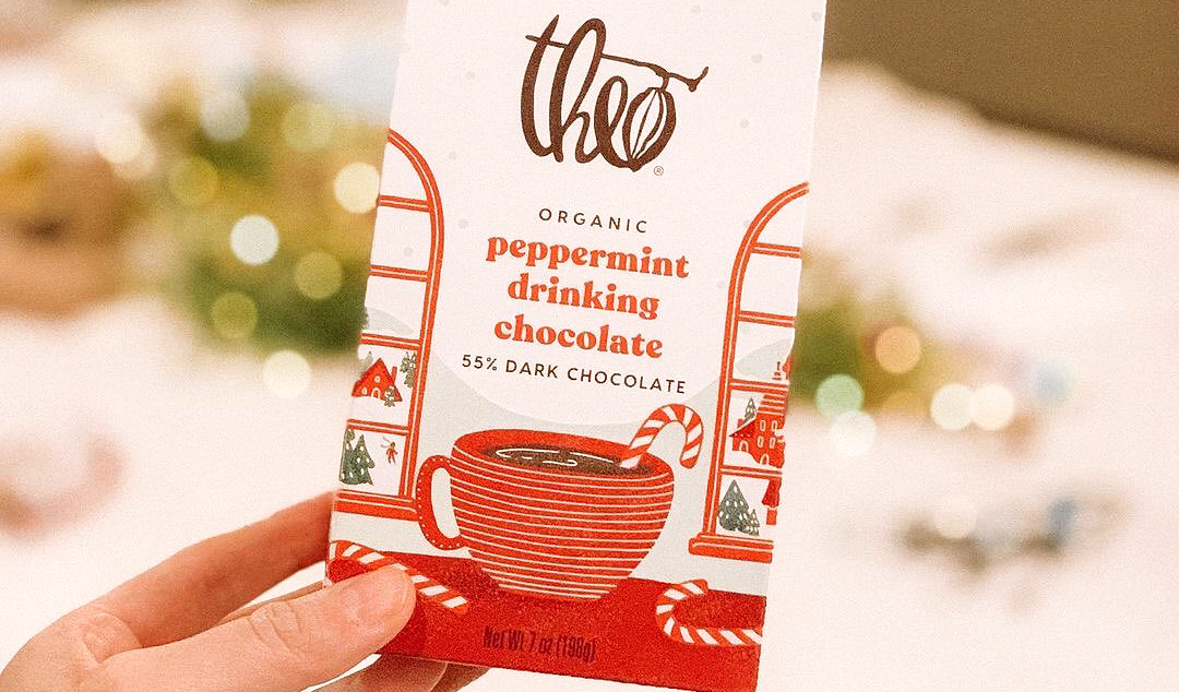
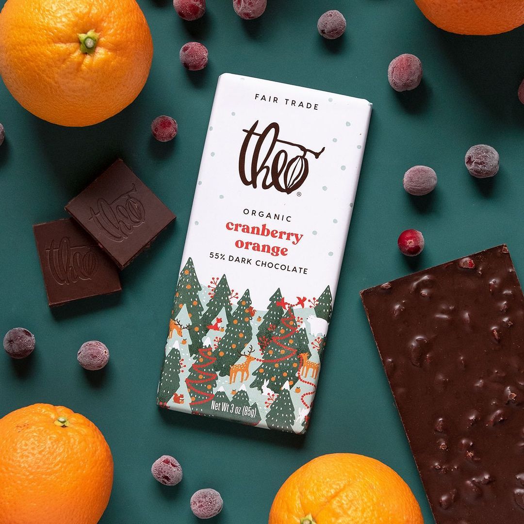
Like many confectionary brands, Theo Chocolate endeavors to bring something more to sweet-toothed shoppers during the holidays. The brand offers a line of seasonal treats with festive flavors, including Gingerbread Spice and Nutcracker Brittle chocolate bars, as well as Peppermint Cocoa Cups. Offerings this delectable deserved to be dressed-up, particularly for the holidays—and, as a design-forward company, Theo Chocolate knows that what’s on the outside of the package can matter just as much as what’s on the inside.
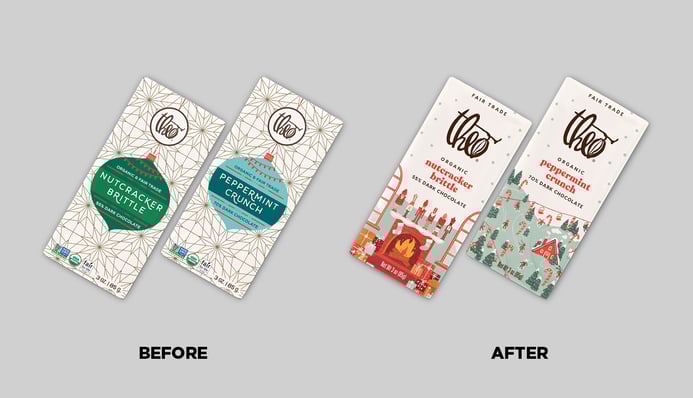
The brand had created multiple iterations of its holiday packaging over the years and completed an award-winning overhaul of its core line’s packaging in the fall of 2019. “Designs over the years have ranged from modern, to cute and nostalgic, to geometric and sophisticated. For 2020, we wanted to find a different angle that fit better with the newly redefined core brand, and conjured a sense of joy and wonder,” said Emily Raffensperger, creative director at Theo Chocolate.
The team began to plan for 2020’s holiday packaging during the winter of 2019—a full year in advance. “When we were starting our research, we could go out to stores and see what was out there at the time in terms of specialty packaging, which was helpful. If it’s 100 degrees outside and you’re sitting in an air-conditioned room talking about snow, it’s harder to get into the right mindset,” explained Mandy Arroyo, graphic designer at Theo Chocolate.
During the research phase, the design team looked across categories—not just chocolate and candy, but other seasonal items in grocery stores, as well as in completely different retail environments. “We bucketed trends we were observing—modern, nostalgic, luxe, hand-drawn organic, lettering-forward—but a lot of our inspiration came from things like stationery cards, wrapping paper, and other giftable items,” said Arroyo.
Within the chocolate category, the team observed that many of the specialty designs were fairly conservative, disinclined to stray far from the core branding. “The designs were very similar in terms of layout and architecture to the standard packaging, but dressed up for the holidays. Theo takes a more open-ended approach to seasonal packaging, wanting to maintain a sense of specialness and giftability,” said Raffensperger.
The fact that Theo Chocolate had just rebranded its core product line also helped to create a sense of opportunity. Rather than developing a look that might have been a reaction to or iteration on a previous holiday design, the team was able to start from scratch. “That ensured we were keeping an open mind and exploring more broadly,” said Raffensperger.
The team considered photography and other treatments for the packaging, but gravitated toward illustration for its friendly, hand-made feel. “There’s a very human touch to it. I don’t think most companies have an in-house design team who are also illustrators, and this was an opportunity for us to showcase the Theo way of doing a holiday scene,” commented Arroyo.
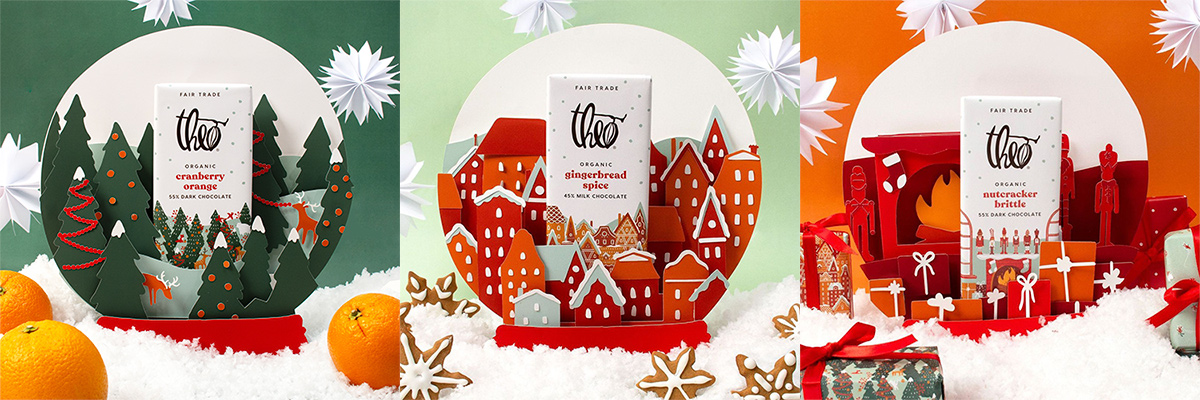
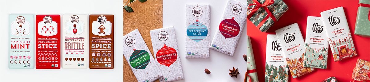
Raffensperger and Arroyo, both skilled illustrators, began with pencil sketches of inviting holiday scenes. For the overarching concept, they drew inspiration from snow globes. “They're nostalgic and a little kitschy and quirky. They invite a really fun sense of discovery. For us, this meant that each piece of packaging became a different little scene or vignette. We tried to build in flavor cues, too. For example, there’s a candy cane forest for the peppermint crunch bar, gingerbread houses for the gingerbread spice bar, and so on,” explained Raffensperger.
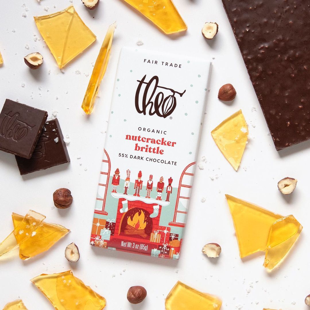
To crystallize this concept of an immersive winter wonderland, the team began by sketching a snow globe from which the scenes emblazoned on each package were eventually derived. To the individual packages, a subtle dot pattern was added to the background—a suggestion of falling snow. “Having a strong concept at the outset helped us decide how to apply the design to different SKUs and other marketing materials,” said Arroyo.

“We did quite a bit of tinkering with how many colors we wanted to include on each package. Moreover, we wanted to make sure the distribution of colors felt pretty even across the line—for example, we didn’t want every product to be heavy on green like the peppermint crunch variety,” said Raffensperger.
While the designers took a fresh approach to the holiday graphics, they still wanted these products to feel consistent with the core Theo Chocolate line. “We tried to keep consistent the placement of the logo and the call-outs for organic and fair trade. The hierarchy of communication takes its cues from the core design and still feels related,” explained Raffensperger.
To support the holiday launch, Theo Chocolate’s design team created a treasure trove of supporting marketing assets, such as those for in-store merchandising opportunities, e-commerce listings, paid promotional campaigns, and social media. Since the 2020 holiday campaign had been planned prior to the pandemic, the brand made some modifications to its messaging.
“Our original brief was focused on how Theo can bring fun and warmth and authenticity to your holiday traditions. In our marketing communications, we pulled back from the emphasis on traditions, focusing more on flavors and creating a really delicious holiday season, given the increase in at-home baking,” said Heineman. “Fortunately, the package itself—which was finalized before Covid-19—communicated warmth and joy more generally, without emphasizing shared gatherings,” she added.
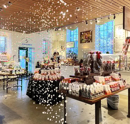
The brand didn’t abandon all opportunities for human connection during the pandemic, though. Theo Chocolate has a flagship store attached to its factory in Seattle, Washington—a quaint, welcoming, red-brick building with “Chocolate Factory” emblazoned over the doorway. “We designed the store to feel like the inside of a snow globe—we had snow falling and these snow ‘cascades’ to create spacing between different shopping areas to maintain safety as people were shopping,” said Heineman.
In the late fall of 2020, the new holiday packaging launched—and there’s no doubt consumers were sweet on it. Compared to the prior holiday packaging, chocolate buyers felt the new design better conveyed key attributes, including “tastes great,” “natural,” “premium,” and “brand I trust.” Not surprisingly, sales snowballed—increasing 37% overall compared to the same period during the prior year. In the grocery channel specifically, sales increased by 120%.
Sales snowballed—increasing 37% overall compared to the same period during the prior year. In the grocery channel specifically, sales increased by 120%.
The new design also helped to re-open doors at retailers who had previously delisted Theo Chocolate’s seasonal collection. “With the new design, some retailers were motivated to begin carrying the holiday products again, which was really wonderful to see,” said Heineman.
Many brands will bolster the launch of new packaging with increased marketing investment, making it difficult to isolate the impact of design.1 In the case of Theo Chocolate, the brand actually decreased its marketing investment for holiday 2020, being uncertain how Covid-19 might impact chocolate sales and shopping trends. “We pulled back on in-store merchandising opportunities. While we did continue to spend on e-commerce, our overall marketing spend was reduced from the prior year,” recalled Heineman. The implication of this is profound: Design alone drove the brand’s impressive performance.
When asked to reflect on what made this redesign so successful, the brand team highlighted the critical importance of their in-house design team—a function that can be undervalued in some organizations who favor external agency talent. “We're a fairly small company—our offices are either above or across the street from the chocolate factory, and I think there's a lot of opportunity for collaboration that makes us nimble and capable of adapting quickly. Outside agencies absolutely bring wonderful points of view and unique skill-sets to the process, but they're not necessarily embedded in the company and the culture, and that can be limiting,” said Raffensperger, who has been with Theo Chocolate since 2014.
Theo Chocolate’s desire to bring design in-house makes sense, given its broader company mores. “We’re a bean-to-bar chocolate company who actually makes its chocolate from scratch. We have our own warehouse that fulfills e-commerce orders, and we see those workers at company get-togethers. We manage all these processes. When we look at our marketing organization, we take a similar tack: much of our design is in-house, and our social media—which I think is best-in-class—is also run internally,” said Heineman.
"We’re a small but scrappy brand. We do a good job of showing that you can have a really small budget and still do so much with it, if you’re willing to get creative."
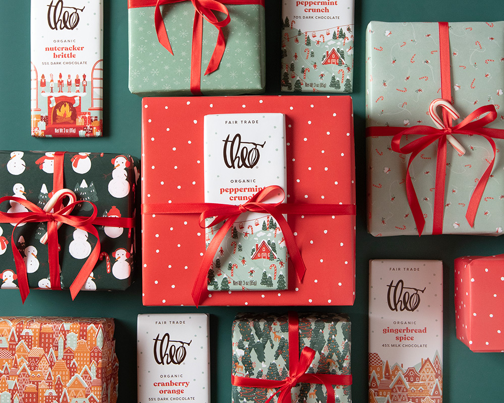
With Theo Chocolate’s success—and stunning presentation on shelf—it can be easy to forget that the brand isn’t a behemoth. The team itself exudes a homey, warm, bubbling kind of energy—active and inventive, but without pretense. “We’re a small but scrappy brand. We do a good job of showing that you can have a really small budget and still do so much with it, if you’re willing to get creative,” said Arroyo. “For example, our photography was shot in my apartment because I was working from home during Covid. We printed out wrapping paper based on the packaging, and wrapped gifts with it, which were used in the photography and in store displays,” she added. This spunky startup mindset—and its impressive outcomes—seems to be the direct product of maintaining such a talented in-house design team.
Theo Chocolate certainly hit the sweet spot with consumers, while demonstrating that effective design doesn’t always require a massive budget or a nationally-renowned creative agency. It also affirms the value of limited-edition packaging in meeting new usage occasions, forging stronger emotional connections with consumers, and bringing new buyers into a brand. In fact, Theo Chocolate’s holiday packaging was such a resounding success in 2020 that it’ll be making a comeback in winter 2021. Sweet!
Download the report with interviews from all the Designalytics Effectiveness Award winners.
1 Design is often undervalued in marketing mix analyses—it’s viewed as a separate “channel” when, in fact, it pervades all other marketing efforts. For example, a television advertisement that showcases strong branding and design will undoubtedly be more effective than one with a weaker design. Therefore, even when a brand does increase its marketing investment alongside a redesign, it’s impossible to separate the two activities.


