"Incorrect assumptions lie at the root of every failure. Have the courage to test your assumptions."
—Brian Tracy, author and professional speaker
In many design projects, brands operate from a certain set of assumptions. Generally, they can be agreed upon in an organization because they seem to make sense. No one thinks to test these assumptions, mostly because it would be costly, time-consuming, and would likely corroborate what everyone knew already, right?
Not so fast.
When it comes to package redesigns, we’ve seen quite a few assumptions that proved to be flawed (as evidenced by the over 50% failure rate of redesigns in the consumer-packaged-goods industry). The good news is that if you test your assumptions early in the creative process, it can not only save your brand from choosing the wrong design direction—it can actually point you in the right (read: sales-boosting) direction.
Allow us to explain. We’ve already covered one example of how our proprietary design screening solution, Versus, is transforming early-stage design exploration. But we wanted to share another, as instances of Versus’ tremendous impact on ROI seem to keep coming up.
As a reminder, Versus is an innovative, easy-to-use tool that allows brands and agencies to quickly (results come in as little as two days, in fact) and reliably measure consumer response to designs. The idea is simple: Pit two designs against each other, and see which consumers would prefer to purchase. Versus utilizes a proprietary, highly-predictive metric that combines implicit and explicit consumer feedback to assess purchase preference quantitatively—and also provides qualitative consumer feedback to help creatives understand why consumers chose what they did.
An established player in the health beverages space, which we’ll call Brand B, recently utilized Versus as it considered a redesign.* Increasingly aware of a visual trend towards minimalism in the category, Brand B felt that its current design was old-fashioned and made it vulnerable to a spate of competitors with simplified, modern designs. The company presumed that such a design was what consumers really wanted. Luckily, Versus offered a quick, cost-effective way to test this belief.
Brand B’s original design featured claims about the health benefits consumers enjoy when using the product, as well as imagery of fruits and vegetables amid a muted farm-scene backdrop. Given the trends in the category, the brand decided to test that design against nine alternatives that took a more minimalist approach. Each of these new options played with different visual and communicative concepts—more or less colorful, different placement of claims, varying fonts, and more—but all were simplified and had none of the colorful imagery of the current design.
The results were surprising for Brand B: the current design bested each of the new options. Imagine for a moment if the brand had proceeded with one of those options… There would be a very high probability that the redesign would actually hinder sales. By testing its assumption, the team dodged a proverbial bullet, branding-wise.
But there’s more. Looking through the consumer responses, the brand saw why people preferred the current design, but also what would make it even better.
First, consumers liked the veggie imagery; in addition to adding color, it seemed to signal that this was a natural product providing important nutrients.
“I liked the array of veggies on the bottom of the package. It made me think that this product would be the perfect supplement for those veggies that I might not be getting enough of.”
“The pictures of the vegetables make this product seem a lot more natural.”
“The fruits and vegetables make me think it is healthy and better for me.”
Though the new designs were clearly not preferred overall, the consumer responses for these still provided keen insights. Respondents liked that these versions were easier to read—a fact cited by many consumers—and that they provided more information about the product.
“I could see on the label that it offered what I look for in the product.”
“The information you need is right there on the front.”
“Easy to read.”
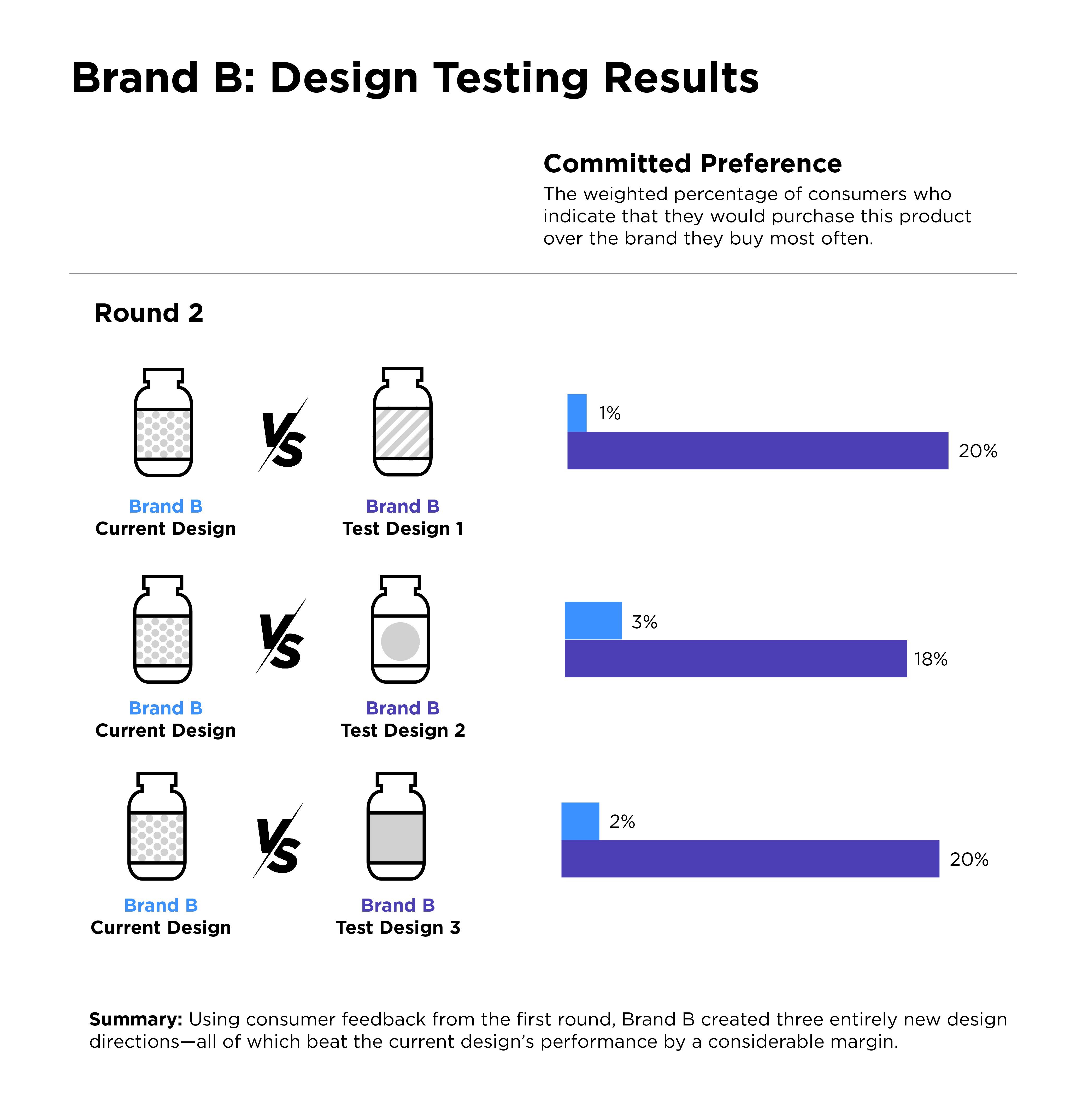
Brand B listened to these consumers and optimized three new test designs, enhancing each with larger, more colorful, and more prominent imagery of fruits and vegetables, which was the opposite of what they’d assumed would be called for at the start. They also used larger fonts and provided more information about what the product included (and what it didn’t). Next, the brand pitted each of these three new options against its current design in a second round of Versus testing.
The results? To say it was a healthy increase in performance would be an understatement. Each of the new concepts bested the current design in committed purchase preference by an average of 17.5 points. (Committed preference refers to the percentage of consumers who say they’d purchase this product over the brand they currently buy.) For context, Designalytics has determined that a shift of just 4 points is predictive of in-market outcomes.

This clearly was another “second-round knockout” for design concepts in Versus—something we are getting used to seeing at Designalytics.
The moral of the story? Testing redesign assumptions early and using consumer feedback to refine concepts represent a powerful one-two punch for brands.
Interested in trying out Versus? For a limited time, we’re offering a special deal: Purchase five Versus match-ups and get two FREE. Don’t miss out – get in touch today.
* In order to maintain client confidentiality in this case, we have blinded the client’s product category.


