As the only provider of syndicated package design data, Designalytics evaluates the top-selling and fastest-growing designs across hundreds of consumer-packaged-goods categories. We measure and analyze a wide range of design performance areas, including visibility, communication, mental availability, element-level diagnostics, and more.
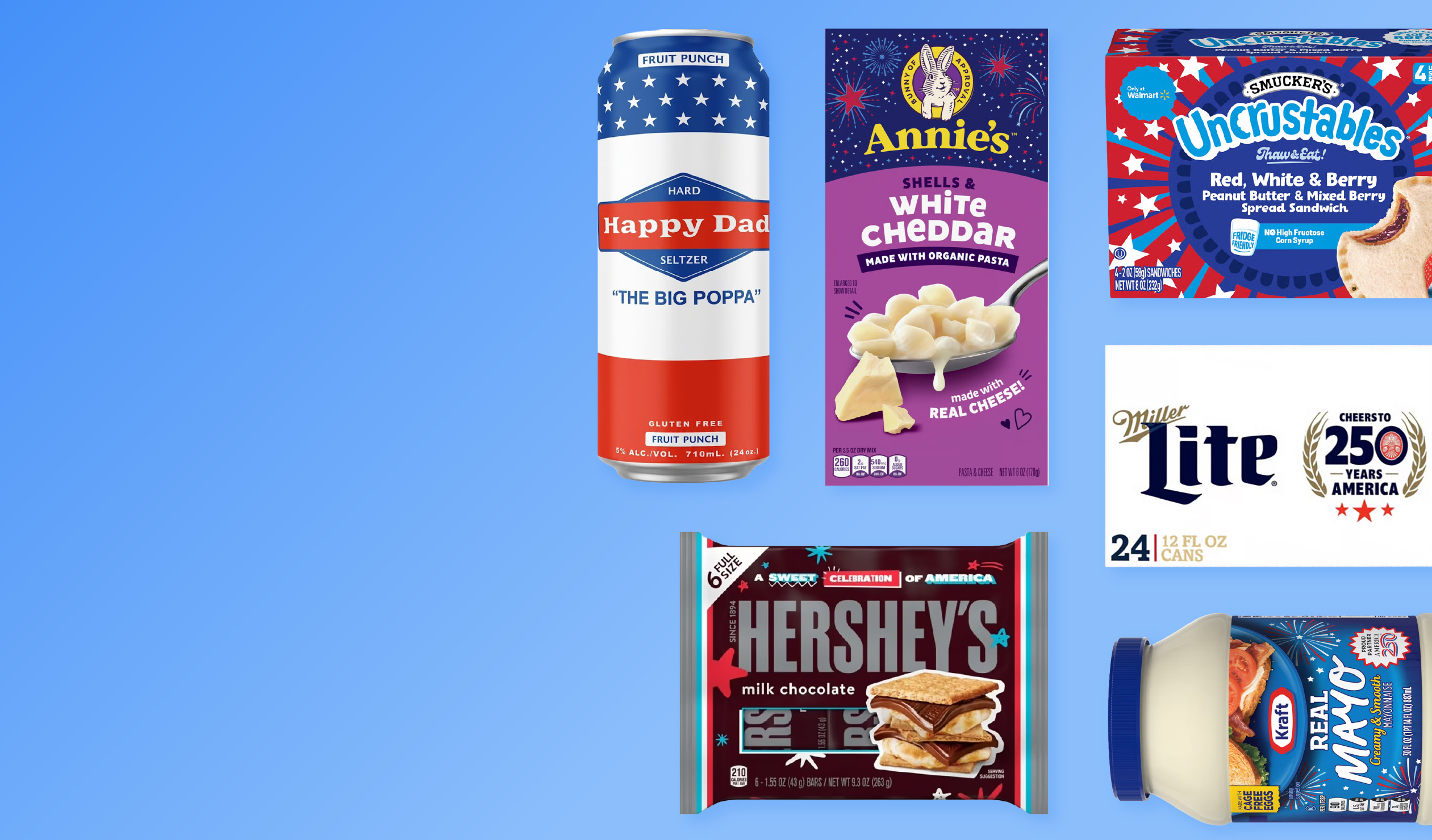
Seasonal packaging can create excitement and allow brands to connect with consumers around shared moments. In this roundup, we highlight six brands whose Fourth of July-inspired packaging earned higher consumer preference by making their products feel more timely and holiday-ready.
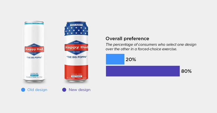
Happy Dad Hard Seltzer
Category: Hard Seltzer
Happy Dad’s limited-edition summer packaging swapped a minimalist can for a bold, stars-and-stripes-inspired design that embraces the season. 80% of consumers preferred the updated design, pointing out that the can felt inviting and party-ready. One noted that it was a “colorful, festive can that I would want to serve to friends,” while another said it would be “great to have out on the table during a BBQ.”
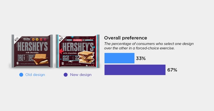
Hershey's Chocolate Bars
Category: Chocolate Candy
Hershey’s leaned into summer traditions with packaging that celebrates one of the season’s most iconic treats. The limited-edition design features a more eye-catching and appetizing s’mores imagery and playful graphics—changes that 67% of consumers approved. One explained that the stacked s’mores looked “more appealing and inviting, especially how the marshmallow drips from the graham crackers.” Other consumers mentioned the holiday design and how it “reminds me of summertime and making s’mores.”
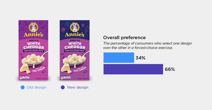
Annie's Macaroni & Cheese
Category: Macaroni & Cheese
66% of consumers chose the limited-edition Annie’s mac and cheese design over the standard design. Consumers said the seasonal fireworks graphics felt more colorful, “fun, and festive for my children.” Others pointed out the darker background at the top of the box, sharing that they preferred the navy color and that it “makes the brand pop more.”
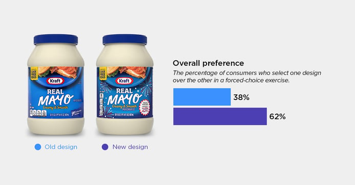
Kraft Real Mayo
Category: Mayonnaise
In time for BBQ season, Kraft gave its standard mayo jar a spark with fireworks graphics and a commemorative “America 250” badge. Consumers said the limited-edition design felt more celebratory and “makes you feel like you’re buying something special.” Another consumer noted that the packaging “fits with the summer season.” The changes resulted in 62% of consumers choosing the seasonal design.
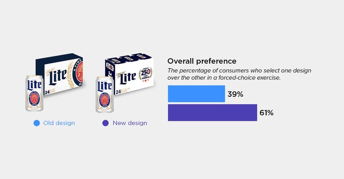
Miller Lite Beer
Category: Beer
For its limited-edition release, Miller Lite replaced one of its visual assets—the “fine pilsner beer” badge—with one honoring America’s 250th anniversary. According to consumers, these graphics made the box feel more special, exclusive, and great for entertaining. 61% of consumers chose the limited-edition design, one consumer explaining that it “feels more celebratory,” while another noted that it “looks like something I wouldn’t mind having out on a table for a party.”
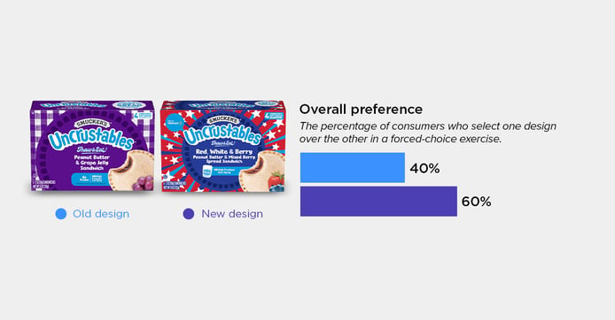
Uncrustables
Category: Frozen Appetizers & Snacks
60% of consumers preferred the seasonal Uncrustables for its mixed berry flavor and dazzling graphics. Consumers said the red-white-and-blue and fireworks design made the product feel celebratory, while the new flavor “feels new and refreshing.” Others shared that “limited edition flavors feel special” and that “themed artwork shows that the company is keeping up with the times.”
Gain a deeper understanding of your category with a Designalytics’ syndicated design research subscription. Our subscription allows you to access in-depth qualitative and quantitative consumer insights, see how your packaging stacks up against competitors, and identify opportunities to gain a competitive edge.


