 Brand: Hershey's
Manufacturer: The Hershey Company
Agency: Soulsight
In general, people don’t like change. Once they’ve found something really good, they stick with it—because it’s hard to imagine it getting any better. This certainly applies to consumers, but it also can apply to brands.
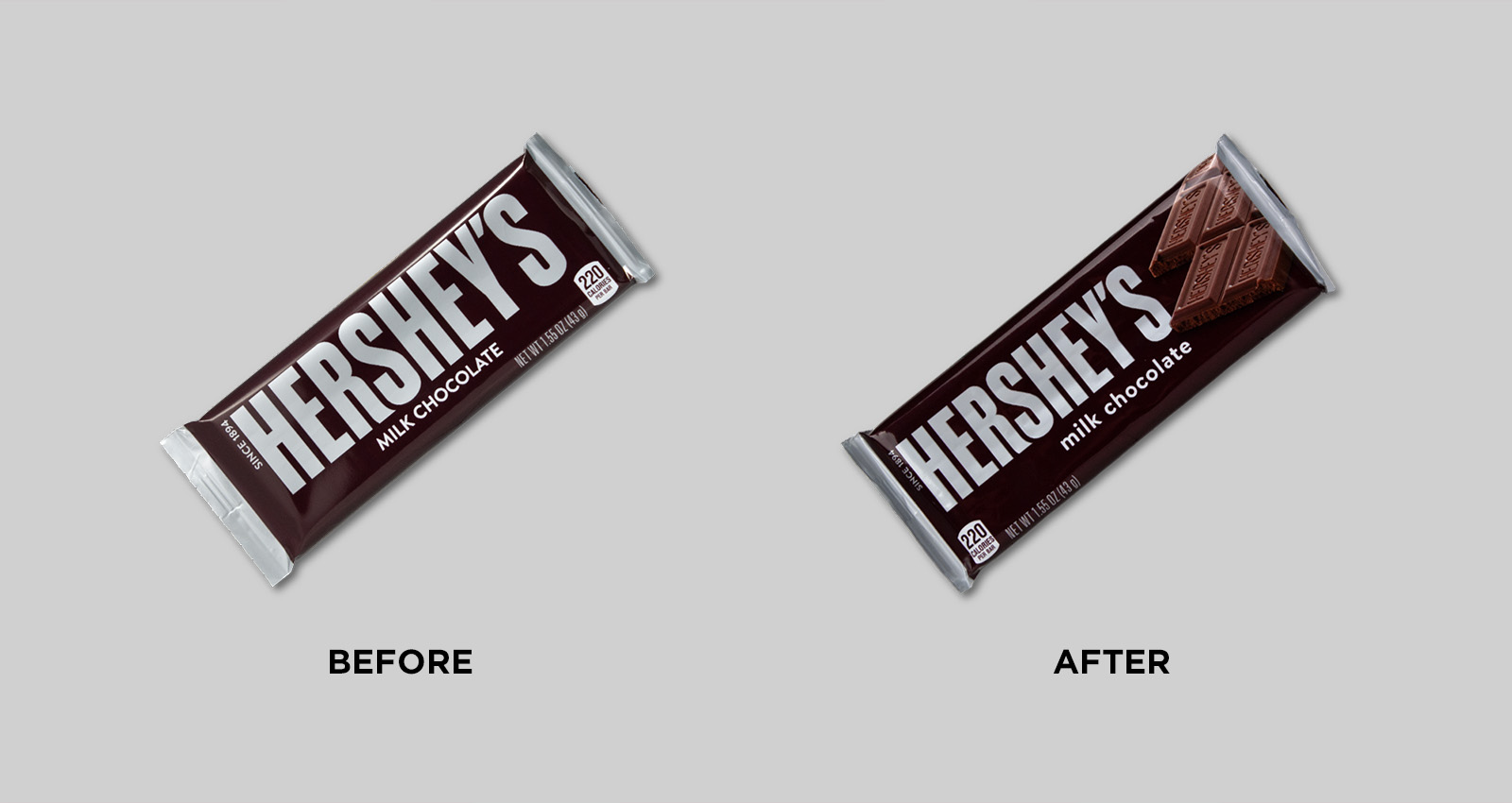
Hershey’s milk chocolate, for example, is an iconic brand that has changed little over the years. How iconic is it? Well, there aren’t many consumer-packaged-goods companies that have a town and a theme park named after them. At more than 120 years old, the brand is an American classic. It’s not surprising, then, that the Hershey’s chocolate bar wrapper had remained essentially the same since 1951. Why change what’s working, right?
Turns out you can improve upon a classic.
The Hershey’s team understood that even the most beloved brands aren’t immune to changing times, and they had noticed a recent shift in the marketplace that couldn’t be ignored. “In the last five to seven years, there's been more photorealism in chocolate,” said Tracy Malkowski, director of strategic design at The Hershey Company. “It started with premium brands like Godiva, but it’s shifted into the everyday candy space as well. Everyone is trying to reach a level of ‘beautiful food.’”
"Everyone is trying to reach a level of 'beautiful food.'"
A recent redesign of another candy brand in The Hershey Company stable, Reese’s, had indicated that focusing on this could offer big benefits. “We had done quite a bit of work on the Reese's brand, primarily to increase appetite appeal, and the initial results were positive,” stated Malkowski. “So we really wanted to revitalize our namesake brand in the same way.
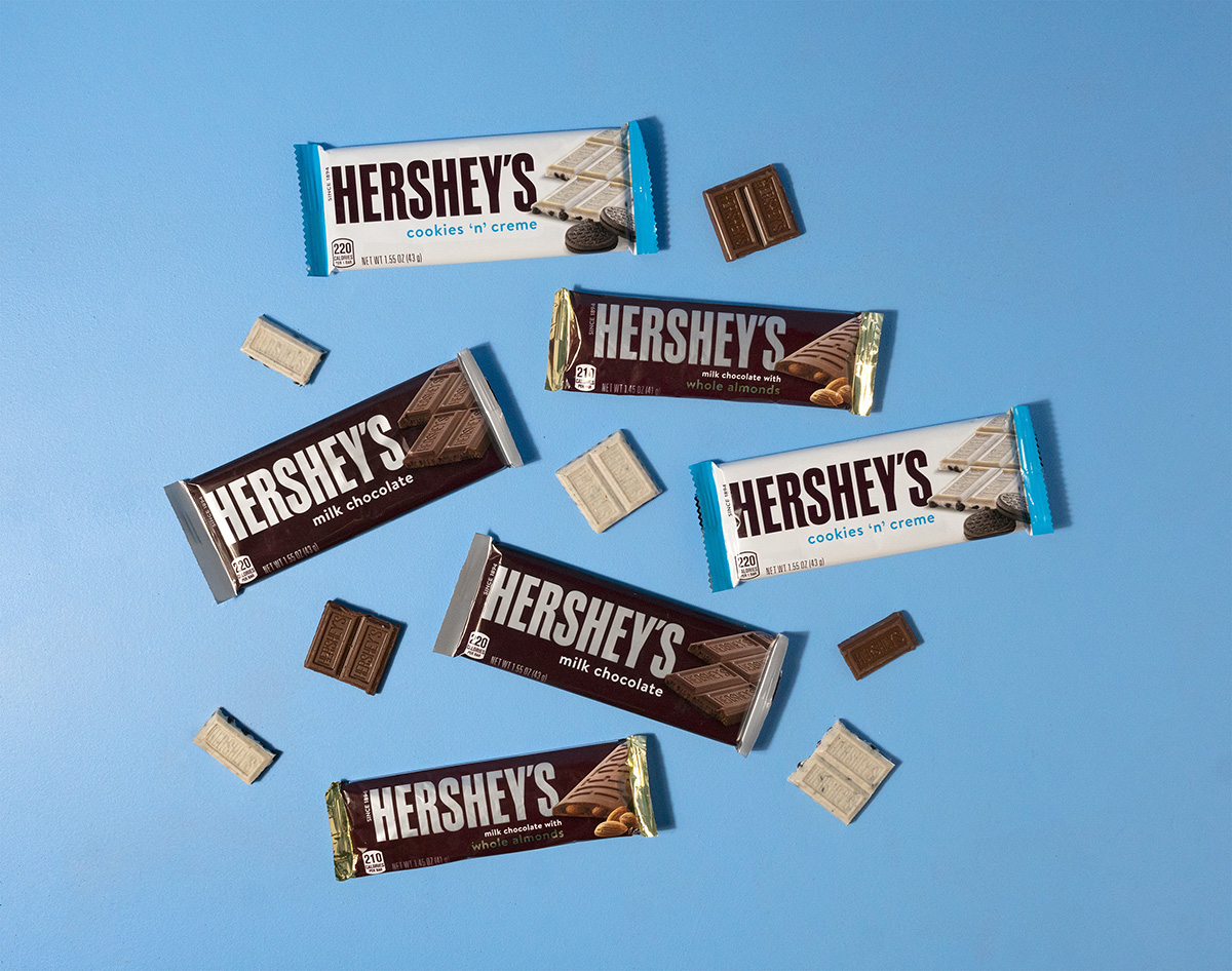
The redesign would also provide an opportunity to create a more cohesive design system across different sub-brands (such as Hershey’s Almond, Hershey’s Cookies & Creme, etc.) to aid in line navigation. As a first step, the brand conducted some distinctive-assets research prior to the redesign—and wisely included their branding and design agency, Soulsight, in that process. Neither organization was taking anything for granted. “No assumptions were made,” said Malkowski. “There was a lot of rigor in the process prior to and during the creative brief process.“
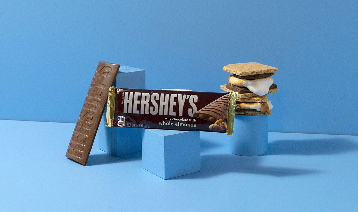
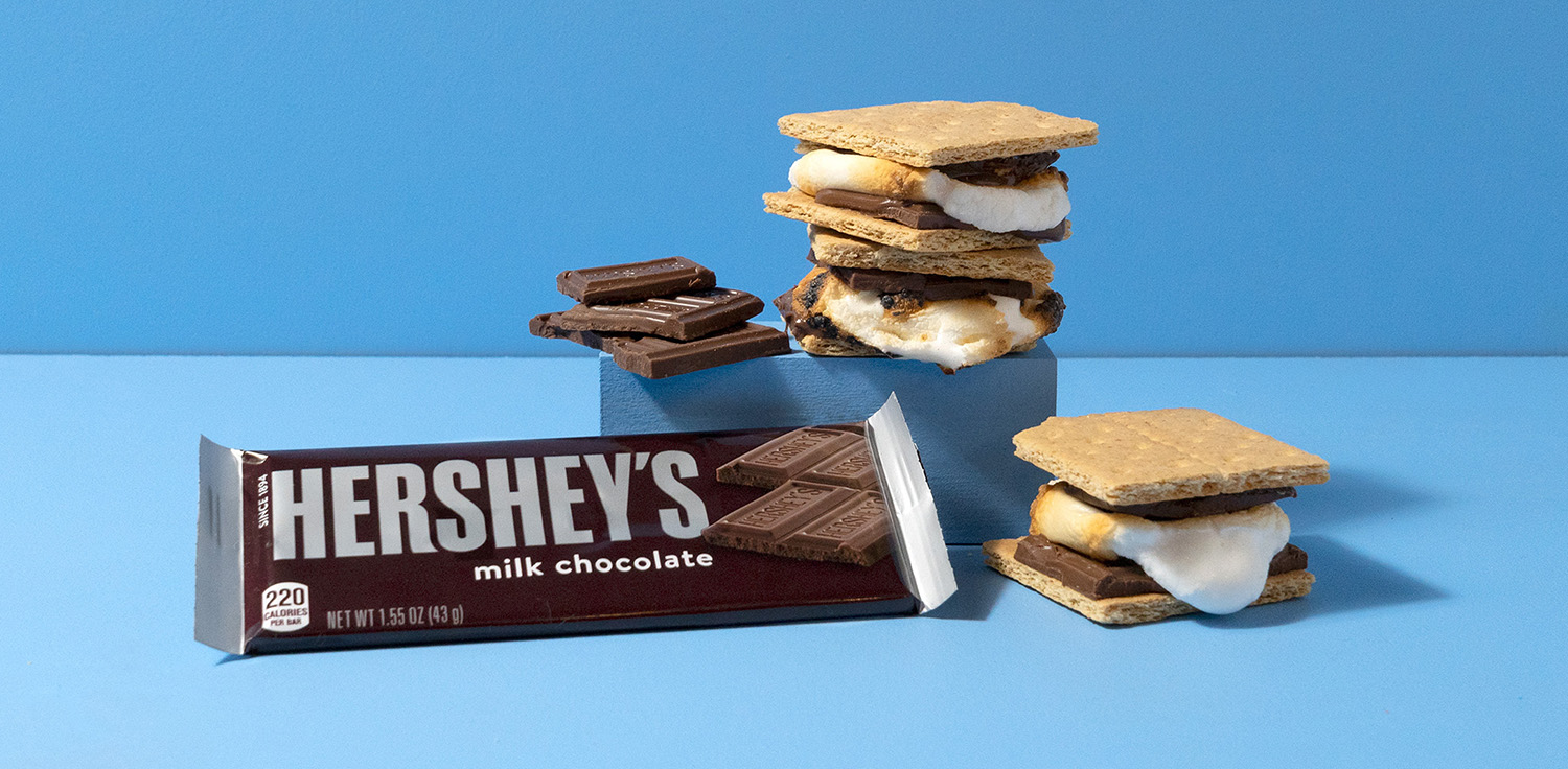
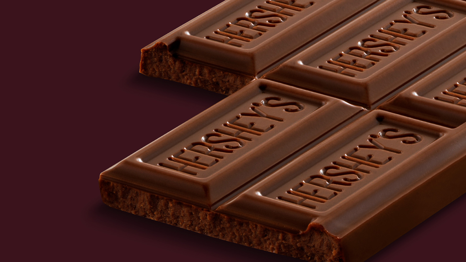
The research proved extremely helpful to the agency as it considered how to approach the project. “It showed us that some parts of the brand were very meaningful to consumers,” said Rietje Becker, creative director at Soulsight. “The pips [the rectangular, logo-embossed pieces that make up the chocolate bar], for example, were a major asset to the brand. So we thought: what better way to introduce that appetite appeal than through an asset that consumers already recognize?”
"The pips [the rectangular, logo-embossed pieces that make up the chocolate bar]... were a major asset to the brand. So we thought: what better way to introduce that appetite appeal than through an asset that consumers already recognize?"
As the design process began, Malkowski and her team were understandably cautious when considering how far to go with the new look. “I've worked on historical brands my entire career, and I've never dealt with consumers who were this attached to a brand,” noted Malkowski.
But the Hershey’s team was open to seeing a range of approaches, and Soulsight wanted to stretch the brand’s comfort zone. “We looked at a wide variety of concepts,” said Becker. “I think it's always important to push and pull those assets. Few have as many ownable assets as the Hershey’s brand does, so the question becomes: What do you emphasize, and what do you deprioritize? And at what point does it stop feeling like the Hershey's chocolate bar consumers know and love?”
The agency presented a number of options, including ones with images of flowing, melted chocolate, and others that added another primary color to the silver-and-munsell-maroon palette (the latter is the dominant color, and happens to be proprietary to Hershey’s brand). Additional variations captured the push-and-pull approach Becker espoused. “There were a couple that were kind of extreme,” Malkowski said with a chuckle.
The ultimate choice for the design included some improvements that helped create the cohesive design system that was a stated goal for the project. For example, the “fins”—those jagged-edged sides to the bar—had distinct colors that corresponded to different flavors. “It’s all about consistency,” said Becker. “It was important for us that consumers could easily find the right product. This color system became a helpful piece of communication to help them do that.”
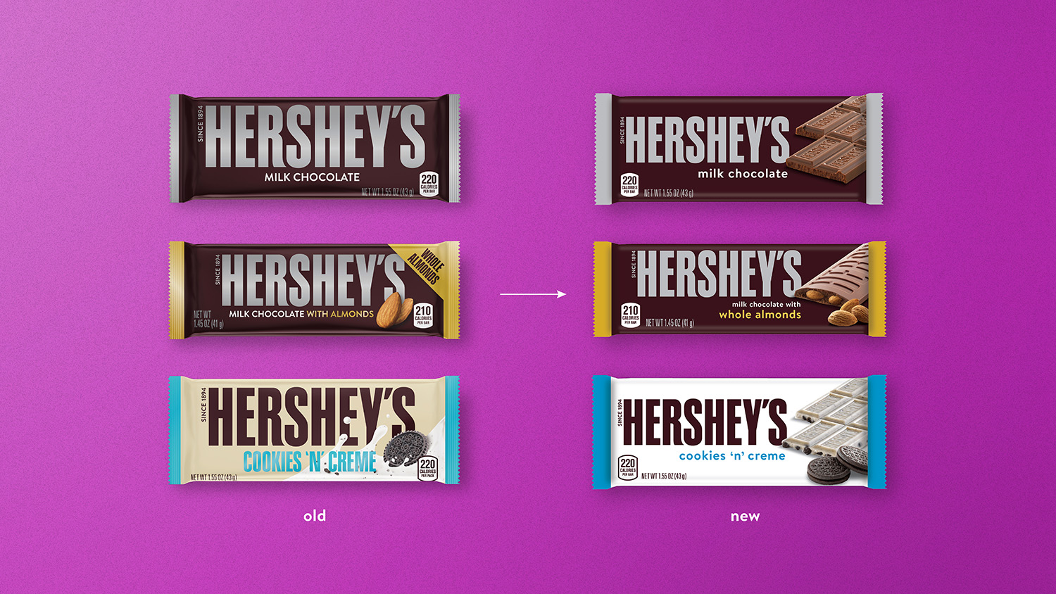
The most significant change, though, was the star of the show: the addition of the chocolate bar itself. The new package design featured a sizable, photorealistic image of the delicious product within—a consistently successful tactic across food and beverage categories—that showcased the texture of the pips consumers loved so much. “Getting a really great representation of the texture was so important,” said Laurel Anderson, design manager at The Hershey Company. “I think it was a really critical piece with the photography, so we spent a lot of time getting that right.”
Getting it right, it turned out, also meant working with a chocolate stylist. “There are a few people out there who are actually ‘famous’ in the chocolate world as stylists,” commented Becker. “It’s amazing how they’re able to get that exact cut just right for a photo shoot. It’s really an impressive skill.”
To make room for those scrumptious rectangular pips, the brand downsized its logo. It also updated the typeface for describing the variety (e.g., “milk chocolate,”) choosing a softer, friendlier font and lowercase letters. “The logo had to get smaller to accommodate the imagery, but that was a trade-off we were willing to make,” Becker explained. “It helped that we were accentuating the chocolate itself, which we already know consumers love.”
When the new design launched, it became clear that sometimes people really do like change, provided it focuses on what really matters to them. In a head-to-head test of the old and new designs conducted by Designalytics, consumers vastly preferred the new design to the old one—with 72% indicating they’d prefer to purchase the updated version, and only 28% sticking with the previous design. Moreover, the chocolate imagery was the most resonant element of the new design, whereas the logo proved most popular in the prior version.
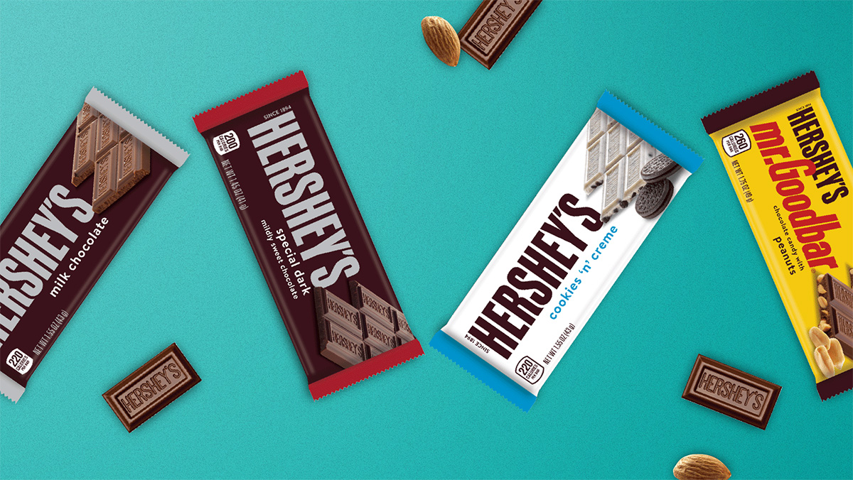
Consumers also liked the fact that they could “see what they’re getting,” which was intended by Soulsight and the Hershey’s brand team—and actually served more than one purpose. “In the new design, you're not only seeing the texture of the chocolate, you're also seeing if there are inclusions, like almonds, for example,” said Becker. “So it's driving appetite appeal, but it's also driving distinction between flavors and sub-brands in the portfolio.”
The sweetest result of the redesign, however, was its impact on the bottom line. During the nine months following the redesign, sales increased by 9.1% compared to the same period during the prior year.1 The brand felt that the in-market success was largely attributable to the design. “We do believe that the design—in and of itself—was successful in helping us achieve that goal,” commented Malkowski.
During the nine months following the redesign, sales increased by 9.1% compared to the same period during the prior year.
To Anderson, the design’s success stemmed from a sense of appreciation and stewardship that the Hershey’s team and Soulsight shared from the start. “I think when you're going into something like this with such an iconic brand, you’re not necessarily there to ‘shake things up.’ You have to start with a very healthy respect for your brand and what it represents to consumers.”
Becker concurred. “We weren’t reinventing the brand,” she said. “We were just finding a new way to honor it.”
1 IRI, total U.S., multi-outlet, Q2-Q4 2020 vs. year ago.