“Tastes great.”
When it comes to the food and beverage categories in consumer-packaged-goods (CPG), those are two of the most important words consumers can ascribe to your brand. In fact, “tastes great” consistently tops the list for category decision drivers—attributes that drive purchase in a given category—according to Designalytics’ cross-category database.
Before that purchase decision is made, though, consumers can’t rely on their sense of taste—they only have sight. Which is why many food and beverage manufacturers have been employing larger, more detailed food photography on their packaging.
When consumers are asked to evaluate individual aspects of package designs, visuals related to taste and scent are consistently among the most engaging and resonant elements. Quite simply, people love imagery that stimulates the senses—which is why savvy brands have modified their package designs to crank up the taste appeal.
Here are some recent examples of brands that won big with this approach:
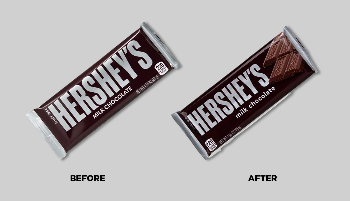
Hershey
The brand’s minimalist brown wrapper had remained the same since 1951, before the candy legend recently rolled out updated packaging. The new design includes a sizable, photorealistic image of the delicious product within—notably, the scrumptious squares themselves, embossed with “Hershey’s.”
Consumers vastly preferred the new design to the old one—with 72% indicating they’d prefer to purchase the updated version, and only 28% sticking with the classic design.
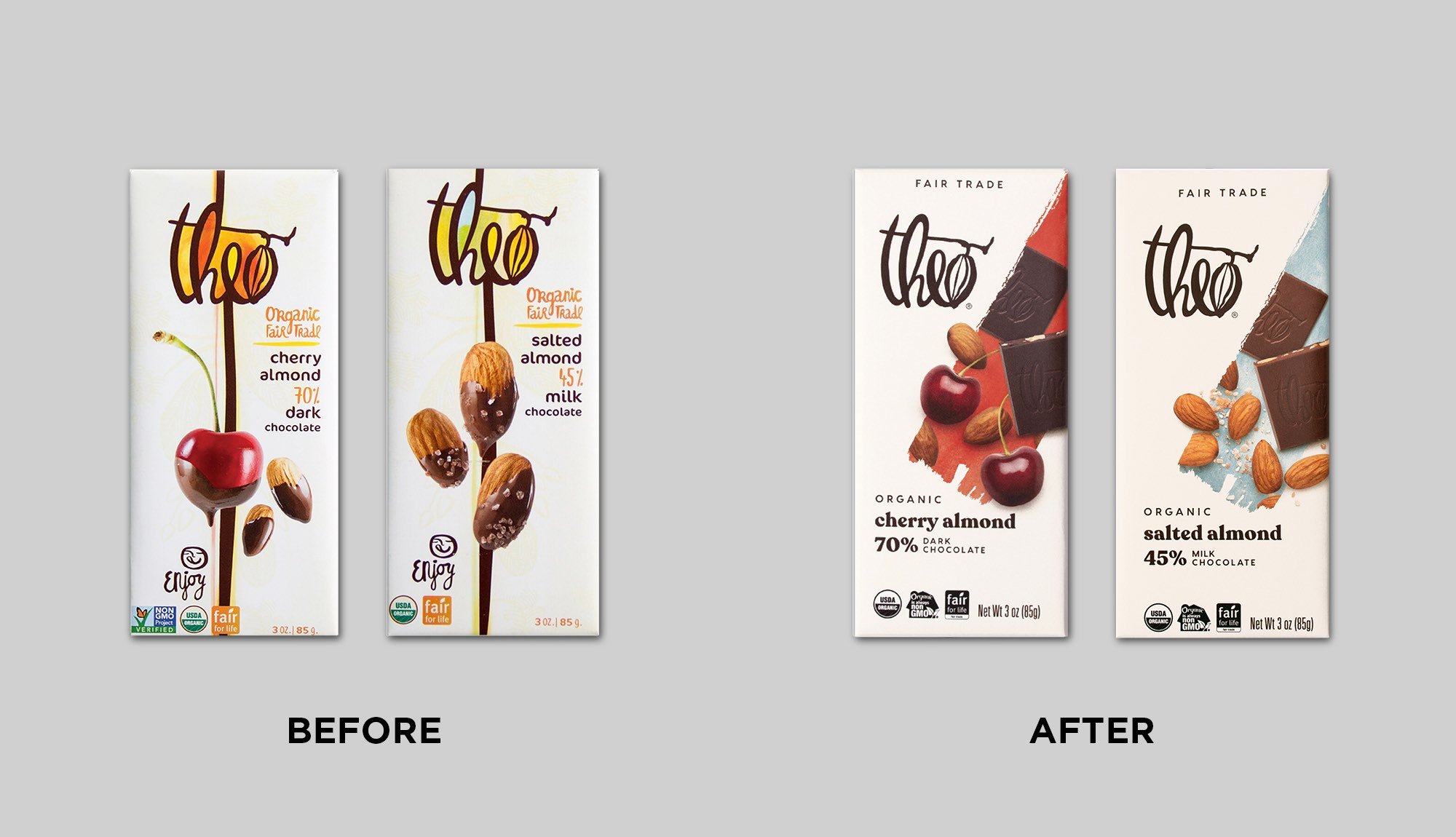
Theo Chocolate
When evolving their package design, Theo Chocolate prioritized taste appeal— they wanted clear and apparent flavor indications, executed thoughtfully and deliberately. The new design’s photography incorporated chocolate squares, showcasing the texture and giving consumers a preview of what they could expect upon unwrapping the bar. The delicious imagery delivered: the brand saw a sweet 16-point bump (58% to 42%) in purchase preference with the new design.
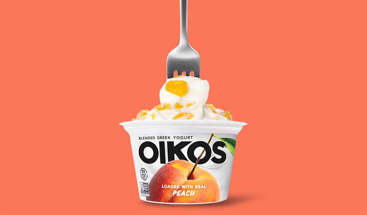
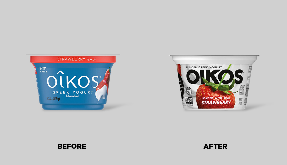
Oikos
It doesn’t get much more flavor-forward than Oikos’ redesign. The brand tempted consumers by putting the fruit front-and-center, to the point of partially obscuring their own logo (a very bold move in the design world). And oh, how sweet this change was: A full 78% of consumers preferred the new design over the old.
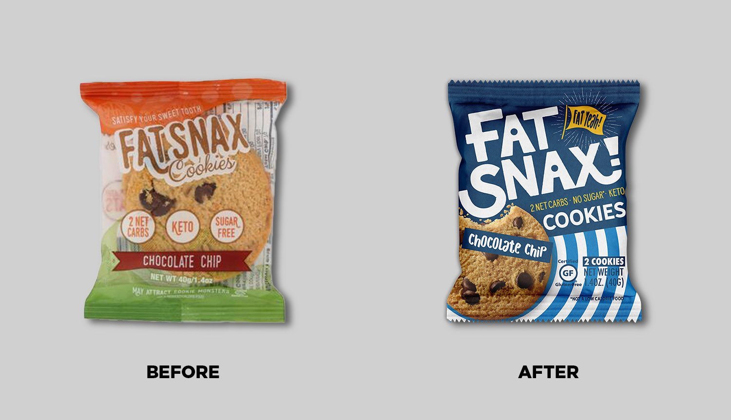
Fat Snax
This cheeky, unapologetic cookie brand was already a hit with keto-minded consumers. But with their bold redesign, they moved from transparent packaging (where you can't control the way the cookie crumbles) to taste-forward photography with the idea of attracting a broader audience. It paid off—consumers said they’d prefer to purchase the new version over the old by a margin of 60% - 40%.
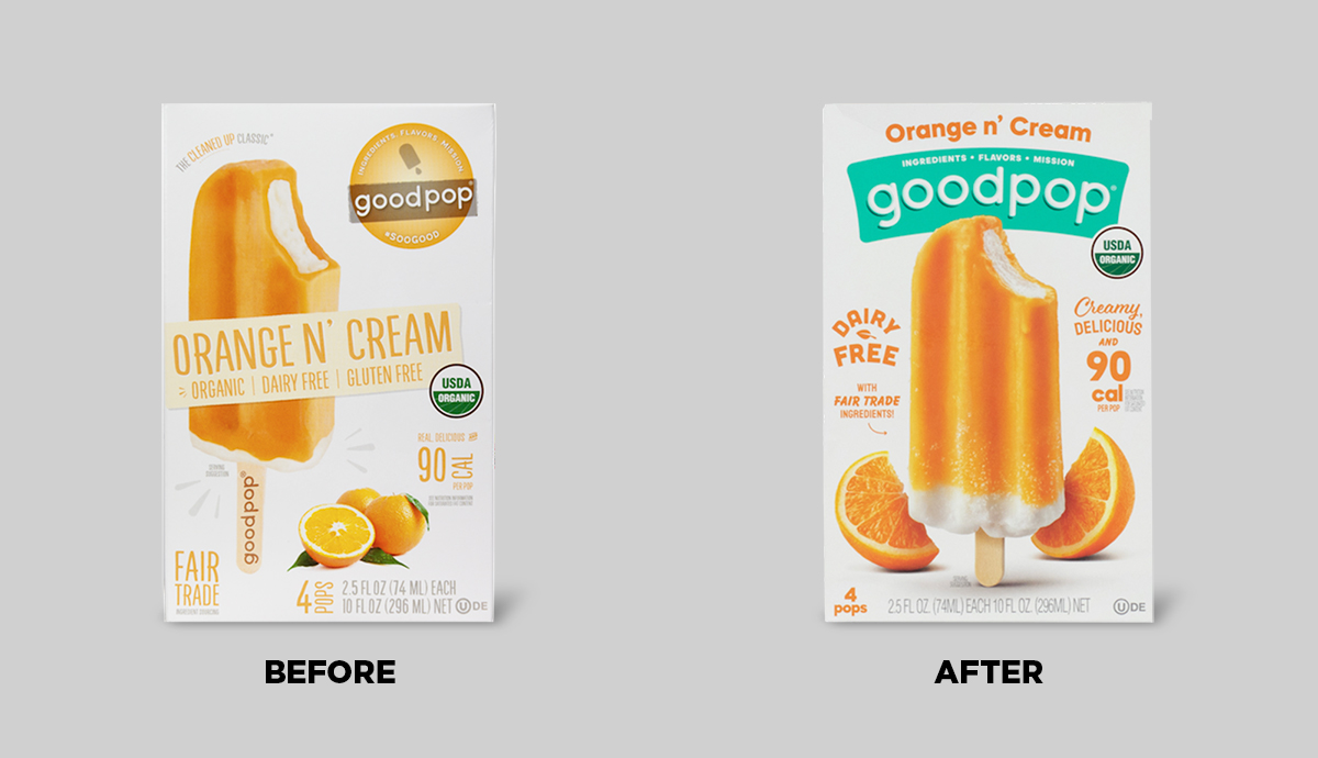
GoodPop
The mouthwatering imagery on this challenger brand’s package really, well… pops. In addition to a number of other upgrades, GoodPop's new design features upgraded delectable product and flavor imagery.
And this chilly treat’s design is undeniably hot stuff as far as consumers are concerned. A quantitative evaluation affirmed that 73% of category buyers preferred the new design for purchase to the prior design.
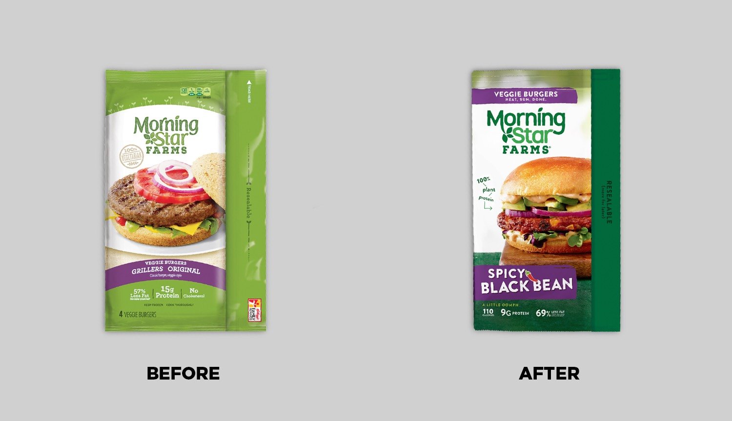
MorningStar Farms
Already highly respected as an OG of the plant-based meat category, MorningStar Farms wanted to increase its taste appeal in an increasingly flavor-focused space. The punched-up product photography was very taste-forward… and well received by consumers. They preferred the new design to the old by a three-to-one margin, according to Designalytics’ evaluation.