
As the only provider of syndicated package design data, Designalytics evaluates the top-selling and fastest-growing designs across hundreds of consumer-packaged-goods categories. We measure and analyze a wide range of design performance areas, including visibility, communication, mental availability, element-level diagnostics, and more.
In 2025, the International Food Information Council reported that 70% of Americans snack at least once a day, and 62% are replacing traditional meals with snacks or smaller meals. As snacks take on a bigger role in consumers’ daily routines, brands need their designs to work harder than ever. These five snack redesigns demonstrate how strategic changes to sensory cues, messaging, and color can drive stronger consumer preference.
No Man's Land Beef Jerky
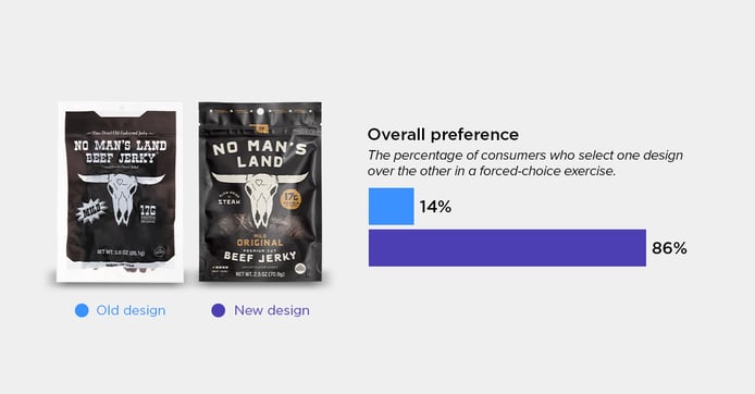
The updated design gave consumers something the previous package didn’t: a look at what they were actually buying. The redesign included a window that let consumers see the jerky itself, while using contrasting gold accents to highlight important information. Together, those changes made the package feel more complete. One consumer explained, “It still feels rustic without making me feel like I’m missing something.” Others said that the viewing window was useful for “assessing product quality” and noted that the gold “looks more premium-looking.” The result was a dominant 86% consumer preference for the new design.
New Primal Snack Mates Meat Sticks
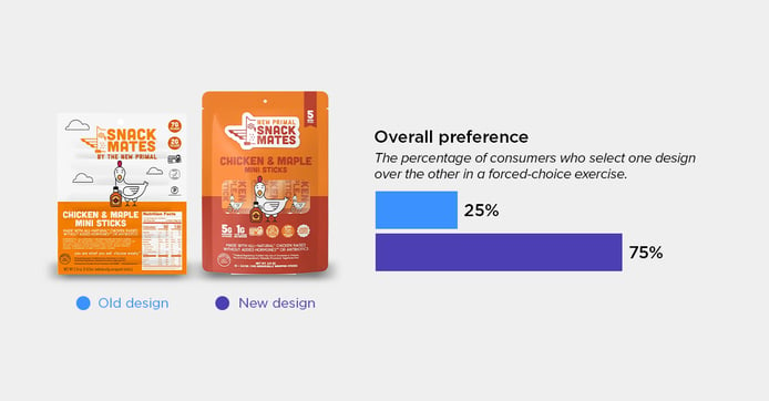
By removing the large white nutrition panel from the front, New Primal gave its design more room to work—and won over 75% of consumers. A bold orange-and-red color scheme made the package “easier to find on the shelf,” while a clear window gave consumers a view of the product inside. One consumer said the previous package “looks like the back instead of the front,” and others appreciated that the new version was “not as cluttered” and “looks more fun and enticing.”
Takis Kettlez Potato Chips
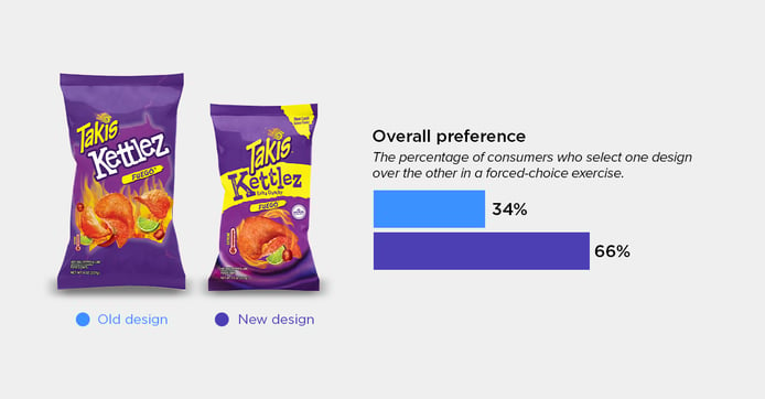
Takis’ newest Kettlez redesign communicated sensory cues better, and it paid off. Larger, more detailed product imagery featured the chip texture, while the added “extra crunchy” gave consumers a sense of the experience they could expect. Many consumers also mentioned that the added yellow band helped key details stand out against the purple package and felt “more true to the brand.” Even with a smaller package weight, 66% of consumers preferred the new design over the previous. One consumer summed it up simply: “The flavor and crunchiness of the product seemed clearer.”
Rolo Chocolate Candy
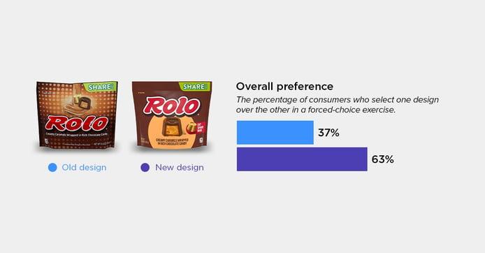
Rolo simplified the packaging for its share pack to focus on what’s important: the candy. The redesign swapped the “distracting” dot pattern for a solid background and made the candy larger, centered, and “more decadent.” One consumer said the close-up image “just looks more delicious,” while another liked that the picture was “exactly what’s in the package.” By giving the product more attention, the new design made the candy feel more appealing, helping it earn 63% consumer preference.
Jack Link's Beef Jerky
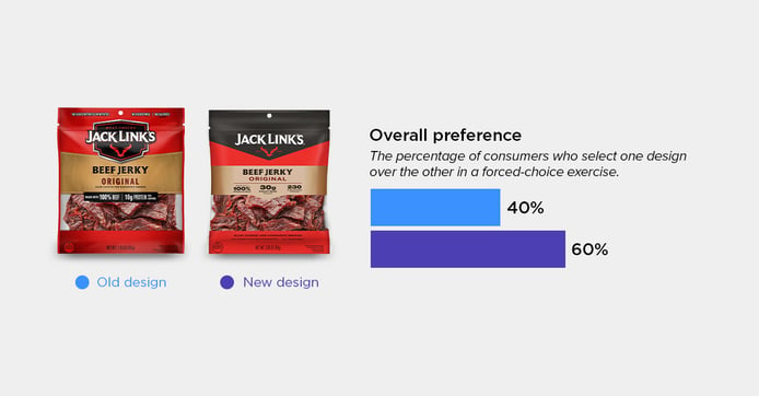
With its latest redesign, Jack Link’s earned the approval of 60% of consumers largely by making its nutritional value easier to understand. The brand shifted from a smaller per-serving focus to more prominent per-bag callouts, including a stronger emphasis on protein and calories. Bold, black fonts gave those numbers more visual weight and made the package feel more premium. One consumer appreciated that “the full calorie and protein amount for the bag” was shown on the front, while another said the “black label makes it appear more high quality.”
Want to see what’s working in your category beyond these five examples? Designalytics’ syndicated design research gives brands and agencies access to consumer insights across thousands of CPG redesigns, helping teams make smarter design decisions with real consumer data.