 Brand: Nuun
Manufacturer: Nestlé Health Science
Agency: Nestlé Health Science
It’s safe to say that hydration enhancers have been having a moment lately. The category, once primarily the domain of athletes, has skyrocketed in popularity as more consumers become focused on this key element of healthy living.
As one of the originators of the category, Nuun has certainly benefited from this meteoric ascent. Founded in 2004, Nuun built a loyal following among runners and fitness enthusiasts long before enhanced hydration became mainstream.
The evolution of the category had made it clear that the target market had expanded, though. “We have a lot of tried-and-true loyalists,” said Valerie Ruppel, brand manager for Nuun. “So we asked ourselves what we could do to start growing the brand.”
When Nuun was acquired by Nestlé Health Science in 2021, such growth became an imperative. The company’s leadership saw huge potential in the supplement and lifestyle space—they had purchased Vital Proteins and Orgain around the same time—and the nascent hydration-enhancer category was a part of its strategy.
A new design would be essential to compete. At the time, Liquid I.V. was beginning to transform the space, and brands like LMNT and Ultima were starting to establish themselves. “The redesign happened at a critical moment when hydration products were really starting to skyrocket,” said Ruppel. In order to stake their claim in the now-exploding category (of which it had been a pioneer), Nuun needed to be smart and move quickly.
The creative brief was unequivocal about one thing: convey hydration across the entire portfolio. “Hydration was the big push,” recalled Josh Bell, senior creative director and strategist at Nestlé Health Science. “It was clear that we needed to cue that in a much more aggressive way to create better consumer understanding at shelf.”
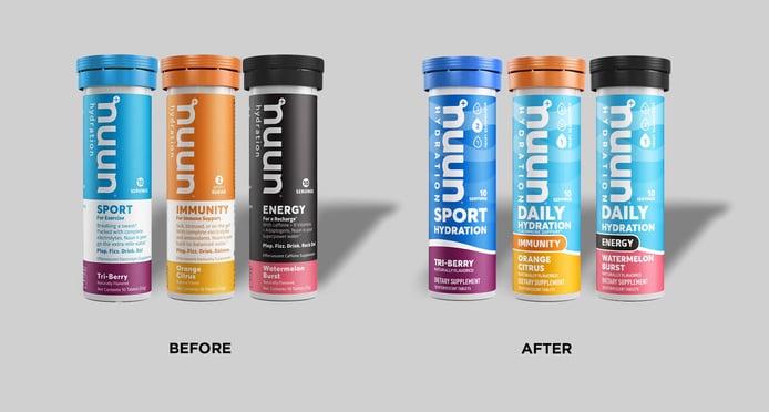
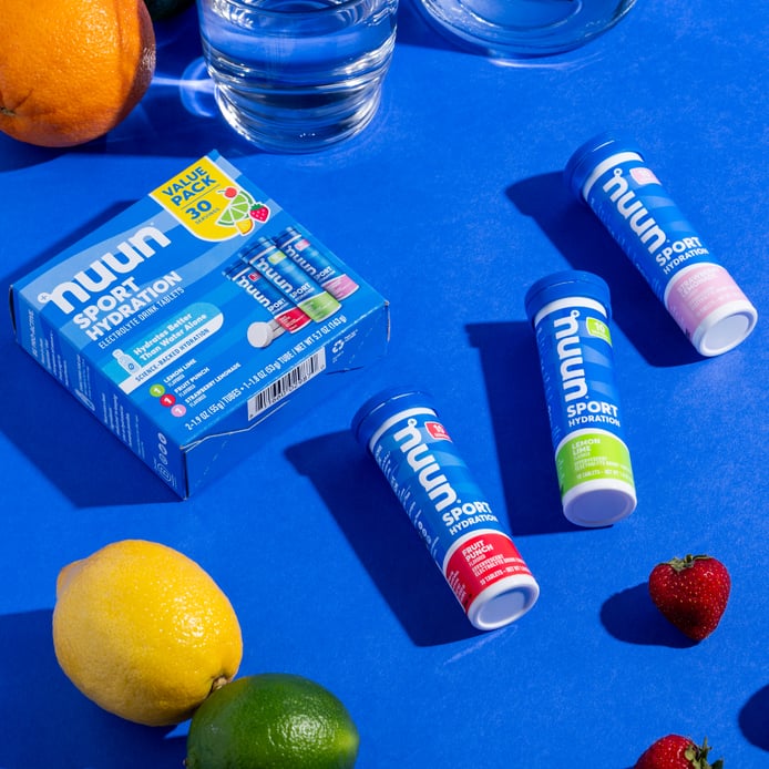
Given the expanding product set, it was also essential to create an architecture to handle the current SKUs, as well as any future ones, within a navigable and engaging portfolio. There was a wealth of products to consider beneath the two main lines, Sport and Daily: Energy, Immunity, Vitamin, with “plus-ups” and different flavors for each.
The Nestlé Health Science creative team explored quite a few concepts, aided by Bell’s keen sense of the brand: how it had evolved to this point, and what elements were central to its DNA. It became evident that his team, rather than an outside agency, was suited for the task of revitalizing the packaging. “Our in-house creative team did campaign work, new product launches, and had package design experience,” noted Bell. “So we had the muscle memory to make it happen.”
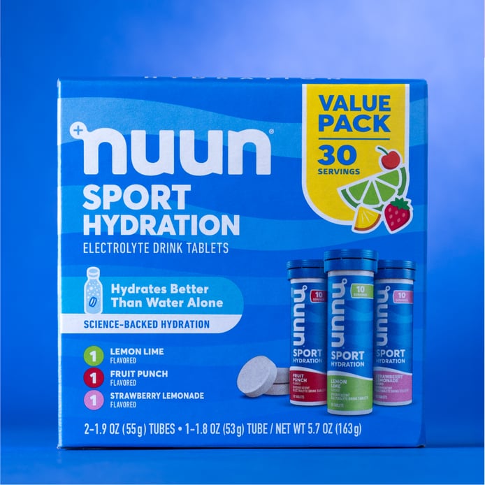
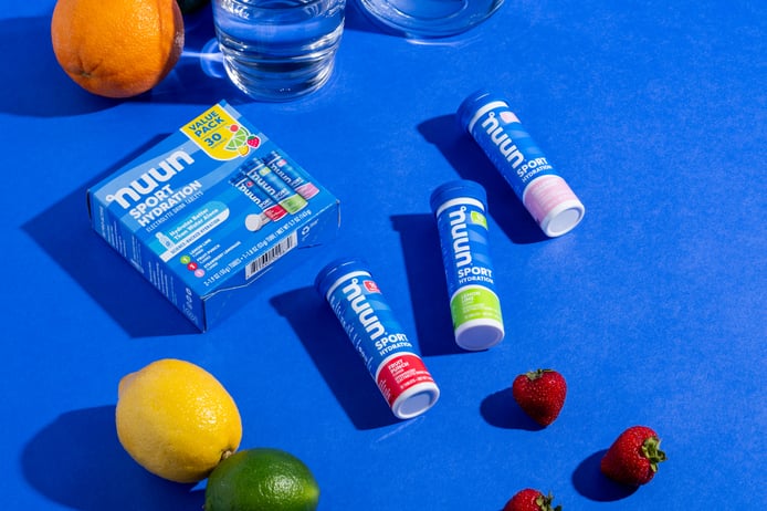
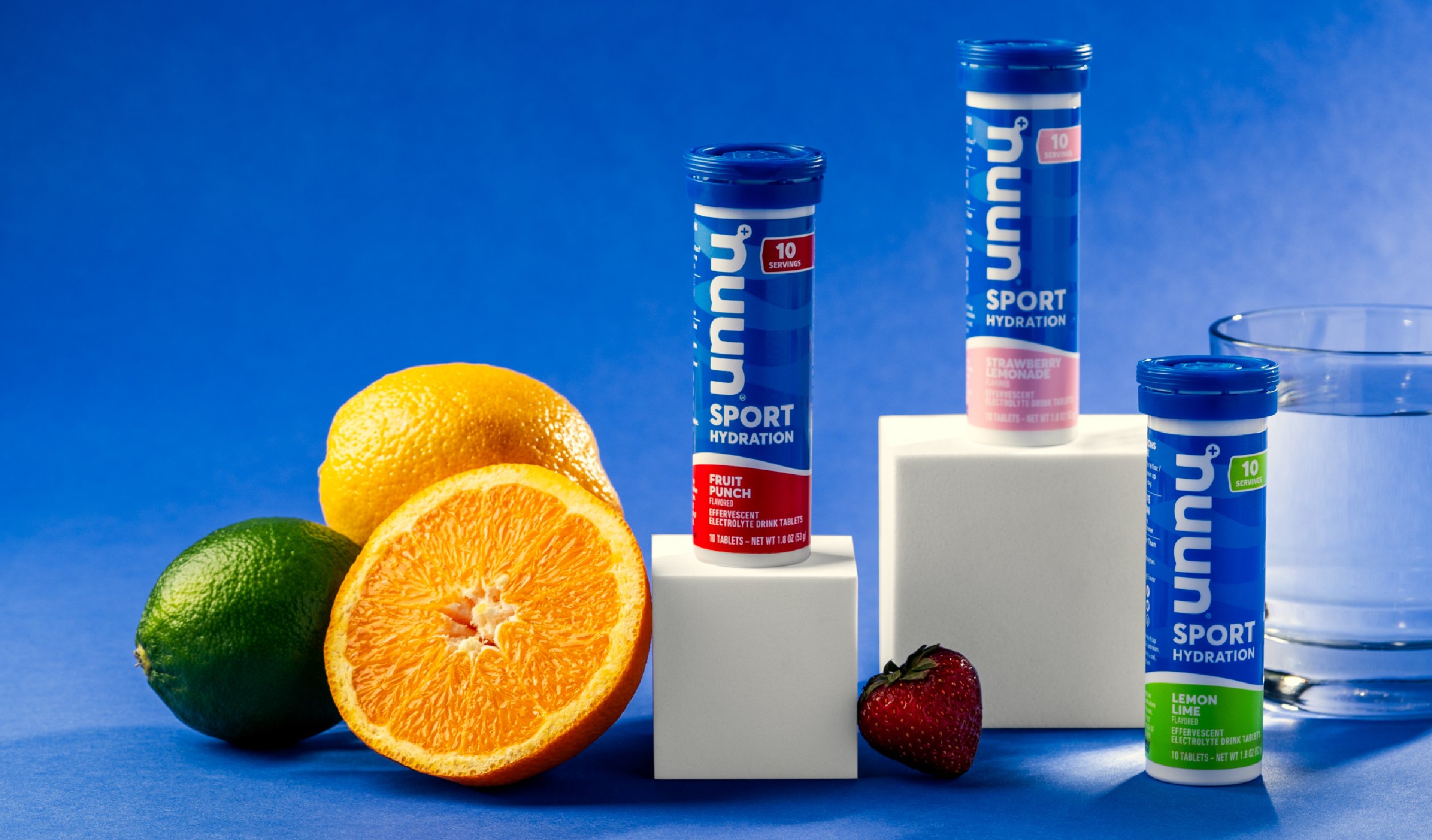
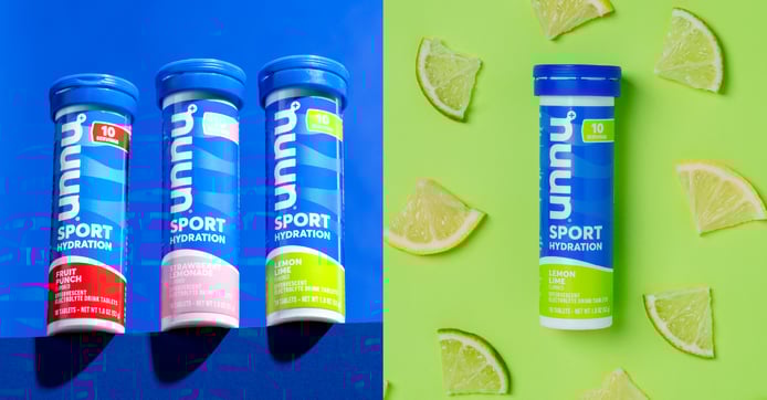
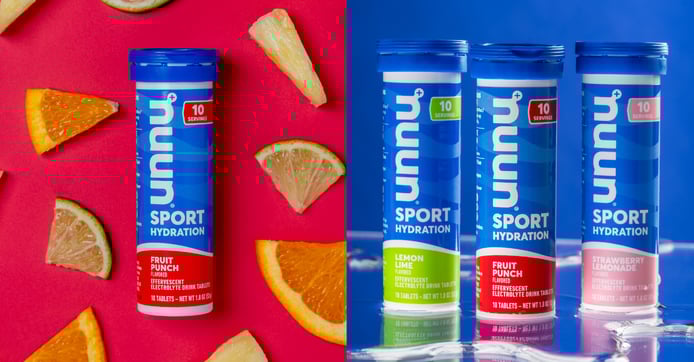
To hammer home Nuun’s hydration credentials, Bell and his team went with a less-but-larger approach. The word “hydration” features prominently on all SKUs, both after the brand name and on the lower-half of the tube. It is now virtually impossible to look at the package without knowing its key benefit. To make room, the brand had to make some changes, including cutting the storytelling copy from the previous iteration.
“In 2019, that copy was very on brand, because it felt sort of cheeky,” Bell said. “But we thought the category was taking off to the point that just the word hydration—and a functional addition like immunity or energy, for example—would do enough communicating for the front of the pack.”
Words weren’t enough, though. Nuun also wanted to use color to instantly communicate the product’s primary purpose. The previous design took a multi-color approach focusing on signaling the bonus benefits of different varieties. “We had been leaning really heavily into normative semiotics across categories with the prior packaging,” Bell noted. “For example, the immune space is orange, the energy space is black, and so forth.”
This approach still made sense for consumers to find specific sublines, but the most important element—hydration—wasn’t coming through as clearly. The solution? The main color for the packaging would now be predominantly blue, and each subline would be clearly identified by an additional shade familiar to consumers. “The blue signals hydration, and the accent colors help the sublines stand out,” Bell stated.
“The blue signals hydration, and the accent colors help the sublines stand out.”
There were also discussions about removing certain claims and certifications. For instance, the category had evolved to the point where labeling the product as organic and non-GMO was unnecessary, as research had indicated that consumers assumed all products in the category fit these criteria. It was, as Bell put it, “table stakes.”
Another claim that was less important than expected was sugar content. “We saw some playback in the research that consumers assumed our products were sugar-free or low in sugar,” he said. The category had established an expectation, so the brand didn’t need to include that on the front of the pack.
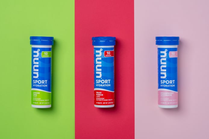
As it turned out, there was a perfect candidate to replace sugar content: number of servings. Nuun’s packaging is unique among its competitive set—a tube of effervescent tablets, rather than a box of powder packets—and some consumers wondered if the full package included only one serving. “I've seen people pour all 10 tablets into a glass of water,” Bell said. “That’s an issue. So it was clear that the number of servings was more important than the sugar content.”
The sales numbers rose as well—7.9% in the six months after the launch compared to the same period the prior year.
Designalytics’ testing of the new design showed that consumers preferred it over the old look by an overwhelming margin: 83% to 17%. Not surprisingly, the sales numbers rose as well—7.9% in the six months after the launch compared to the same period the prior year. This is all the more impressive because the brand significantly outpaced the category growth rate of 4.6% during that time.
Ruppel believes the new design was successful in part because the Nuun product line is more navigable. “The new look made it a lot easier for consumers to pick their favorite products,” she said. In addition, anecdotal evidence has indicated that repeat purchases have increased after the redesign. “We have seen a lot more brand lovers coming back to certain sublines just because it was easier for them to shop,” she added.
The brand’s new look ensured consumers could easily find their chosen flavor and subline easily.
Bell agreed, and noted that the brand’s strategic approach to the design made an immense difference and left the brand well-positioned for further growth. He also couldn’t help but be proud of the way it turned out. “To throw some really official design jargon around,” he said with a playful smile. “The packaging just looks cuter, you know?