In a recent post, we reviewed strategies for designing packaging that have been successful at capturing consumers' initial attention—a requirement for standing out on crowded retail shelves amid competitors that are becoming increasingly design-savvy. That said, once you've made eye contact, prolonging the look can provide a major competitive advantage. Consumers are only willing to spend a short period of time scanning store shelves, so holding attention effectively "runs the clock" on competitors, narrowing the scope of shoppers' consideration sets.
We've compiled a few visual strategies that brands have used successfully to command consumers' attention for longer periods of time.* Designalytics' data is based on eye-tracking technology, which measures the length of time that consumers gaze at packages in a competitive lineup during an initial exposure period. Hundreds of consumers evaluate each category.
-
Brand or design novelty
Brand or design novelty can pay big dividends when it comes to holding consumers' attention.
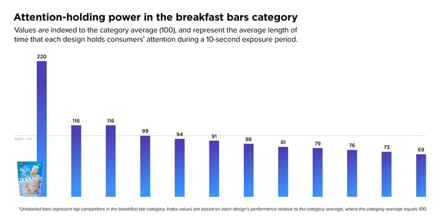
Take, for example, Rice Krispies Poppers. Consumers looked at Poppers for more than twice the amount of time they looked at the typical package in the same category. This product represents both brand and design novelty; it's a new sub-brand in the breakfast snack bar category and it comes in a pouch format—a rare occurrence in this category. Moreover, the product as pictured on the package is unique among the competitive set: square treats that look nothing like the bar or biscuit format that consumers have come to expect.
-
Design intricacy or intrigue
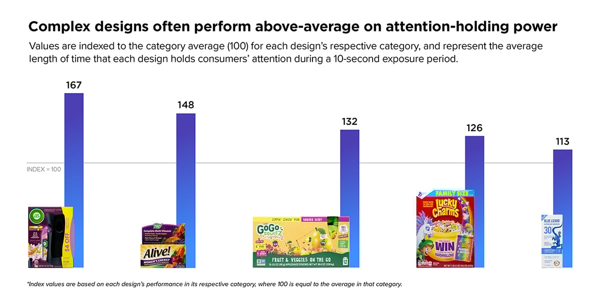
In many cases, the more intriguing or intricate the packaging design, the more apt consumers are to linger on your brand. For example, Air Wick Freshmatic's design utilizes scent imagery, multiple product images, and high-contrast color-blocking to hold attention. It performs 67% better than the average for its category. Alive! multivitamins, which features dynamic typography and colorful food imagery, perform 48% better than the average package in the adult multivitamins category.
-
Copy or graphics that present a challenge
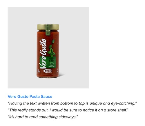
So far, we've assumed that lingering looks are always a positive sign. This isn't necessarily the case, though. For example, many consumers will stare at small text or hard-to-discern graphics because they need more time to take in the design or the information presented. These attributes aren’t intrinsically good or bad; they depend on the brand objectives and category context. For example, Dove Men+Care is a top-performing brand in the men’s body wash category for attention-holding power, but some consumers cite legibility issues related to low contrast and small text size. By contrast, Vero Gusto's vertical wordmark represents a deliberate design decision that keeps consumers looking longer; while some consumers complain that the brand name is difficult to read, many others perceive it as modern and eye-catching—a presumably acceptable trade-off for the brand. The bottom line: understand why consumers are looking longer, and whether any obstacles to clear communication are outweighed by other design advantages.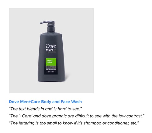
Want to read the full report with tips for improving on several design performance measures? Download it here.
*The principles shared here are based on the hundreds of package designs that Designalytics has tested to date. However, none of these principles always holds true. As all designers know, there are no universal rules for developing effective designs. Design success depends heavily on the specific category and competitive context, as well as a particular brand’s positioning and design objectives.


