
This blog post was updated in May 2026 to reflect the most recent information, data, and insights available at the time of publication.
More and more, brands are embarking on redesigns with an eye towards “modernizing” their packaging. The instinct is a valid one; after all, no brand wants to look like it is stuck in the past. It’s natural to want your package design to keep pace with the times.
The problem is that modernizing for its own sake almost never works.
At Designalytics, we’ve gathered and analyzed a lot of data on package design. This has provided us with some perspective on what generally works—and what doesn’t—when it comes to driving growth with design. And one thing we’ve found is that “modern” is not a design direction brands should pursue (at least for its own sake) if the goal is to drive growth. Here are some reasons why:
Consumers generally don’t care whether a design is modern
As part of our unique, empirically validated approach, Designalytics conducts research to understand which attributes are most important to consumers when making purchase decisions in a given category. (Research is conducted with a few hundred consumers for every category we assess.) This allows us to not only objectively determine the top purchase-driving attributes, but also rank them in order of importance to consumers.
To provide context for this information, we have created an attribute-importance index. A score of 100 in this index is average; scoring above 100 indicates a higher level of importance to consumers, and a score below this threshold indicates it is of below-average importance. Here are some examples from our database: The most important driver across food and beverage categories is “tastes great,” which has an average score of 262. In the personal care space, “effective” is a top driver, with a score of 249.
The average score for “modern” across the 150+ CPG categories we’ve evaluated? It’s 20. That means it is only one-fifth as important as the average attribute in any given category. In other words, consumers are indifferent (at best) about the importance of modernity in designs.
“Modern” can be in the eye of the beholder
Even if some consumers might prefer a more modern-looking design, such a designation remains a nebulous target. If a brand is shooting for a contemporary look, it may hit the mark with some consumers… but the change may be perceived as the opposite by others.
Here's a striking example of minimalism backfiring on an established category leader. An iconic dessert brand recently introduced a redesigned e-commerce package for its signature product. The new look had a cleaner aesthetic that leaned into simplified visuals and appetite imagery and an updated logo. The result? Consumers weren't on board with the change. When tested, the original design won consumer preference by a landslide: 75% vs. 25%.
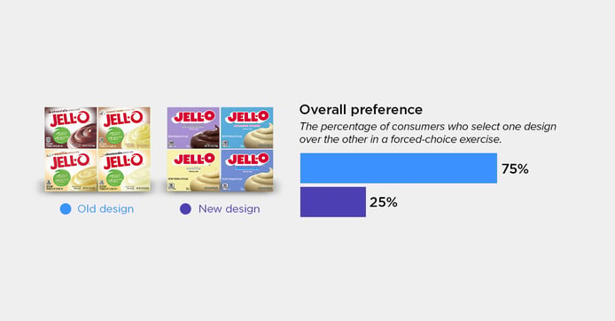
The consumer feedback told a clear story. Consumers gravitated toward the familiar: the original design had a look consumers knew well. It also emphasized nutritional information, which was completely lacking from the new design’s streamlined look.
And here’s a twist. We can assume that this new design was meant to look more modern—yet in reality, consumers mentioned the word “modern” far more often in relation to the old design than the new. This represents another danger in modernizing: the subjectivity associated with it often makes it a moving target.
In other words, the changes the brand made in the name of modernity didn't make the package feel fresh—it made it feel unfamiliar.
To most brands, modern means minimalist—that is rarely a good thing.
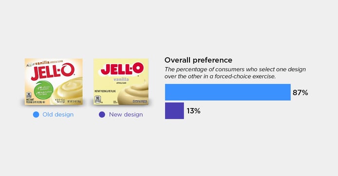
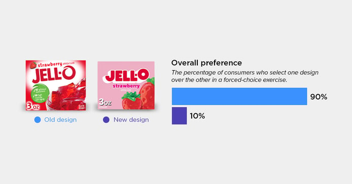
As stated above, minimalism is a popular design trend that brands tend to use as a stand-in for modernity. The problem is that it often impedes communication of attributes that are important to consumers, and we’ve found that such communication has an 88% correlation to directional in-market outcomes. To put it another way: Winning designs communicate very effectively, and minimalist designs rarely do. Overall, only 25% of minimalist redesigns in our cross-category database outperform their more maximalist counterparts.
In the example above, consumers stated that the minimalist redesign made the product look “generic,” “like a store brand,” and “less appetizing,” while the old version had “more information about the product” and was “most like what I already buy and trust.”
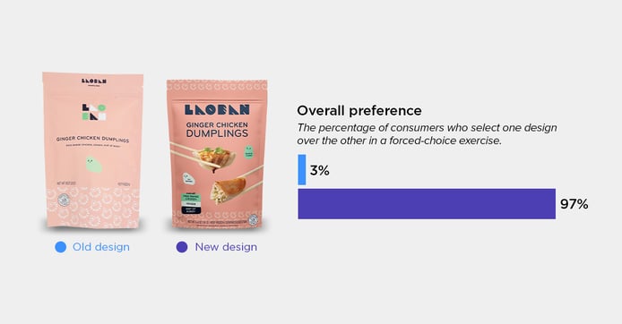
At the other end of the spectrum, some brands have moved away from minimalism with remarkable results. Laoban, a frozen dumpling brand, took a bolder approach in its redesign—adding vivid imagery of actual dumplings to the front of the package, enlarging the logo for greater shelf impact, and providing more product information to give shoppers the confidence to choose. Rather than stripping the pack down, they built it up—thoughtfully and strategically—with elements that mattered most to consumers.
The outcome mirrors what we consistently see in our data: when a redesign improves communication of the attributes consumers actually care about, it almost always wins over consumers. Importantly, Laoban retained its playful personality—so it still felt familiar to those who knew and loved the brand. In the end, an overwhelming number of consumers preferred the new design to the old. The redesign was a bonanza for Laoban. In the six months after the redesign was launched, sales soared 296% compared to the same period in the prior year. Distribution increased, and sales per point of distribution jumped 120%. (Note: This redesign was so good that it won a Designalytics Effectiveness Award.)
A “modern” redesign isn’t a worthwhile goal
Often, the drive to embark on a modernization of a brand’s design comes from looking at competitors. Brand managers may see an updated package from a rival and fear they’ll look antiquated on the shelf alongside it. The redesign is essentially an attempt to “keep up.”
Savvy brands, on the other hand, get a baseline read of their current design to better understand whether a redesign is even warranted. They also keep tabs on the performance of competitors’ redesigns in order to see whether it’s worthwhile to “keep up” in the first place and, if so, how. (Learn more about syndicated design performance data, which can help you do this quickly and affordably.)
If a package does require a fresh look, the goal should be to increase the design’s performance—likely by improving upon one or more of these key metrics of design success. Any concerns about whether a design is outdated can be assessed through consumer testing during the creative process, and necessary adjustments can be made by the experts at your design agency.
So go ahead and allow your competitors to “modernize,” while you keep an eye on the real prize: A redesign that actually improves your brand’s bottom line.


