 Brand: Laoban
Manufacturer: Laoban
Agency: Sabik Design
Patrick Coyne owns a brick-and-mortar dumpling restaurant called Laoban in Washington, D.C.. Like so many entrepreneurs, his business was upended during the pandemic and—with no in-person dining—he had to find ways to adapt. “At the start of Covid, we were just throwing our dumplings in Ziploc bags and selling them curbside,” he recalled. It was working well enough that he and his partner Tim Ma (an acclaimed chef) developed the idea to expand the Laoban brand into the frozen-food aisle of grocery stores.
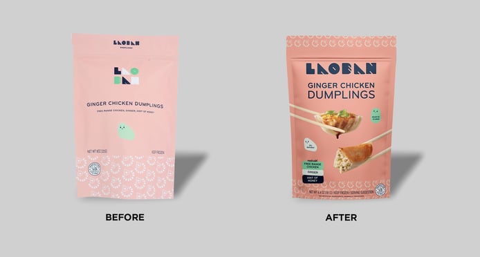
This pivot happened very fast, and the packaging for Laoban frozen dumplings reflected that scrappy, nimble approach. Its sleek, minimalist design featured fun blob-like characters and a muted-peach color, an intentionally whimsical look that stood out in a traditional grocery freezer. “It was very simple and colorful,” Coyne said of the original package. “It was very different from anything else in the aisle. When people walked by in stores, they would say ‘oh, what is that?’”
That distinctive look (and tasty product, of course) helped Laoban build a following and get distribution in its first few chain retailers—Fresh Thyme, Fresh Market, and Whole Foods—relatively quickly. When the brand wanted to grow, the packaging’s limitations became clear. “We were trying to sell to places where customer curiosity wasn't necessarily as great,” noted Coyne.
To help them in this endeavor, Laoban partnered with Sabik Design, a Breckenridge-based independent design studio. Coyne wanted the new design to remain recognizable to Laoban’s core consumers, but both he and Hana Hart (Sabik’s founder and creative director) recognized opportunities to improve. “There was an overall lack of clarity when you saw the packaging,” said Hart. “So we needed better communication, to amplify taste appeal, and to show the product in use.”
The design wasn’t just for the brand’s existing offerings, either. At the time, the company was planning to expand its product set, adding in bao buns, scallion pancakes, crab rangoon, and Taiwanese popcorn chicken products. With this in mind, the teams at Laoban and Sabik were cognizant of creating a design system that was flexible. “We needed to be able to accommodate multiple new product lines and form factors, and make it a universal design template,” said Coyne.
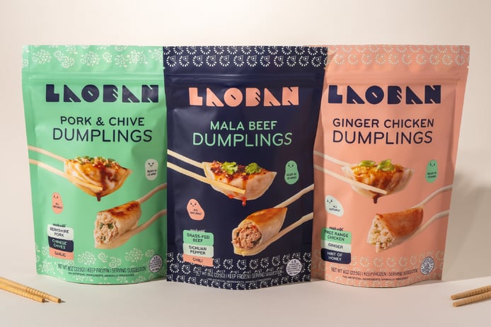
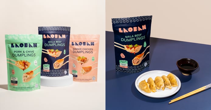
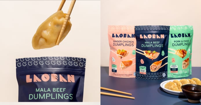
The first, most glaring issue: The star of the show wasn’t even pictured. So how would the brand give these delicious dumplings their close-up? Hart remembers having fun with the possibilities. “We explored a lot of photographic layouts and what that was going to look like,” she recalled. “Was the product going to be plated? Was it on chopsticks? What were the angles of the chopsticks? Were the model’s hands included?”
Ultimately, Laoban chose the imagery that featured two dumplings held in chopsticks, as if being shared at a meal. The top dumpling was golden brown and featured tantalizing toppings. “I wouldn’t say dumplings are the sexiest when they're just plain,” Hart quipped. “So it was pretty clear we wanted to put the sauce on it, as well as some toppings.”
The other image was equally appetizing, but the dumpling was cut open so that consumers could see inside. “We wanted to show the cross section so you could see those real high-quality ingredients and truly sense the flavor,” noted Hart. Coyne was quick to praise BurkleHagen, the photography studio the team worked with, for expertly highlighting the filling, texture, and taste. “The photos came out beautifully,” he said.
“We wanted to show the cross section so you could see those real high-quality ingredients and truly sense the flavor.”
One of the most interesting elements of the previous design was its soothing simplicity, which likely helped pique consumers’ interest in a crowded freezer aisle. Still, it was evident that improved communication was a necessary element of the redesign, starting with the wordmark.
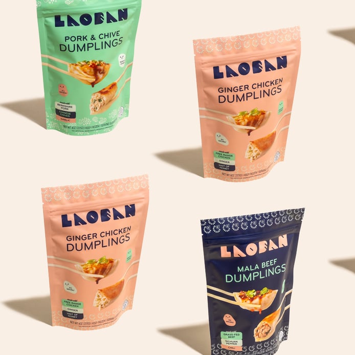
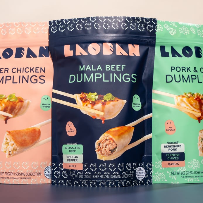
The previous design featured two wordmarks—a smaller one at the top of the package, and a stacked one (half of the brand name above the other half) at the center of the design. Coyne and Hart agreed that there should be only one larger wordmark at the center, and decided against the stacking approach for better clarity. The choice on the color change to the wordmark came down to the wire. “We actually played around with keeping the multicolored logo,” said Hart. “We ended up changing it at the end of the project, and I think it makes a huge difference. It’s more legible and more prominent.”
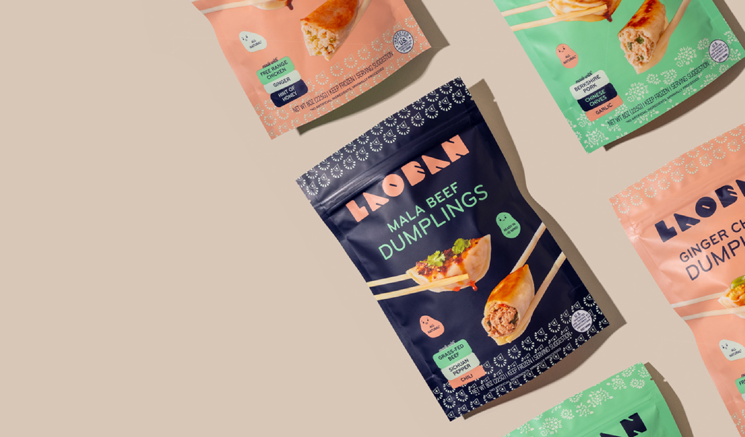
Claims and ingredient information were so subtly presented on the old packaging that it was easy to overlook them; the new design, on the other hand, features a modular system of badges that colorfully highlights key ingredients and important information. “We wanted to keep some of the minimalism of the old packaging while still communicating those important messages,” noted Hart.
Another thing that stayed? Those charming little blobs. “Those mascots are what people most associate with the brand,” Coyne said. “Those facial expressions create an emotional connection, and it’s the part of the packaging that sticks out the most.”
“Those [blob] mascots are what people most associate with the brand. It’s the part of the packaging that sticks out the most.”
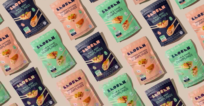
The new look is also fully flexible, allowing Laoban to integrate its new products into a cohesive design system. “I think moving to that format has allowed us to scale, to add product lines in a pretty seamless way as well,” Coyne stated. “Everything was harmonized and consistent.”
Once the packaging hit shelves, there was no change in the marketing plan—but the new packaging clearly didn’t need extra help. The redesign was a bonanza for Laoban. In the six months after the redesign was launched, sales soared 296% compared to the same period in the prior year. Distribution increased, and sales per point of distribution jumped 120%. The results of a consumer evaluation by Designalytics were just as overwhelming: 97% of category buyers preferred the new design over the old one.
In the six months after the redesign was launched, sales soared 296% compared to the same period in the prior year.
Hart believes that the new design has been successful because it draws attention to the best parts of Laoban without messing with what makes the brand unique. “We didn’t want to change much beyond highlighting the taste, ingredients, and how easy it was to eat,” said Hart. “It was already a lovable brand, and this hopefully made it more lovable.”
Coyne agreed. “When we make our products, flavor comes first, so we needed that to come through with this design,” Coyne said. “We accomplished that. Other than that, we really wanted to keep the rest of the package as simple and straightforward and honest as possible.”