 Brand: Neutrogena Ultra Sheer
Manufacturer: Kenvue
Agency: Internal
Over the decades, Neutrogena has become a leader in the skin- and sun-care categories, fueled in part by its focus on product efficacy. Its tagline—”beauty to a science”—embodies its strong commitment to research and development, and to creating products consumers trust.
It’s essential to maintain that trust, which is why the brand is vigilant when approaching redesigns. When it was clear that one of its most popular lines, Ultra Sheer, needed a refresh, Neutrogena utilized every tool at its disposal to ensure success.
The project was undertaken in part to celebrate the benefits of a new formulation, but also to create more design unity with Neutrogena’s broader product set—particularly the brand’s highly successful Hydro Boost line. “Hydro Boost is our biggest platform,” said Cathie Cocqueel, global brand design director at Kenvue, which owns Neutrogena. “We wanted to harmonize the Ultra Sheer design with the rest of the brand.”
On a tactical level, the new look needed to tout the benefits of a recent formula upgrade, while also showcasing the features already important to consumers (e.g., SPF, lightweight feel). Just as important—especially for a category leader like Neutrogena—was to ensure the consumer was at the center of the redesign process. “From the start of the project, we emphasized not losing the customer on their journey,” said Mary Jane Campbell, director of global insights at Kenvue. “Sometimes when brands upgrade their design, they drift further from what drives consumer behavior. We didn’t want to do that.”
“Sometimes when brands upgrade their design, they drift further from what drives consumer behavior. We didn’t want to do that.”
During the design exploration phase, the team utilized an agile “test to learn” approach. They screened early concepts with a large consumer base, which allowed them to identify and refine the best concepts using consumer feedback. Campbell said this method proved very effective. “We used Designalytics for creative exploration and refinement, and there were a couple of big takeaways at the start. First, don’t worry if your first concept is not a winner, because that’s part of the process. Second, we learned that little changes can make a big impact."
The research phase also produced lessons the team hadn’t expected—and will be helpful to them for future design projects. For example, Campbell and her team requested a large group of Neutrogena brand buyers be included in the testing, in addition to overall category buyers (which naturally included some Neutrogena buyers). The idea was to ensure that, in connecting with all potential buyers, they weren’t somehow alienating their loyal customers. The additional time and expense was unnecessary, Campbell recalled. “It turns out that 99% of the time, the response of brand buyers aligns with the category buyers.”
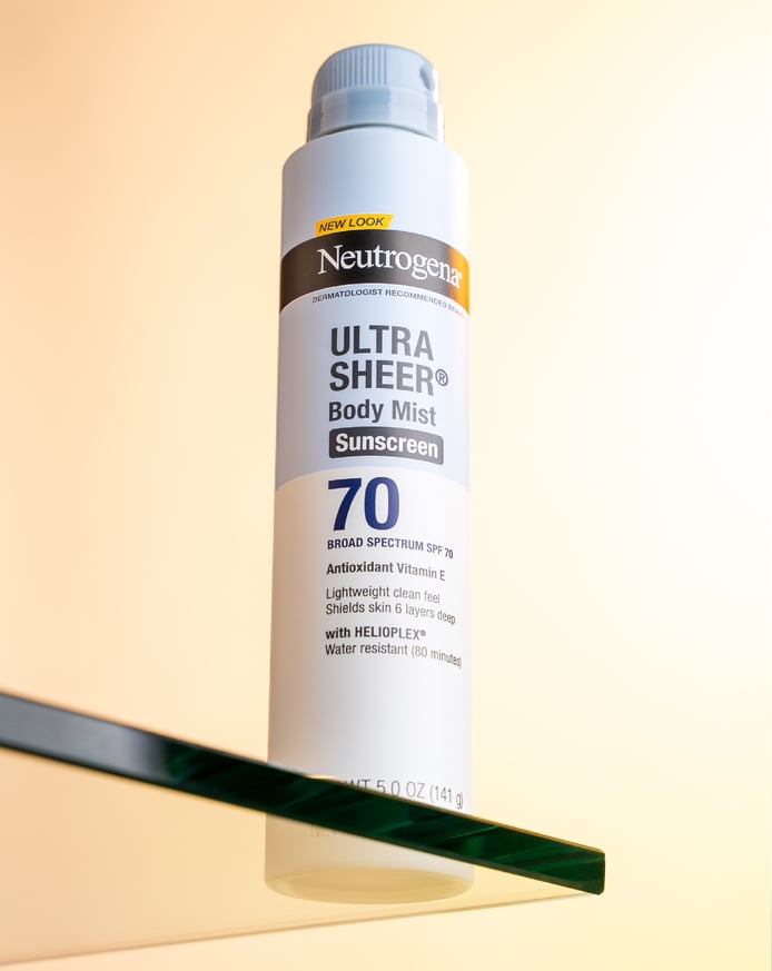
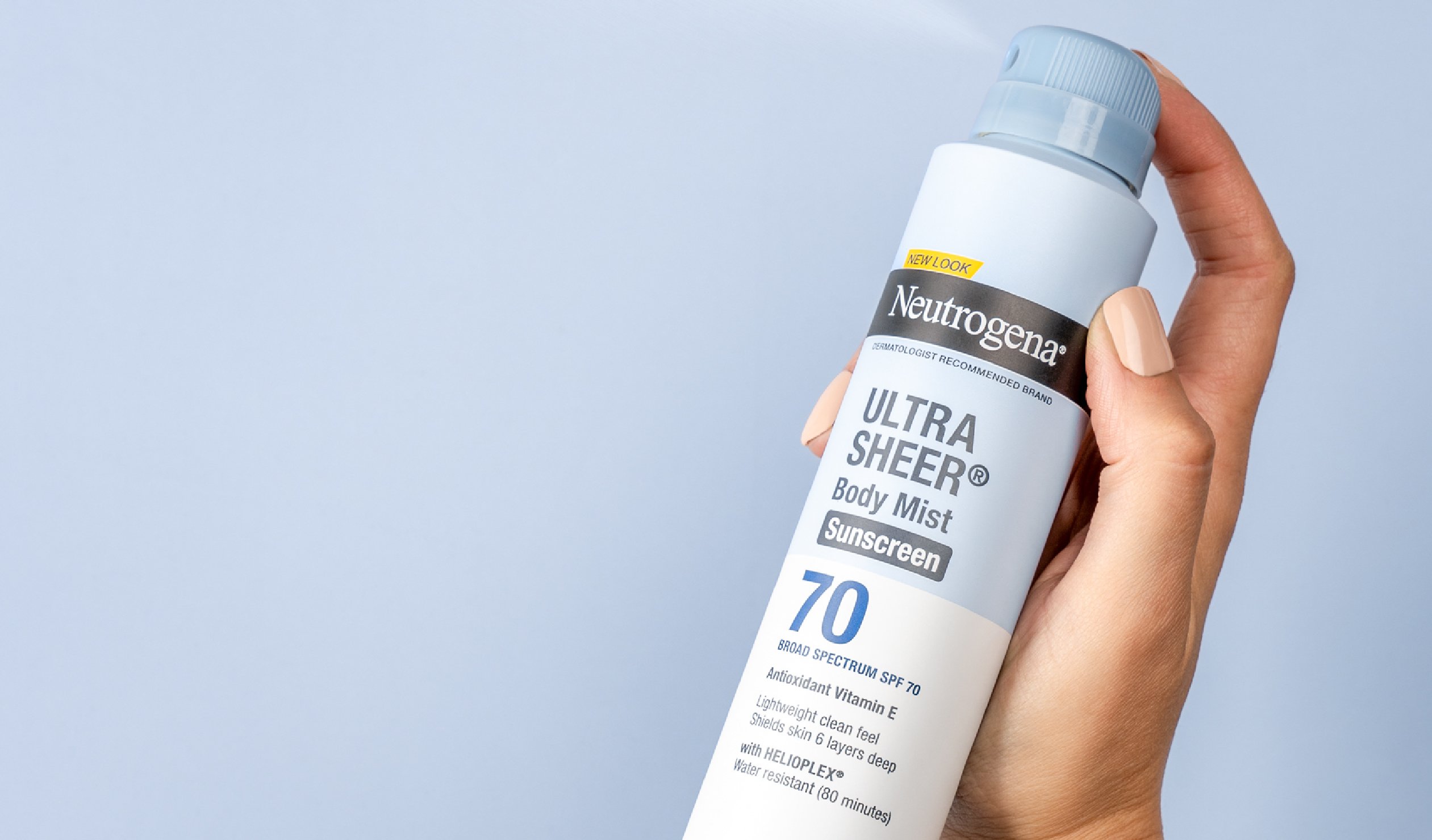
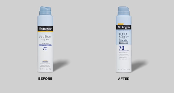
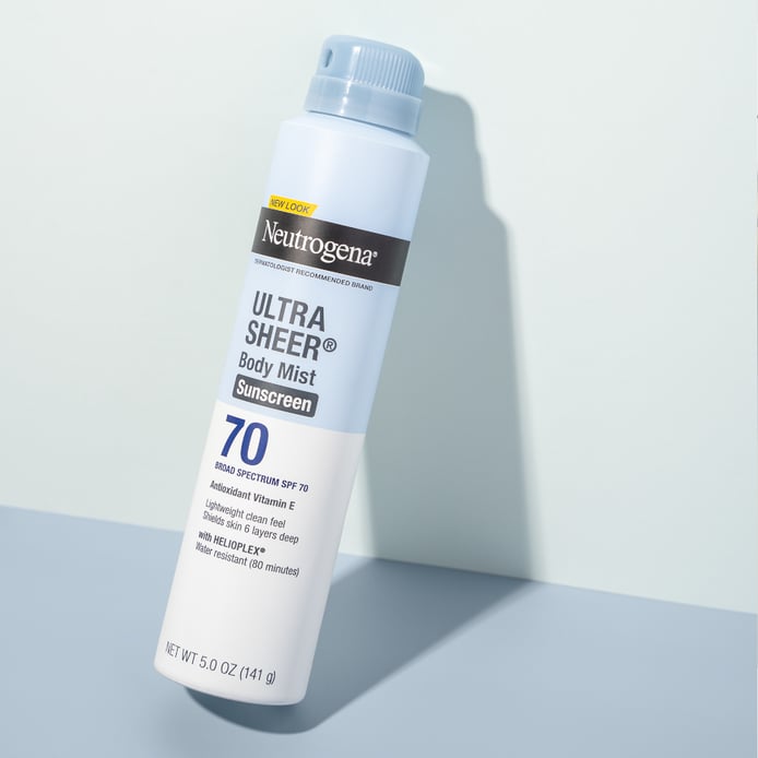
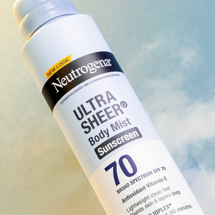
Not surprisingly, any potential change was heavily scrutinized. To wit: the team explored moving the block of blue from the top of the package to the bottom (to better align with the larger portfolio). In testing, however, consumers made it clear they preferred the block where it was. Cocqueel believes this made intuitive sense. “The blue on the top is suggestive of the sky, so it cues the sun intuitively. This is a sunscreen, but we don’t have any direct sun cues on our packaging,” she said. “On top, the blue subtly suggests a sunny day, which we would lose if it was moved to the bottom.” The blue band remained and has actually expanded to cover half of the bottle now.
“The blue on the top is suggestive of the sky, so it cues the sun intuitively.”
The fonts on the Ultra Sheer bottle are now bolder (and some are all-capped), making them more visible and legible. This improved stand out in highly competitive retail environments while retaining the brand’s overall aesthetic. “We found the right balance between being bold and modern, and still authentic to the brand,” Cocqueel noted.
Neutrogena’s research showed that certain claims and product information, such as the SPF number, were more important to consumers. “We know what consumers look for first, so our hierarchy of communication needs to reflect that,” said Campbell. “SPF is something more consumers, and especially younger consumers, are prioritizing now. So that became bigger and more pronounced on the pack.”
The new design also touts the benefits of the new formulation for Ultra Sheer. A prime example is the “six layers deep” language on the new pack, which alludes to absorption and the efficacy of the sunscreen. “We also know our consumers love numbers. They might not understand each of the layers, but they intuit that it means the product offers protection and they’re not likely to get sunburned,” said Campbell.
The redesign seems to have led to sunny days for the brand, as Ultra Sheer saw a sales increase of 7.5% in the six months after the redesign compared to the same period the prior year. Designalytics’ consumer testing supports this outcome, as 75% of consumers preferred the updated design over its predecessor. When noting why they chose the design, consumers regularly cited how appealing the design was and how much easier it was to find the information they needed.
Ultra Sheer saw a sales increase of 7.5% in the six months after the redesign compared to the same period the prior year.
When asked why she believed the design succeeded, Cocqueel was quick to note the contributions of a variety of folks at the brand, ranging from marketing and design to the consumer behavioral insights team. “Each of us brings our own expertise,” she said. “We have different perspectives, and each of us isn’t always right. We need those other points of view.”
Cocqueel is proud, not only of the finished product, but of Neutrogena’s approach to design. “I think this design is a great balance—modern, appealing, easy to shop, and still recognizable as Ultra Sheer. I also like that we are always looking to improve. I think a brand is alive… it’s never static. Our consumers are evolving, and we need to evolve with them.”
“[A brand] is never static. Our consumers are evolving, and we need to evolve with them.”