
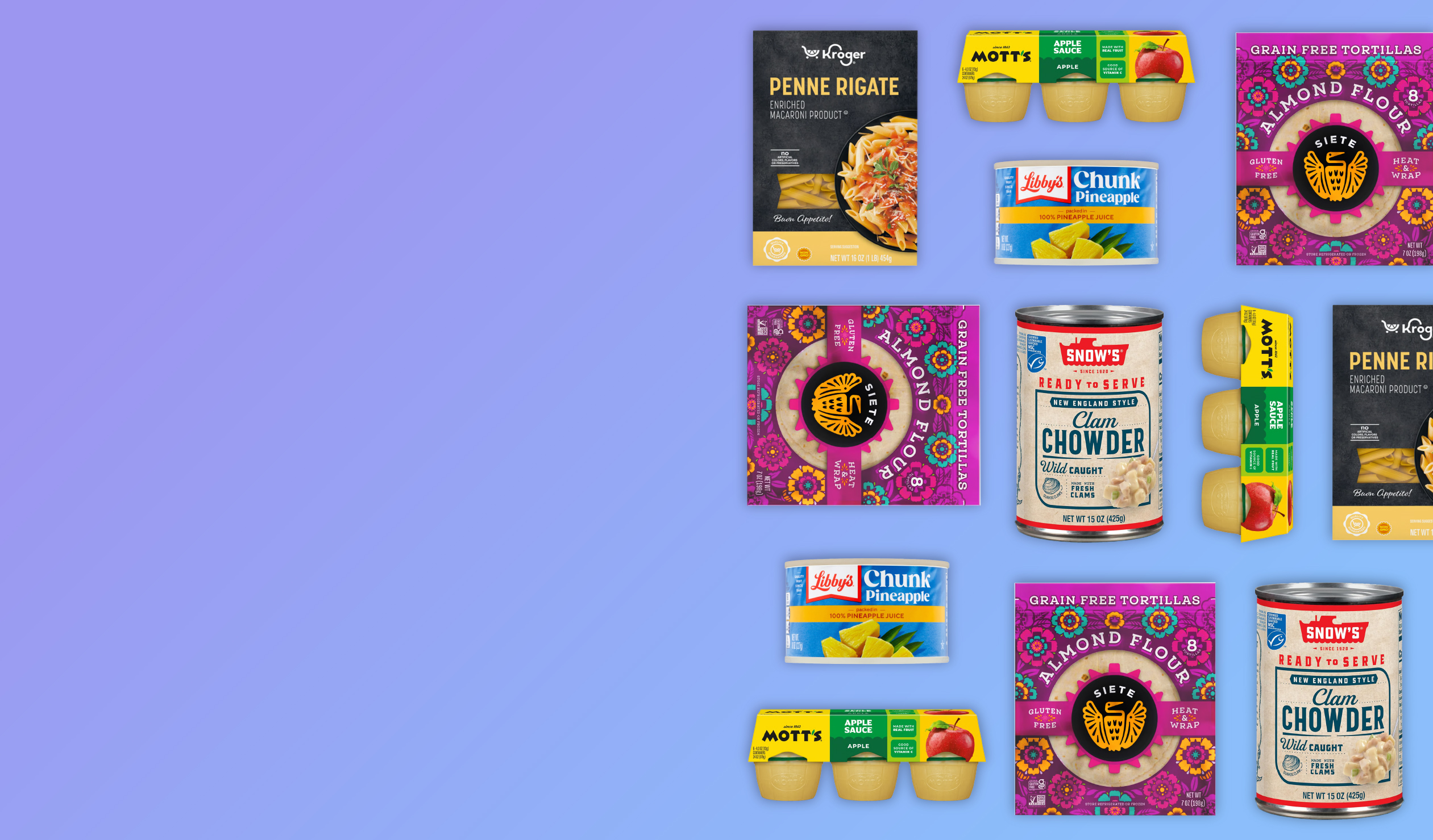
As the only provider of syndicated package design data, Designalytics evaluates the top-selling and fastest-growing designs across hundreds of consumer-packaged-goods categories. We measure and analyze a wide range of design performance areas, including visibility, communication, mental availability, element-level diagnostics, and more.
There’s an important balance to strike with food packaging—brands need to highlight its taste appeal and make important information easy to spot without overwhelming consumers. Our data shows that five pantry packaging redesigns did just that, utilizing imagery, color, layout, and messaging to increase consumer preference.
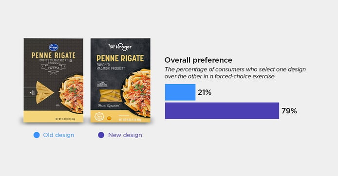
Kroger Penne Rigate Pasta
Consumers often want to see the product inside the box, but what they want to envision is how it might look on their plate. Kroger’s Penne Rigate redesign gave a better look at both, enlarging the window to showcase the pasta and spotlighting the finished dish to make it more appetizing. Consumers appreciated being able to see more of the product, along with the prominent “No artificial colors, flavors, or preservatives” claim. Others liked the “Buon Appetito” wording, saying it gave the packaging a “more authentic” Italian feel. Together, these changes helped the redesign earn preference from 79% of consumers. As one put it, the new packaging “seemed like a higher-quality product, and it gave me more confidence that it would meet my needs.”
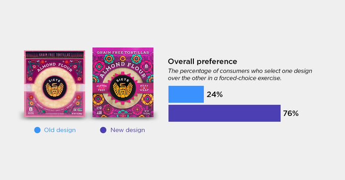
Siete Tortillas
Siete brought more energy to its tortilla design with some pretty dazzling floral graphics and colors that practically pop off the pack. The changes caught consumers’ attention, with one noting that “the bolder flowers and the more colorful package caught my eye.” The stronger color contrast also made key product claims easier to read. Overall, 76% of consumers preferred the redesign, with some also responding to the sense of authenticity it conveyed. As one consumer put it, “I think this packaging looks more fun and authentically Mexican.”
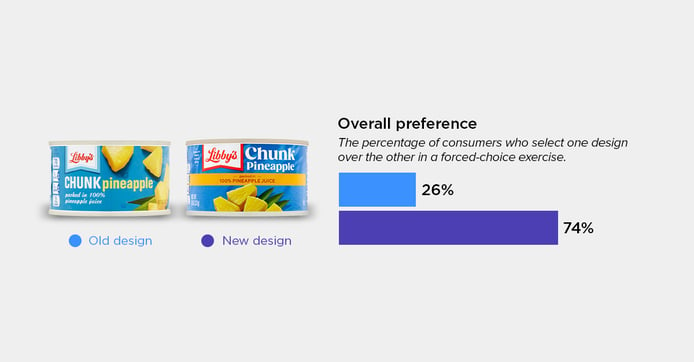
Libby's Chunk Pineapple
This redesign earned 74% consumer preference using imagery that seemed “fresher,” “juicier,” and “more appetizing”. The new can featured a more organized arrangement of pineapple chunks that consumers described as “more natural.” One even said, “you could lay out the slices on a platter by themselves.” A bold yellow strip also brought the “100% Pineapple Juice” callout front and center, making it easier to find and read. As one consumer explained, that claim was “one of the first things I look for when I buy pineapple,” while another felt the updated design made the product look “healthier and better quality.”
Snow's Ready-To-Serve Soup
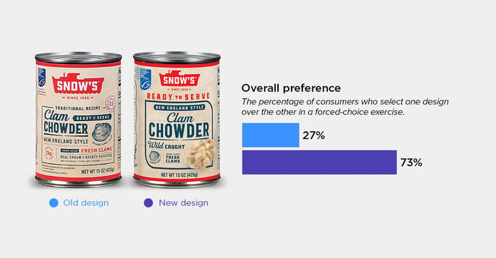
Snow’s new design struck a balance between its traditional feel and a clearer focus on what matters to consumers—specifically, how the soup would taste via an appealing spoonful of the chowder. As one consumer explained, a “picture of the product shows you what you are buying.” The simplified layout also focused on key callouts like “ready to serve” and “wild caught,” which was appreciated. One consumer summed up the redesign’s appeal: “The label looks more modern, but at the same time it also looks old and traditional. It makes me think the product would taste better.” Ultimately, 73% of consumers chose the new design over the previous one.
Mott's Applesauce
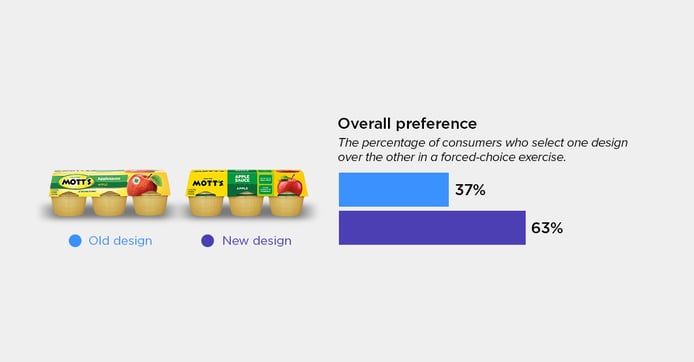
Applesauce is a simple snack, and Mott’s latest packaging did a great job of highlighting why it is worth choosing. The brand took a more streamlined approach, making the logo more visible and benefits easier to read. A new “made with real fruit” callout and a more legible vitamin C claim gave consumers even more reasons to consider the product. As one consumer explained, “I like seeing that it’s a good source of vitamin C because I don’t usually think of applesauce for that.” Others appreciated the cleaner layout, describing it as “less complicated and easier to read.” These changes paid off, with over 63% of consumers preferring the new look.
These pantry packaging redesigns show how design can dramatically improve the purchase conversion potential of a product. It’s important to remember that what works for pasta may not work for soup or canned fruit.
Our syndicated data research gives brands and agencies access to consumer preference data across thousands of CPG package designs, helping them understand what’s working in their categories and make more informed design decisions. Explore our syndicated data subscriptions to see how consumer insights can inform your next packaging design.