 Brand: BUILT
Manufacturer: BUILT
Agency: Interact Brands
As demand for protein snacks grows, it’s never been more clear: consumers are looking beyond the traditional choices when seeking this nutritional staple. Chips, waffles, pasta… It seems you can get a muscle-building boost in almost any grocery aisle these days.
The folks at BUILT have watched this transformation unfold with understandable interest. Founded in 2018, the brand creates snacks for protein-conscious, on-the-go consumers, and for years that meant creating traditional protein bars that are so popular with fitness enthusiasts. From its founding, though, the Utah-based brand has prioritized creating products people actually wanted to eat, rather than just consume for nutrition’s sake. That’s one of the reasons they created BUILT Puff, a lighter, protein-rich snack with a unique, marshmallow-y center.
The BUILT Puff was meant to complement the BUILT Bar, but it wasn’t long before this delicious newcomer was the brand’s number-one seller. It was clear that BUILT needed to redesign its packaging to better connect with its evolving target market. “We have consumers who have referred to our product as ‘purse candy,’ and so we had to have a package design that lived up to that promise,” said Megan Crossland, chief commercial officer at BUILT.
BUILT engaged Interact Brands, multi-time winner of the Designalytics Effectiveness Awards, for this project. Part of the initial work revolved around finding where the brand fit in with the protein-bar category—and where it might carve out its own niche. The teams conducted workshops where they mapped BUILT against current competitors as well as brands in other food categories. “We wanted to think differently, and explore different ways to position the product," said Blake Mitchell, principal at Interact Brands. “We had a lot of fun with that process.”
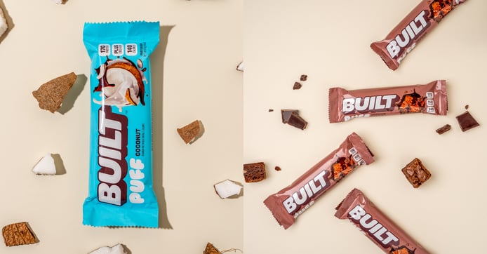
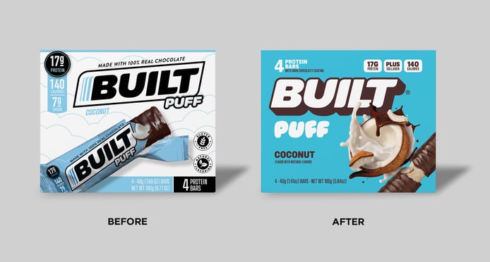
Ultimately, the brand decided to focus on flavor and indulgence, so increasing appetite appeal was paramount. “The deliciousness of the Puff was not really coming across clearly enough with the old design,” said Hannah Chapman, creative director at Interact Brands. “We knew BUILT could compete very well as a better-for-you option, but felt that leaning into the candy-bar indulgence would help the brand stand out.”
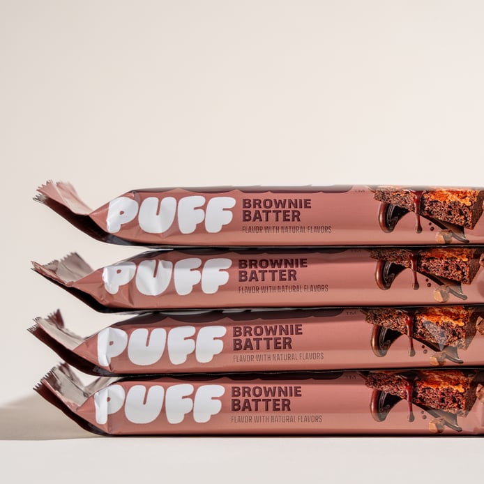
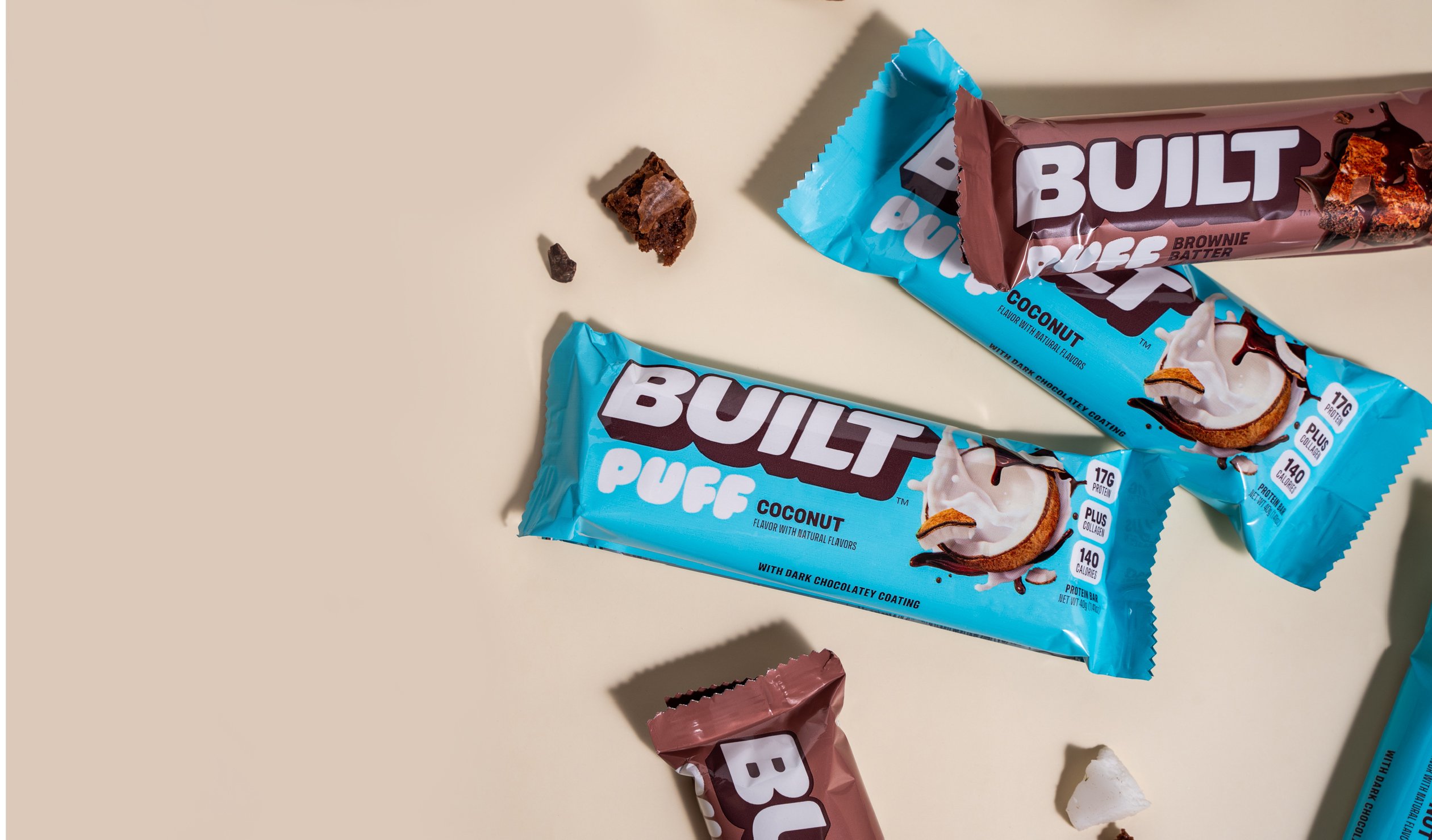
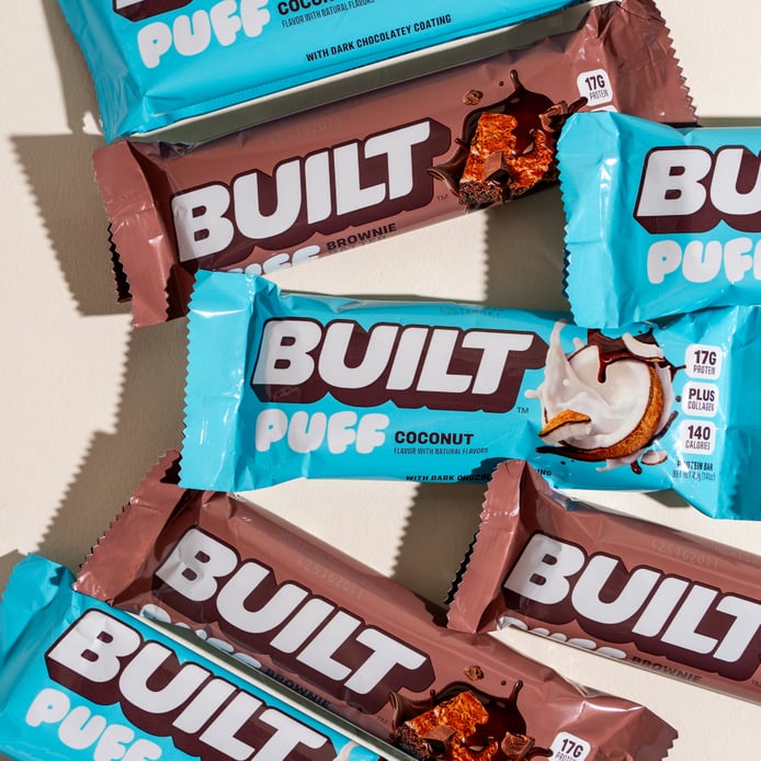
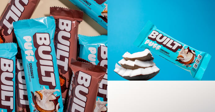
BUILT needed to show how different the Puff was, though—and in more ways than one. It started with taste imagery, which now dominates the packaging, with an interesting twist. The bar is clearly shown: pulled apart so consumers can see the marshmallow-y inside. Yet it’s the flavor photography that jumps off the package. In the case of the coconut variety, for example, a cracked-open coconut is spilling over while a splash of chocolate curls around it. Chapman called this a “dynamic explosion of flavor.”
That dynamism was part of the appeal, according to Crossland. “The Puff is just more fun as a product, “ she said. “We wanted to make sure we had energy and motion in the imagery. Sports nutrition brands are usually serious, so we wanted to make the design more accessible and fun.”
Certain elements of the old design have been scrapped—such as “gluten-free” and “natural flavors” badges, as well the “100% real chocolate” banner—in order to make room for the bold flavor imagery. Nutritional claims have been moved from the center to the top, and a collagen reference has replaced the sugar call-out.
“Sports nutrition brands are usually serious, so we wanted to make the design more accessible and fun.”
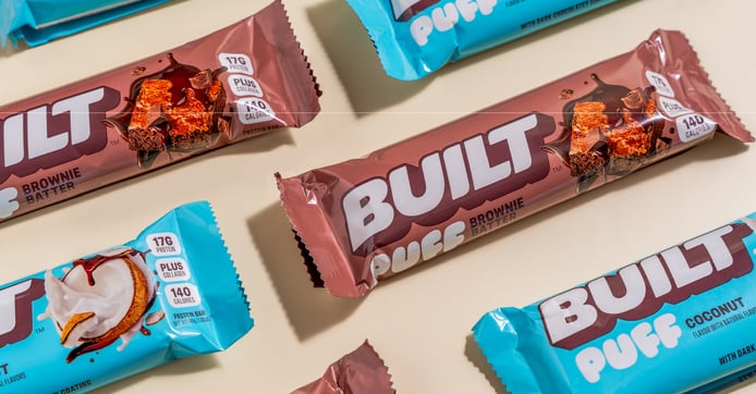
Another key change? Color. Whereas the previous design featured a white background and a cloud motif (suggesting the lightness of the puff), the new design went with a buoyant blue and a larger “puff” alongside the name. According to Mitchell, there was a healthy debate about the primary color to be used, but the switch to blue seems to have won over many consumers. In Designalytics consumer testing, many mentioned the new color specifically, calling it “more inviting,” “more vivid” and “eye-catching.”
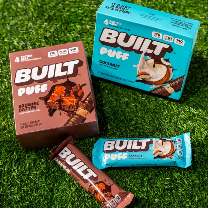
While BUILT still sells its protein bars online—and the new design system has been carried across the portfolio—its primary product is now the BUILT Puff. To differentiate the two, the brand added a tagline to the side of the box: It’s not a bar, it’s a puff. This was specifically designed to reset consumers’ expectations. “A lot of people avoid the protein bar category because of its connotations about being chalky or having a bad aftertaste,” noted Crossland. “Most people who are trying our brand today prefer the puff because it’s unexpectedly delicious, so we wanted to reframe those expectations.”
It seems consumers are embracing this vibrant revamp from BUILT. During the six months following the redesign, sales increased by a striking 200% compared to the same period during the prior year*. Designalytics consumer testing aligns with this result, as the majority of consumers preferred the new design, calling it more engaging, inviting, attractive, and appealing.
During the six months following the redesign, sales increased by 200% compared to the same period during the prior year.
The excellent reception and results have also made a difference in the product’s distribution, according to the brand. At the time of the redesign, BUILT Puffs were sold in major chains like Walmart, Sam's Club, Costco, Publix. After the redesign, the brand added Target, Kroger, Aldi’s, BJ’s, and others to its roster of retailers. “We’ve made some impressive distribution gains in the last year, which is in part due to how great the packaging looks,” said Crossland. It wasn’t just that the Puff appeared in more stores, though—it also sold better on a store-by-store basis. Sales per point of distribution jumped by an impressive 100%.
The design allowed the brand to evolve—maintaining its spirit while accentuating its personality and tastiness. “I think the new design allows the delicious flavor of the products to shine through,” said Mitchell. “At Interact, we just wanted to help create packaging that showcased how great the product is. Once consumers try them, BUILT’s products speak for themselves.”
Crossland was overwhelmed by the response to the refresh. "It's been exciting to see so many people connecting with BUILT in a whole new way,” she said. “We’ve always known we had a great product, but this new look helped us show up on the shelf in a way that truly reflects who we are. Big thanks to the Interact team for their creativity, collaboration, and vision. They collaborated well with our internal team and played a huge part in helping us reach more people."
*Reported growth numbers are based on third-party sales data; post-redesign sales were compared to sales from the same period during the prior year.
