
Brand: Heinz
Category: Ketchup
Parent brand: KraftHeinz
Agency: Unknown
Welcome to our Redesign of the Month series—where we spotlight one deserving brand harnessing the power of design to make an impact, tell a story, and outshine its previous packaging. Hundreds of current category consumers evaluate the old and new designs across a wide range of performance areas, including purchase preference, communication, mental availability, and design element resonance. Notably, Designalytics’ testing outcomes align with actual sales performance more than 90% of the time.
Congratulations to this month’s honoree: Heinz Ketchup.
Background
When you’re already leading your CPG category, there’s a tendency to be cautious about embarking on redesigns. There’s validity to that, too—messing with success can be a recipe for trouble, right? As we’ve seen again and again at Designalytics, that’s not always the case if you are smart, consumer-driven, and measuring for the right things.
At Designalytics, our data has shown that strategic packaging upgrades by successful brands can dramatically improve design performance. The latest redesign of Heinz ketchup is an impressive example of small changes making a big impact.
So how did they do it?
Key creative changes
As the dominant brand in the ketchup space for decades—and a brand with history stretching back 150 years—Heinz clearly needed to take a thoughtful approach to this redesign. Any drastic changes or ill-conceived tweaks might actually do more harm than good. Still, the brand saw an opportunity to improve the design and seized it.
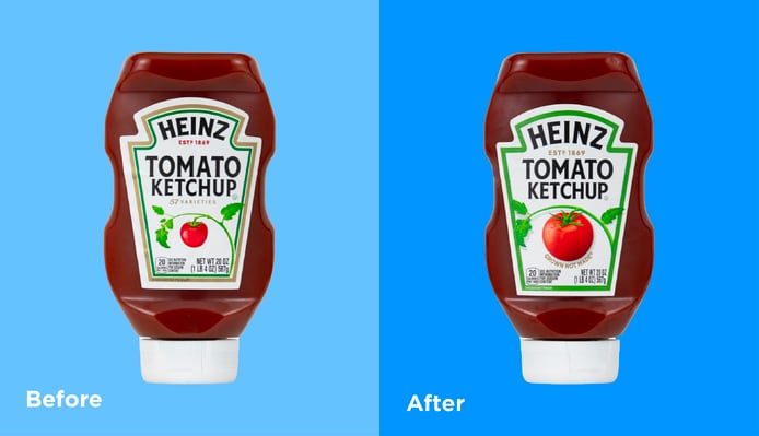
First, the brand placed a larger, plumper, photorealistic tomato (complete with water droplets) at the center of the label. The vine is more prominent and appears thicker, stretching in an arc across the width of the label, from border to border. Speaking of the border, it was simplified, with a wider green outline replacing the dual gold-and-green from the prior version.
The brand removed the longstanding “57 varieties” callout, and instead added a “Grown, Not Made” tagline directly below the tomato. This was a clever way to emphasize the natural origins of the product, and reintroduces the phrase that had been on packaging in the not-too-distant past.
The bottom line
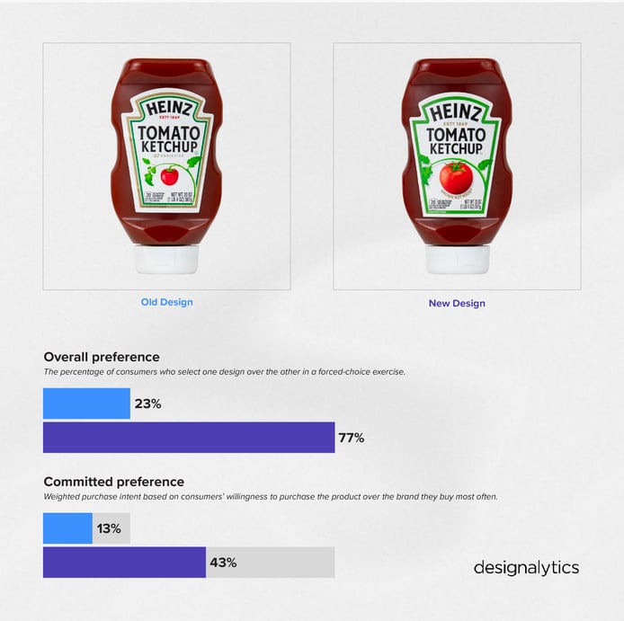
This redesign was a clear winner: 77% of consumers preferred to purchase the new design over the old. In the three months after the launch, sales are already up 5%, and the brand has gained 2 percentage points in market share (69% to 71%) vs. a year ago.
Redesign wins and opportunities
The wins were aplenty for this redesign, in part because it maintained the familiar look of Heinz Ketchup while communicating what consumers care most about.
That starts with appetite appeal. The redesign uses roughly the same template as the previous version (ensuring consumers recognize it) while amplifying the flavor cues of the key ingredient: tomatoes. In Designalytics’ testing, consumers repeatedly used words like “ripe,” “fresh,” and “healthy” to refer to the new image of the tomato and vine. One noted the difference it made to them: “I like the large picture of the plump, red tomato. It makes the product look real and trustworthy.”
The “grown, not made” callout was a clever way to complement the taste imagery and affirm the natural origins of the product. In their responses to why they chose the new design, consumers regularly noted that it seemed healthier and more natural. When asked which words they were more likely to associate with the new design over the previous version, consumers used words like “trusted” and “delicious.”
These two changes made a big difference in communication, which Designalytics has determined has an 88% correlation to in-market outcomes. The new look topped the old in communicating the 12 most important attributes to consumers, and by an eye-popping average margin of 49 points. Some of the most impressive wins were on the top three attributes: “tastes great” (number 1, +52 points), “made with real ingredients” (number 2, +51), and “high quality” (number 3, +51).
Wins
- As a category leader—particularly such an iconic and enduring one—it can be difficult to find ways to widen the gap between your brand and competitors. By leveraging design as a growth driver, Heinz did exactly that, boosting both sales and share.
- The “grown, not made” tagline addition made a significant and positive impact. It was the third most engaged-with design element, and the consumer response was overwhelmingly positive. It was a simple enhancement that paid big dividends.
- The accuracy with which consumers could identify Heinz ketchup among its competitors increased from 83% to 89%, and confusion with Heinz Simply (another product in the portfolio) dropped.
Consumer highlights
“The big red tomato looks delicious.”
“I like the ‘grown not made’ tagline because it makes it sound more natural.”
“I like that it has the classic Heinz Tomato Ketchup text and the familiar label shape. That makes it very easy to spot on a store shelf.”
About our data
Our goal behind highlighting impactful redesigns is to help brands understand market reactions to design changes and make intentional design decisions. We create a full report of these insightful case studies for every brand redesign in our cross-category database. These value-add tools are created automatically for our clients who subscribe to syndicated category data. For more information on this redesign report or others, contact us.