
As the only provider of syndicated package design data, Designalytics evaluates the top-selling and fastest-growing designs across hundreds of consumer-packaged-goods categories. We measure and analyze a wide range of design performance areas, including visibility, communication, mental availability, element-level diagnostics, and more.
A 2026 report from Mondelez found that 66% of U.S. adults reach for a snack at least once a day. In a category where consumers have countless options, packaging plays a critical role in which snacks ultimately end up in their carts. In this roundup, five brands upgraded their designs with more engaging and appealing imagery as well as more targeted, strategic messaging, earning higher purchase preference in the process.
Bahlsen Choco Leibniz Cookies
Category: Cookies
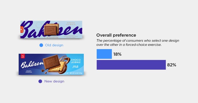
To start, Bahlsen updated its Choco Leibniz packaging with a more enticing product image. One consumer explained, “Getting a good look at the cookie inside makes the product more appealing,” while another added that the “cookies and chocolate swirls look more indulgent.” Consumers also appreciated that the Bahlsen logo was no longer obstructed, and said the darker blue background made the package easier to read. These changes resonated with 82% of consumers choosing the new design.
Xochitl Tortilla Chips
Category: Tortilla chips
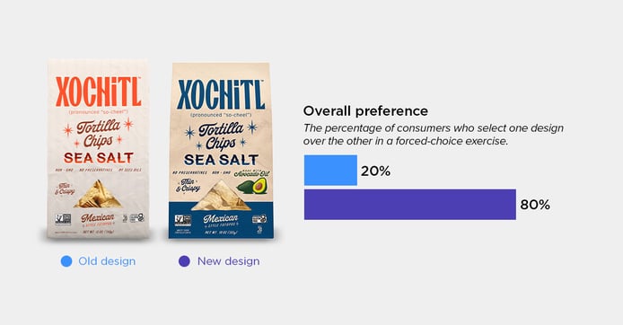
Xochitl earned an 80% consumer purchase preference with its latest redesign. The main reason? Use of color. Consumers said the switch to blue made the packaging easier to read, feel more “upscale,” and set it apart from other tortilla chip brands. The blue band at the bottom of the bag also drew their attention.
Interestingly, consumers also associated the color with flavor, one explaining, “Blue gave me the impression of a salty, not spicy, chip. Red implied spiciness to me.” Consumers also noted the addition of “made with avocado oil” and corresponding illustration, reinforcing perceptions of a “cleaner, more premium product.”
PopCorners
Category: Salty snacks
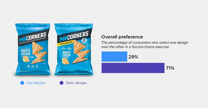
PopCorners refined its packaging by making its biggest benefits impossible to miss—a change that resulted in 71% of consumers choosing the updated bag. Many cited the bright yellow “popped, never fried” banner as the reason for choosing the new design, with one saying it is “eye-catching and highlights an important product feature in a very visible spot.” Others appreciated the more prominent calorie callout. One consumer put it, “I liked seeing the calories without having to look for them.”
P3 Portable Protein Pack
Category: Lunch and snack kits
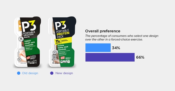
If there’s one thing that’s popular right now, it’s protein—which explains why P3 reworked its packaging to put it front and center. The redesigned pack introduces a bold yellow stripe—matching the word “protein” in the product name—that highlights the 11g protein and “no artificial preservatives” claims. One consumer noted that the yellow “helps to get your attention” while another shared that “the protein stands out, which is important when choosing a snack.” The simple and strategic changes earned the brand a 66% consumer purchase preference.
Milton's Crackers
Category: Crackers
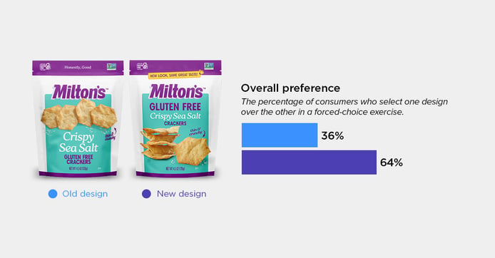
Communication—that is, saying important things better— has an 88% correlation with in-market sales outcomes. Milton’s refreshed cracker packaging boosted this important metric not only with words, but also with images.
First, the redesign showcases the crackers from multiple angles, helping consumers better see their texture and dimension. 64% of consumers chose the new design, with many commenting that the crackers look “thin and crispy” and “like they would be crunchier.” Others pointed out the larger gluten-free claim, saying it was “more easily noticeable” and that “it reassures me it is gluten free because it is a larger font.” One consumer summed it up: “the packaging…feels both healthy and appealing.”
Gain a greater understanding of your category with a Designalytics’ syndicated design research subscription. See how your packaging compares to others in your category, identify opportunities to gain an edge on competitors, and explore in-depth qualitative and quantitative consumer insights.