 Brand: Soley
Manufacturer: Solely
Agency: Fortnight Collective and Bex Brands

Manish Amin, VP of marketing at Solely, described an experience he thinks perfectly conveys how unique Solely’s fruit jerky product is. He was talking to a buyer at an industry trade show, and put an actual mango and guava next to the brand’s Mango Guava product. Amin mentioned that the pieces of fruit were the only ingredients in the Solely product. “The guy said: ‘This doesn’t have gelatin or sugar?’ This was an industry professional, and he actually looked at the ingredient list on the back,” Amin said. “He couldn’t believe it was just fruit. That’s how remarkable this product is.”
That simplicity is the foundation of Solely’s brand, but it's not easy to overcome the feeling that your product is too good to be true. When Amin joined the company in 2022, he felt that the packaging wasn’t working hard enough to get that message across. “We were seeing good traction, but there was an opportunity to reflect the product and the brand more clearly and succinctly,” he said.
Amin collaborated with two agencies to accomplish this, starting with Fortnight Collective, a global agency based in Boulder, Colorado. Fortnight was tasked with helping clarify and crystallize the brand’s overall positioning, as well as handling redesigns and other assets for Solely products. “Previously, Solely was hiding its most important and differentiating brand attribute—it’s 100% organic fruit,” said Andy Nathan, founder and CEO of the agency. “The goal of our brand positioning and package design was to make this very important difference clear.”
Fortnight completed its work quickly (the agency prides itself on moving swiftly from kickoff to completion), defining the brand platform and distilling the brand down to the phrase "the fruit, the whole fruit, nothing but the fruit.” The agency then conducted broad design exploration, ultimately creating the packaging design system, and led photo shoots as well as the creation of assets for several of Soley’s products, including the fruit gummies and dried fruit.

Matt Kubis, creative director at Fortnight, believed this work created the foundation upon which to build the brand further. “The platform we created was all about being truthful, bold, and honest. We gave more clarity and prominence to the integrity inside of every Solely package,” he said.
Armed with strong company positioning, Amin then enlisted Bex Brands, the San Diego-based design agency that has worked with better-for-you brands like Suja and Good Karma. In the creative brief, Amin made clear that while Solely had many great stories to tell—flavor, organic ingredients, great relationships with farms, etc.—the brand needed to focus its messaging. “You can't deliver 15 messages in the one second you have with consumers at the shelf. And that's what we were attempting to do with the old design,” he said.
Of course, grocery aisles are filled with products touting their purity (consider how many brands include the word “Simple” or “Simply” in their names), but no one had a stronger story to tell than Solely. Jeremy Dahl, co-founder and creative director at Bex Brands, knew that while the fruit itself would be the star of the packaging, conveying that it was the only star would be next in line of importance.
“You're talking about only one or two ingredients in the product,” Dahl noted. “Consumers love the idea of simpler, cleaner ingredients, and if you look at Solely’s competitive set, no one else can compare on that front. Combine that with the delicious flavor of Solely, and it’s an exciting story to tell.”

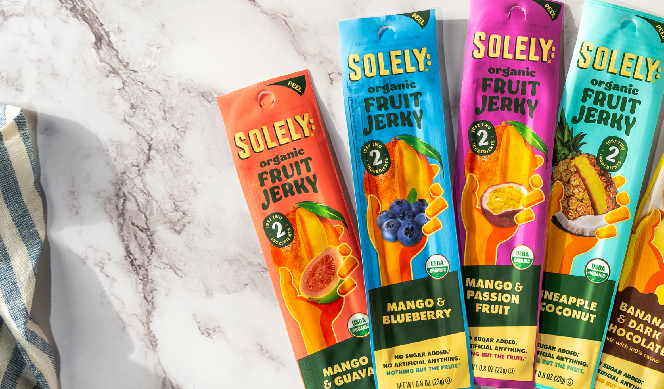
First, the fruit. To better convey appetite appeal, the brand replaced the illustrations on the previous package with photography of the fruit (with a cross-section cut to show the juicy goodness inside). Amin recalled a particularly long day getting the shots for each flavor just right. “I think it was a 14-hour day,” he recalled.
While the fruit is photo-realistic on the new design, the hand remains illustrated—a deliberate choice to retain a distinctive asset. “The hand represents everyone’s hand, really,” Dahl commented. “The farmer’s hand, the hand of the person placing it on the shelf, and ultimately the hand of the consumer. It’s a reminder of all the people involved in creating and enjoying this fruit snack.”
While the fruit is photo-realistic, the hand remains illustrated—a deliberate choice to retain a distinctive asset.
To drive home the simplicity of the product, the brand streamlined communication as well. Gone is the “one whole organic mango” language, and the vegan and non-GMO badges have been removed as well. “We had to make some tough choices in order to distill the messaging down, and moving those badges to the back was one of them,” noted Amin. “We had to focus on what drives behavior, and organic is a higher priority for our consumers.”
The wordy “promise” from the previous design was also removed, replaced with the flavor name in bold lettering against a bright ribbon of color, which communicates and captures attention. “Consumers need a clear understanding of what SKU they’re looking at,” Dahl commented. “We needed to communicate these varieties in different ways, some direct and some indirect. This color and the clear description of the flavor complemented the imagery of the fruit above.”

To clarify the product’s positioning, “fruit jerky” is now more prominent (with the word “organic” added for emphasis) and a clever badge—styled to look like a produce sticker—showcases the number of ingredients in an unmistakable way. “What you see on the front of the pack is what you get inside. We wanted to take something from the produce aisle and repurpose it to articulate simplicity,” Amin recalled. In case it wasn’t clear, the claims at the bottom hammer home the message: “No sugar, no artificial anything, nothing but the fruit.”
Once it was launched, Solely’s new design was met with enthusiastic approval from a broad range of stakeholders. “I have never been a part of a redesign that received such a positive response from retailers, as well as from key advisors and our board,” said Amin. “I think there was a sense that the packaging finally reflected the product inside.”
Consumers seemed to be just as ardent in their approval. During the six months following the launch, sales grew more than 61% compared to the same period during the prior year, despite the fact that the fruit-snack category was nearly flat overall (0.4% growth). Designalytics’ testing affirms this result: Nearly two-thirds of consumers preferred the new design over the previous version.
During the six months following the launch, sales grew more than 61% compared to the same period during the prior year.

When reflecting on the success of the new design, Dahl doubled down on the importance of simplifying. “When you have a great story like Solely, there’s this urge to say everything on the package,” he commented. “You have to make informed decisions about what is most important. You also have to remember to connect with consumers emotionally first and then more logically.”
In part, Amin credits taking the perspective of the brand’s target audience. “Be as critical as your most critical consumer,” he said. “At times it’s easy to make compromises based on your own understanding of the product, but you need to maintain a consumer mindset.”
Most of all, though, Amin thinks this design is just…well, more beautiful. “This is a much more appealing design than our previous one. And more often than not, it’s the art on the packaging that draws consumers in.”