Designalytics has measured the performance of thousands of package designs across consumer-packaged-goods categories. We’ve analyzed troves of data, conducted in-depth interviews with award winners over multiple years, and worked with incredibly-talented brand and agency teams everyday to learn why some package designs skyrocket brand growth, while others fall flat—or even result in sales declines.
So, what makes a winner? Here are eight themes we hear over and over from the teams who successfully drive growth through design:
1. Craft clear, strategic creative briefs
Winners set clear goals before they embark on a redesign—they know what they’re hoping to achieve, and where their existing design falls short. More than that, they constantly evaluate the creative they’re developing against this criteria, and they do it with radical honesty. I love this design, but is it really communicating “healthy” better than the old packaging? That design is delightfully bold, but is it pushing the brand too far?
For some brands, a brief may also include an inspiring idea that, while less concrete, somehow brings a sense of crystalline clarity to the process. For example, Oikos wanted to become “the yogurt with a black leather jacket.” An absurd image? Possibly—but it’s the kind of absurd that makes a strange kind of sense, especially to creatives.
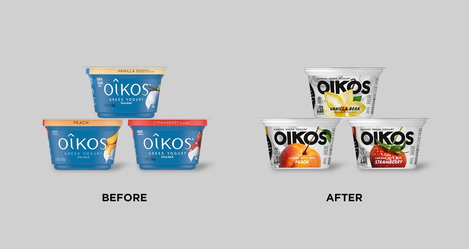
Oikos' clear, confident vision yielded a design that completely reversed a declining sales trajectory and returned the brand to growth (-18% to +7%).
2. Recognize when a redesign should be evolutionary, not revolutionary
Over the past few years, a number of our winners were redesigns for well-established brands—ones who already had top-performing designs. This is the kind of high-wire act that brand managers dread, since it involves considerable risk. However, we’ve repeatedly seen that 1) it’s possible to improve on an already-successful design; 2) evolutionary changes can have an enormous impact; and 3) respect for existing brand equities is absolutely vital for success.
In these cases, the best creative agencies tread carefully, making highly strategic decisions about which package elements to amplify, edit, or eliminate. Often, the change isn’t dramatic—but the sales results can be.
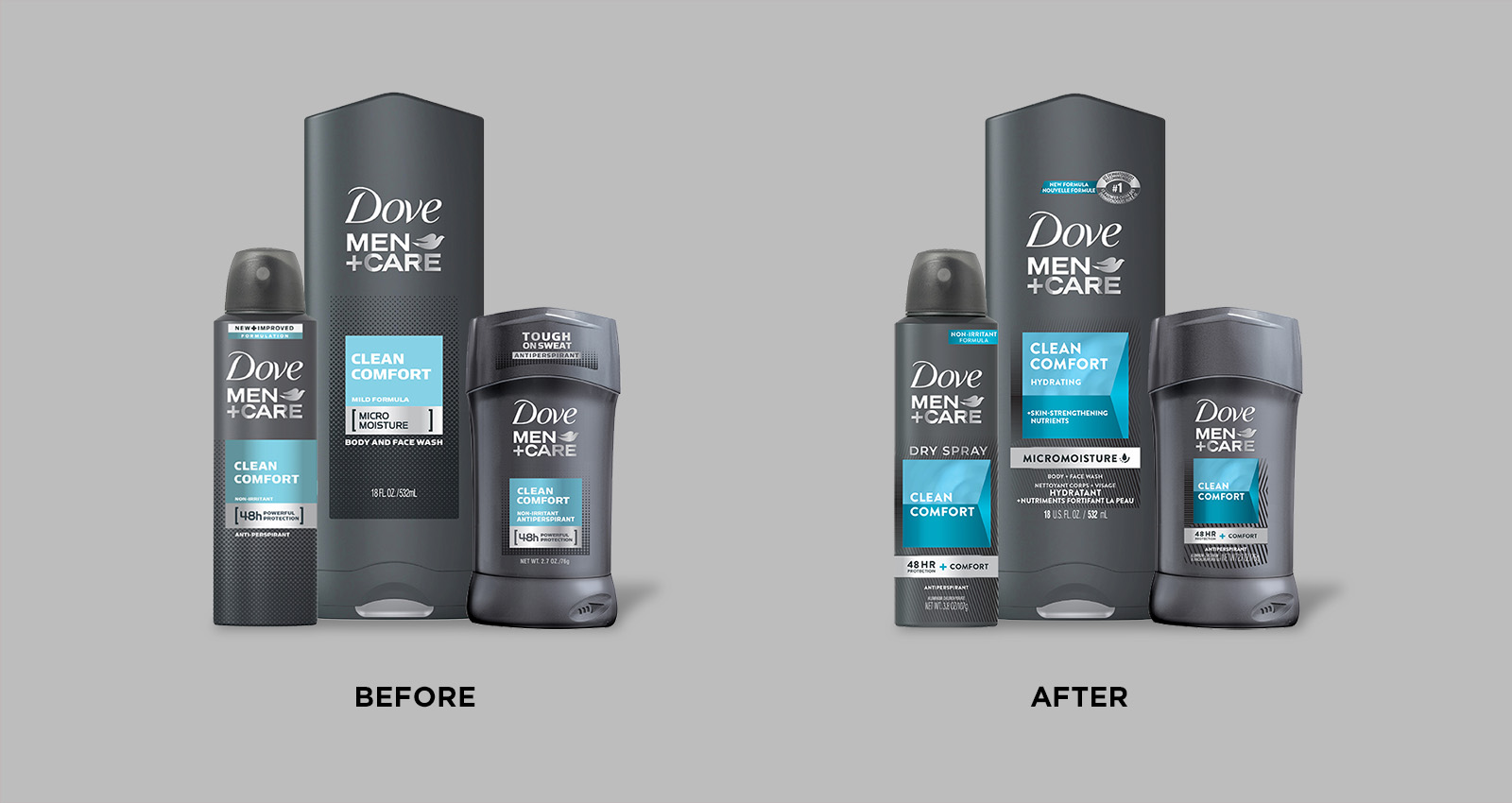
Dove Men+Care made relatively small, highly strategic tweaks, driving a sales increase of 17%.
3. Remove unnecessary constraints and explore broadly
At the start of a redesign initiative, the brand and agency work together to determine which existing visual assets are “must-keep” because they’re distinctive and meaningful to consumers. Winners are able to be judicious during this process; they’re willing to consider that elements they might have thought were crucial, really aren’t—and that marking them “hands-off” would preclude potentially successful design solutions.
Even in the case of evolutionary redesigns, winners tend to go broad in the creative exploration phase. They believe they’ll know “how far is too far” only when they’ve gone too far.
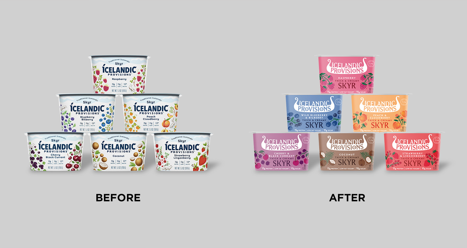 Icelandic Provisions determined that a dramatic change would be required to gain more brand awareness. Bold changes to its logo and color palette helped the brand to capture more attention, trial, and distribution—growing sales by 16%.
4. Collect consumer feedback early and often
Many consumer-packaged-goods brands (especially large ones) wait until the end of the creative process to validate a chosen design direction with consumer research—much too late in the game to provide meaningful direction to creatives.
Winners tend to get consumers involved earlier; they screen initial design concepts with consumers (ideally, quantitatively), use this feedback to refine their designs, re-test with consumers—and repeat as many times as necessary. The value of consumer research is in testing to learn and improve, not to green-light a finished design.
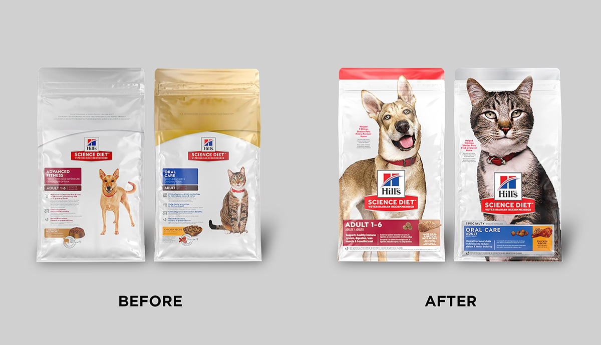 Hill's Science Diet conducted an immense amount of consumer research early in its design process, leading to a vital "a-ha!" moment that would drive the success of the redesign: Pet parents desired a strong emotional connection—in addition to scientific rigor—when deciding which food to purchase. The redesign grew sales by 17%, representing an annualized increase of approximately $100 million.
5. Prioritize communicating important things better
If there’s one design performance area that reigns supreme when it comes to packaging effectiveness, communication is surely it. In fact, successfully communicating the attributes that are most important to category buyers is highly correlated (88%) with sales performance. There’s one caveat, though: This applies to communicating what’s objectively important to category buyers—which is deter- mined by asking those consumers—not what your brand thinks is important.
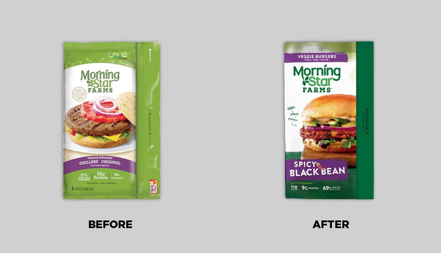 MorningStar Farms started to feel the heat from plant-based competitors focused heavily on taste appeal, so communicating this better became a priority when redesigning. Additionally, even current buyers didn't realize how many different products were in the brand's portfolio, leading the brand to emphasize product type in its hierarchy of communication. The new design drove a sales increase of 14%.
6. Adopt bolder, more consistent branding—especially in the case of challenger brands
When challenger brands recount their success stories to us, nearly every one mentions the importance of boosting brand awareness. Typically, this is achieved by creating a more cohesive design system that can be applied across product variants, and by enlarging the branding on the packaging. While we’d never suggest that a particular approach will work for every brand, it’s difficult to overlook this common thread when it comes to effective redesigns by challenger brands.
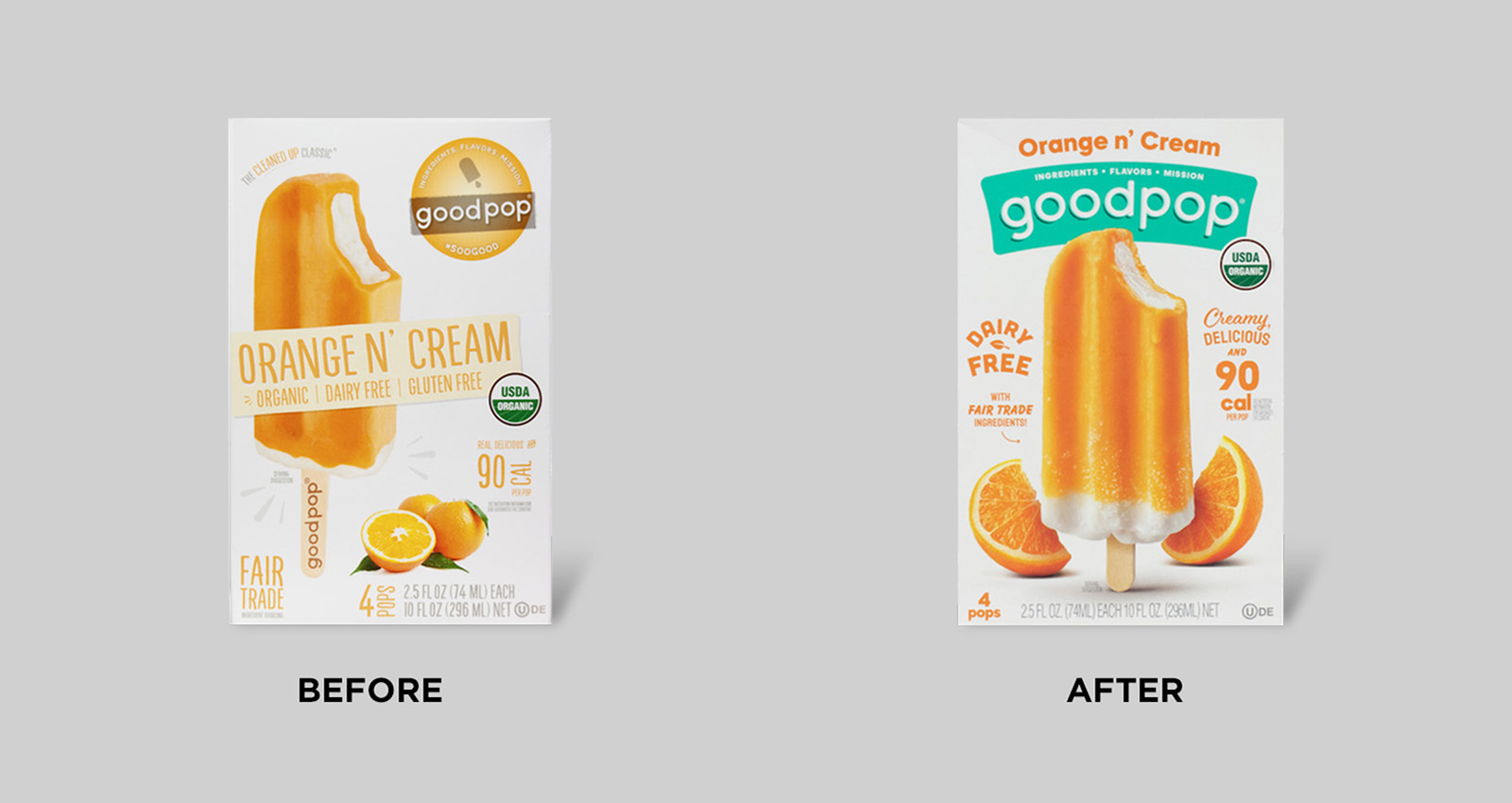 One of GoodPop's primary objectives was to create more prominent, more cohesive branding across its product line. A bigger, bolder logo and consistent brand color (teal) helped immensely. Following the redesign's launch, sales grew by 40%.
7. Punch up imagery related to taste (or sensory) appeal, when applicable
Across almost every food and beverage category, “tastes great” is the top purchase-driving attribute, according to our cross-category database. Perhaps it’s no surprise, then, that redesigns leveraging tastier product, flavor, or ingredient imagery reliably perform better than their less-delectable counterparts.
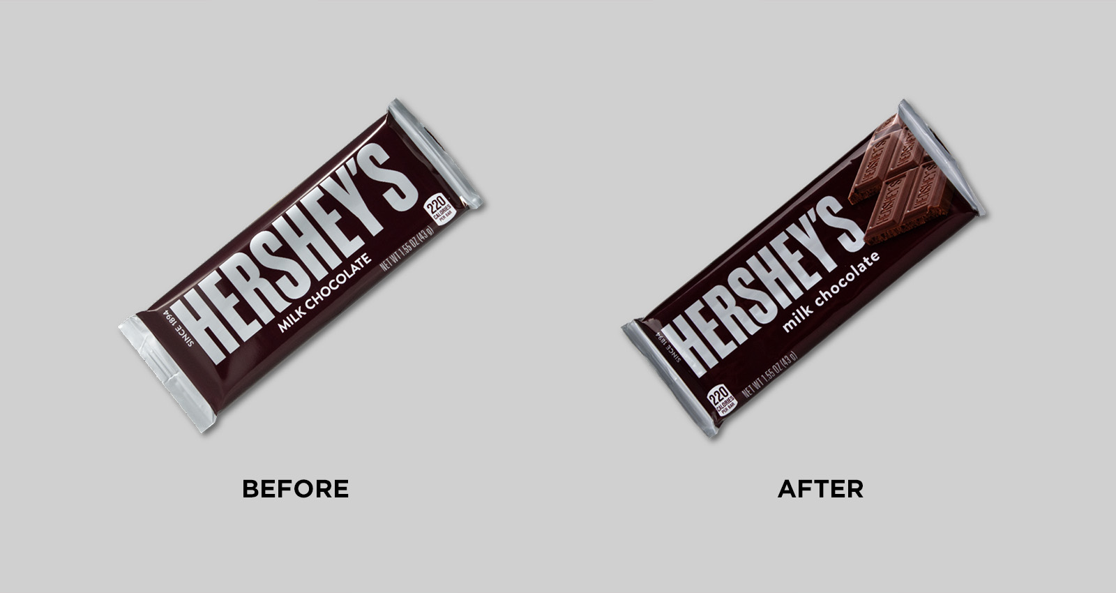 After more than 70 years, Hershey's made a simple—but highly impactful—update to its packaging: It added an image of the chocolate itself. Sales increased by more than 9%.
8. Avoid chasing trends without a strategic rationale
There’s nothing inherently wrong with being trendy, but winners don’t adopt fads just for the sake of it—they make well-reasoned design decisions that reference their brand’s specific goals and their consumers’ needs. That said, there are times when being contrarian does make sense for a brand and presents a valuable differentiation opportunity. As Fred Hart of Interact Brands puts it: “Challenge the category, not the consumer.”
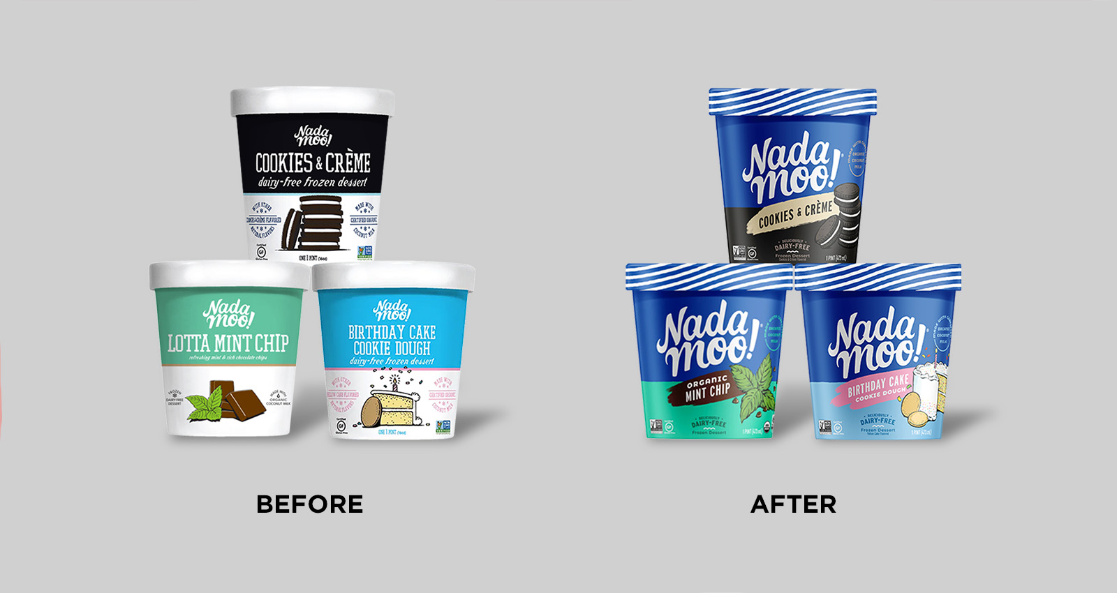 Moxie Sozo's revolutionary redesign of NadaMoo! kept the brand's illustrative approach to food imagery (which they viewed as a point of differentiation), rather than utilizing photography like most of the brands in the category. The redesign contributed to a sales growth of 27%.


